3

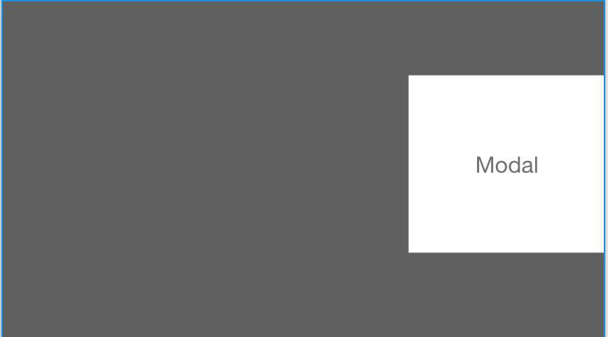
Currently, I am going into an application where there was a decision made to have modals slide into the screen from the right but stay snapped to that right window border.

modal right

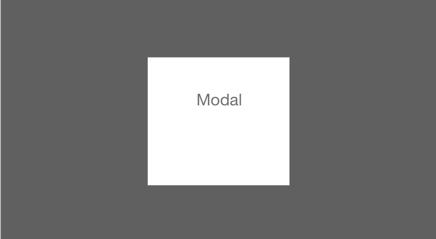
From experience in other applications, I have seen modals always be dead center in the screen or centered horizontally.

enter image description here

I am unsure if this is something that should be continued with or if I should push more modals being in the center of the page.

Any help would be appreciated.

7
  • Will this be a web application (used in a browser) or a desktop application?
    – Kevin M.
    Commented Jul 12, 2018 at 16:19
  • @KevinMol desktop only
    – Nick Rucci
    Commented Jul 12, 2018 at 16:20
  • You say there was. A decision to do it that way. Question is: why? Knowing the reasons behind that decision could help in providing you an answer. All in all, you’ll need to test it
    – Devin
    Commented Jul 12, 2018 at 16:24
  • @Devin so the only explanation was that PM wanted to have some “different” and “sexy”.
    – Nick Rucci
    Commented Jul 12, 2018 at 16:25
  • Well, it is different since you’re breaking an accepted pattern. I don’t know about sexy, but I never understand that kind of definitions like cool, sexy, hip or whatever on an interface. Personally, I wouldn’t do it without a real reason. And either way, I’d test this a lot. Keep in mind that in this placement you can see the content below. This could be handy depending on your needs. But modals are made to draw focus to content in the modal, not to the content below it
    – Devin
    Commented Jul 12, 2018 at 16:30

3 Answers 3

5
+50

The position of the modal is also going to depend on the exact purpose/goal of the modal.

The slide-in modal (or more like a sneak-in panel), would allow the user to go on fulfilling his/her primary goal of seeing this page (for example, reading the text, seeing images, editing content, etc) and ignore the presence of the modal.

A modal which is horizontally and vertically at the center of the page is going to demand attention and should be used in scenarios where it is a must for a user to notice the content of the modal. This will be an action which user must take in order to proceed further <- kind of gets defined as a primary action in the flow.

Another thing to consider could be the scanning pattern. Usually, people read from left to right. So basically, they notice the elements on the left of the screen first (except if the experience is designed for an arabic, hebrew, urdu, etc speaking demographic) and then the element on the right. So placing a modal on the right would make it less noticeable and it can be used more like a UI element which is used in some form of an assistance to the users existing goal and not as a very important content for the user to see, observe or interact with.

A slide in from left/right modal are closer to a toast messages behaviour, which are placed closer to the borders of the screen (bottom left, bottom center, bottom right, top left, top center and top right).

You can also define families for different kind of modals and scenarios in which you must use them.

3

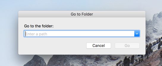
It's not that crazy an idea. Sure, I always think of modals appearing in the middle of the screen, but Mac software (often) slides modals out from the window header.

MacOS Modal

You ought to mock up a right-edge modal and have some people try it out. (Don't warn them about the modal ahead of time.) See how they react to it when they see it for the first time. Me, I'd probably stop and wonder at it for a minute.

1
  • +1 I think most design patterns will have an acceptable/optimal use case, and it would be interesting to see where a right-edge modal would work. Although I think when you disable access to the rest of the screen then it is a lot less hard work to find something in the middle of the screen (given the size of monitors these days, not to mention 2+ screens that people use these days).
    – Michael Lai
    Commented Jul 9, 2018 at 22:50
1

It's true that OSX uses header fixed modals for interactions within Finder, but it is important to try and understand why this may have been implemented in this way.

The modal is fixed to the header of the finder window because the Go to folder action associates only with the finder window you interacting with. Leaving a modal suspended in the center when you have multiple finder windows opened and not having a faded behind it(which would probably look weird in the visual design of OSX) may leave the user a little lost to which Finder window they are interacting with and if you have no finder windows opened while finder is still running and click on GO > Go to folder you will see that modal appears right in the middle top of the screen just like all common modals.
enter image description here

Where it may not be a critical issue of having the modal to slide out on the right it's worth asking if "having something different and sexy" just for the sake of it - is really a good idea.

It is indeed not that crazy of an idea, but the choice on whether to use or not to use should be based on on some research and use case analysis of the application itself.

A couple of points to research and consider:

1) Assuming that most of your audience reads from left to right, it may take longer for them to respond to the action the modal is offering, simply because they first see the fader in the area of the screen they usually pay attention to and only then their attention would travel to the right hand side of the screen. Worth testing this.

2) Because majority of modals appear in the middle and we dealing with a desktop app some of the new users may firs even feel and double check if the UI is broken and they are seeing the full screen of the application and not just the left hand side.

3) Consider how the modal get initiated, if it is triggered by a set of actions that happen primarily on the right hand of the screen it may actually work out well.

4) If the information to the left of the modal(behind the fader) requires to be seen in order to make a decision on the calls to action within the modal itself - it may not be such a bad idea at all then, since it will allow the user to see almost everything they need to refer to in order to make the right choice.

Personally i would stay away from non traditional ui patterns unless ther is a veery good reason for it proven by research and tests.

You may find below resources helpful in making a final decision:

Your Answer

By clicking “Post Your Answer”, you agree to our terms of service and acknowledge you have read our privacy policy.

Not the answer you're looking for? Browse other questions tagged or ask your own question.