2

I made 2 mockups that I'll explain with some context.

Context

I have elements (or categories) that each may contain any number of sub-categories, and even later, sub-sub-categories. I want the user to be able to :

  • Modify the properties of any item of any level easily
  • Modify a group of items if the parent is updated (every child element inherits some properties from the parent)
  • Be able to navigate a list of Categories, Sub-categories, Sub-sub-categories that each can be an arbitrary size (let's say the maximum is 40 elements per layer).

Menu description

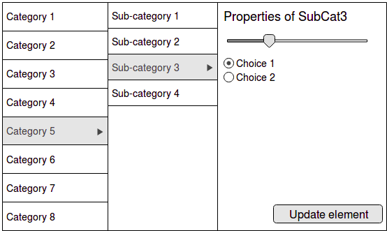
This big element would be directly on a page as the main interaction, not as a dropdown hover, or mega menu like detailed on this StackExchange post, but as a clickable-only surface. When clicking an element from one of the category layers, the form on the right adapts to allow specific modification (first illustration).

mockup 1,

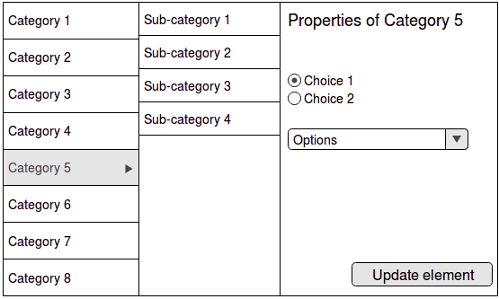
If the user wants to, he can also modify each category directly, modifying every sub-item automatically (second illustration). mockup 2
Do this type of menu have a name, and is it a good choice for my context?

Thanks!

Edit: This is a 100% desktop website.

3 Answers 3

4

It is a (newer) version of a "cascading menu".

Ryanair has an interesting version of it on their website.

Helpful links: https://codepen.io/MaGiO/pen/YXXzeJ and https://tympanus.net/Blueprints/MultiLevelMenu/

Sources: https://www.htmlgoodies.com/beyond/javascript/cascading-menus.html https://material.io/design/components/menus.html#dropdown-menu (scroll down to cascading menu)

5
  • Good answer. Would be a great answer with a source. Commented May 17, 2018 at 12:53
  • Thanks @rob-e - I slightly updated the wording, too. It also made me wonder if this is a way we refer to it in my team or a generally approved terminology. For sure though it looks like a version of the more traditional cascading menu we were used to in earlier Windows, right?
    – Mike Mark
    Commented May 17, 2018 at 13:06
  • I'm not searching for this exactly ; it seems that "Cascading menus" mostly refer to an element which : activates on hover (1), closes itself automatically (2), and is mostly used for navigation purposes (3). What I'm looking for is something closer to what is done on some Windows apps, it's the same idea as the File Explorer. You click on the left panel a folder, and the right panel will update accordingly. I'd like to find that, except there could be up to 3 side-panels + the main one. A name, some plugin for doing that, or even a concrete example out there that could inspire me. Commented May 17, 2018 at 13:20
  • 1
    Hmmm... In my mind if not the same, they are very similar. Choosing if it will work on hover on click depends on your product. Check this: codepen.io/MaGiO/pen/YXXzeJ and this: tympanus.net/Blueprints/MultiLevelMenu
    – Mike Mark
    Commented May 17, 2018 at 13:53
  • 1
    You're right @MikeMark, it's just a matter of CSS/JS in the end. The MultiLevelMenu blueprint is incredible and pretty much what I need, even more. The breadcrumbs is a clever replacement for multiple side-panels like I thought I'd do. Commented May 17, 2018 at 14:57
2

I would refer to it as a master-detail UI scheme with nested hierarchy.

It is not unlike the structure of e-mail clients like Outlook, which presents you (from left to right) with a folder structure, then the feed of e-mails pertinent to the selected folder, then the actual content (i.e. the workspace with editable details - where stuff happens).

This information architecture is absolutely appropriate to many use cases and master-detail is considered highly learnable. You could consider, and this is just an enhancement suggestion, to breadcrumb the title of the edit window, to say any of the following:

  • Properties > Category 5 > Sub-Category 3
  • Properties of Sub-Category 3 (under Category 5)

Slight preference for the first option, but users may expect that kind of breadcrumb trail to be fully clickable, in which case you have two navigation paradigms that need to play nicely together. This is where affordances come into the picture, in presenting the breadcrumb as a purely passive "you-are-here" assist.

This may seem superfluous but to me that level of information redundancy is a good safeguard - rather than relying on the user's tracking of the selection status of two neighbouring columns (parent and child); easily lost sight of if the edit zone is busy with a lot of controls. Signal to noise ratio (in terms of information presented) is an ever-present thing.

Since the question of mobile design came up: In a responsive version of your UI you could consider presenting the subcategories in a drawer rather than a separate column, so that your Android or iPhone device shows one single stack that does not quite occupy the width of the screen; a common mobile UI pattern. You can still denote hierarchy through visual means alone.

I came across this article: https://medium.com/@lucasurbas/case-study-master-detail-pattern-revisited-86c0ed7fc3e

A quick search on 'Master-Detail' will give you tons of resources, including code related material. Best of luck!

0

This seems like a good choice for desktop, it would be interesting to see how this works for mobile. It seems quick, easy and clean to use.

You may also run into more trouble if it goes deeper than 2 levels or the category lists start to expand more and get longer.

I cant remember what its called but I have seen it used alot for FAQs and help pages.

1
  • I just edited my question to point out that the website is and will stay 100% desktop. I'm glad people think this is a good idea :) Commented May 17, 2018 at 8:32

Your Answer

By clicking “Post Your Answer”, you agree to our terms of service and acknowledge you have read our privacy policy.

Not the answer you're looking for? Browse other questions tagged or ask your own question.