1

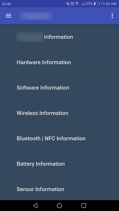
I am a developer trying to make an information page for an application in development. What this uses is an expandable list, that looks as follows when not expanded:

enter image description here

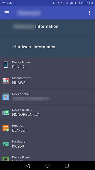
This is the generic android design with a certain color background. When a certain group is expanded, the list looks as follows:

enter image description here

While the second (expanded) look is what my app in general exhibits (flat colored icons over a pastel black background), the un-expanded view looks very dull and not-so professional.

Now, I am in no way a qualified UX designer, just a developer in a low budget team. How can I make this un-expanded (first screenshot) design stand out or rather, what are the mistakes I am doing that makes this unexpanded view look so dull?

Thanks.

1 Answer 1

3

I believe the screenshots you've provided are more than enough to give you some tips on how to improve the looks of your not expanded screen.

Try the following:

  • add some generic icons to each main category. You can either use some flat (2 colour) icons or those colourful pictograms. Use it wisely, otherwise your app may turn into fun-fair advertisement.
  • use varied font size, i.e. "Battery information" can have some small-font explanation like "Battery usage, estimated remaining time" etc.
  • use correct indent, i.e.when you expand "Hardware information", the sub-items should be indented to indicate that they are the subcategories and not the following main categories.
1
  • 1
    Besides agreeing totally, you may try to use the small-font explanation mentioned with @Mike's answer as a line below your list item's to more subtle and appealing visual I suppose. Commented Mar 5, 2018 at 13:22

Your Answer

By clicking “Post Your Answer”, you agree to our terms of service and acknowledge you have read our privacy policy.

Not the answer you're looking for? Browse other questions tagged or ask your own question.