1

I'm working on a betting website, so it is kinda one game dashboard for all games, user only navigates from left side bar to change events. I have standard header where on the right top corner is notification/deposit/account/logout.

So my question is about how to make user account/settings/profile appear. I was thinking about a pop-up way to open the user account, because the user will not leave the game dashboard and can come back to the game easily. I'm not fond of the pop-up boxes, so I'll need your help. Is it right to use pop-ups or it is better to open up the account in separate page?

1
  • Are you using any user interface frameworks or creating your own? If so, it might be worth adding that context to your question. Some UI frameworks have relatively opinionated views of this situation. Commented Oct 11, 2018 at 20:00

3 Answers 3

1

It depends on how many controls there are - The step between a modal dialog (popup) and a separate page is a dropdown or a slideout (tray or drawer)

If you only have a few (2-4) simple (text inputs/radios) items to show, a popup is a reasonable solution.

If you have many (15+?) configuration controls to show, then you should take the user to a separate page.

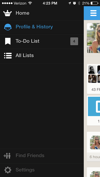
If you have something between, consider a slideout tray or drawer.

Usually the drawer slides over the existing content, though in other implementations it can be seen to push the existing content to side.

In either case it represents a way of offering the user a separate UI, without the feeling of leaving the main UI.

Here's an example from the Foresquare mobile app:

enter image description here

And here are a bunch of links:

https://www.creativebloq.com/ux/ui-design-pattern-tips-slideouts-sidebars-101413343

https://ourcodeworld.com/articles/read/325/top-10-best-slide-sidebar-menu-drawer-javascript-and-jquery-plugins

http://www.material-ui.com/#/components/drawer

3
  • Thanks for reply but I'm talking about website not app. I guess I did not describe it correctly. Sorry for my english Commented Feb 13, 2018 at 15:02
  • 1
    The same principles can apply for a desktop website. Just ensure the slide out is anchored to the same side of the page that has your account icons.In your case - the right hand side.
    – sclarke
    Commented Feb 13, 2018 at 15:04
  • The design concept remains the same whether you're in a mobile app or on the desktop. The example is from a mobile app, but if you click through the links and do some googling, you'll find copious examples large display versions.
    – dennislees
    Commented Feb 13, 2018 at 15:05
0

If you are working on modern website, in any case you need to take in mind that it will definitely be accessed with mobile device. If you mind mobile users and don't provide alternative mobile version of your website, which has no sense now in my opinion, so you should avoid pop-up screens. They are very complex in programming in such way that they are comfortable to use. The other thing is that your game will not be seen on small screen behind pop-up screen. I think that separate page for profile which could contain all accounting data, preferences, etc. is better solution. In his answer, @dennislees suggested some of modern variants of this separate page.

0

It's my personal opinion. Keep "User account/settings/profile" in the top right corner of the create new "profile" section with all features (user account/settings/profile). It seems like all of features are related to user. If you create another section for these features, it will expand more and be more annoying. Try to shorten your application as much as possible.

Your Answer

By clicking “Post Your Answer”, you agree to our terms of service and acknowledge you have read our privacy policy.

Not the answer you're looking for? Browse other questions tagged or ask your own question.