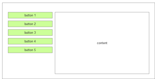
If we have the classical vertical side menu (on the left) for desktop:
then, what is the best practice for displaying it responsively, especially when there's quite a few menu buttons?
To hint you at possible directions of thought, I have researched several options myself:
dismissed methods:
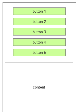
a) all buttons listed vertically:
- with numerous buttons this could take up the entire phone display area and by clicking a button you'd hardly notice that content has changed in the content pane;
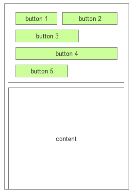
b) all buttons wrapped:
- with too many buttons this might still take up too much of the phone display area; on top of that, if the button text is too long (as it is likely to be in some languages such as German) no wrapping could occur at all;
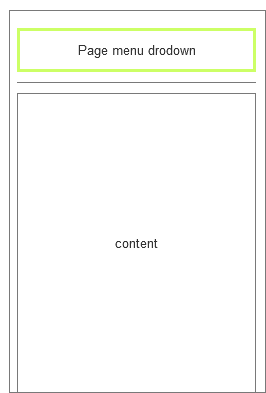
c) drop-down menu displaying all buttons on click
- this would seem as the ultimate solution at first, but it poses a great problem with the wording inside the drop-down - whatever you put, e.g. "Page menu", "Page tabs", "Click to see page contents", etc, there is a risk that users would ignore it and proceed to reading the content below (that is content corresponding to the default button, usually the first one), instead;
Making the menu fixed, would probably make it more visible for the user, but then having this menu fixed + most probably, having the header (above it) fixed, as well, would take up plenty of precious display space.
methods in consideration:
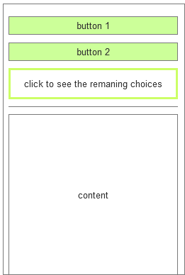
d) variation of "c)" - showing the first two buttons
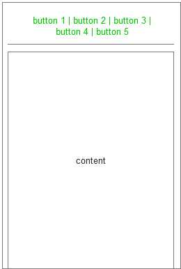
e) variation of "b"
- in this case the buttons are displayed as simple text links; this would take up less space, but would still not be feasible with too many buttons with long names
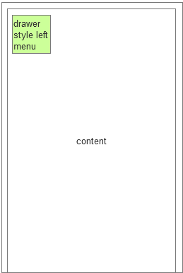
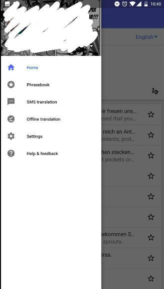
f) drawer style left menu - when clicked it would slide the vertical menu on the right, over the content area
(idea taken from Responsive design for sidemenus)

