0

I'm designing a wedding dress collection page in my website. I have about 10 collections with about 20 dresses in each.

The collection are distinct (each features a different model, photo location and a general "vibe" in the pictures).

Usual buyer persona wants to go through the entire catalog and would prefer to see the new collections first.

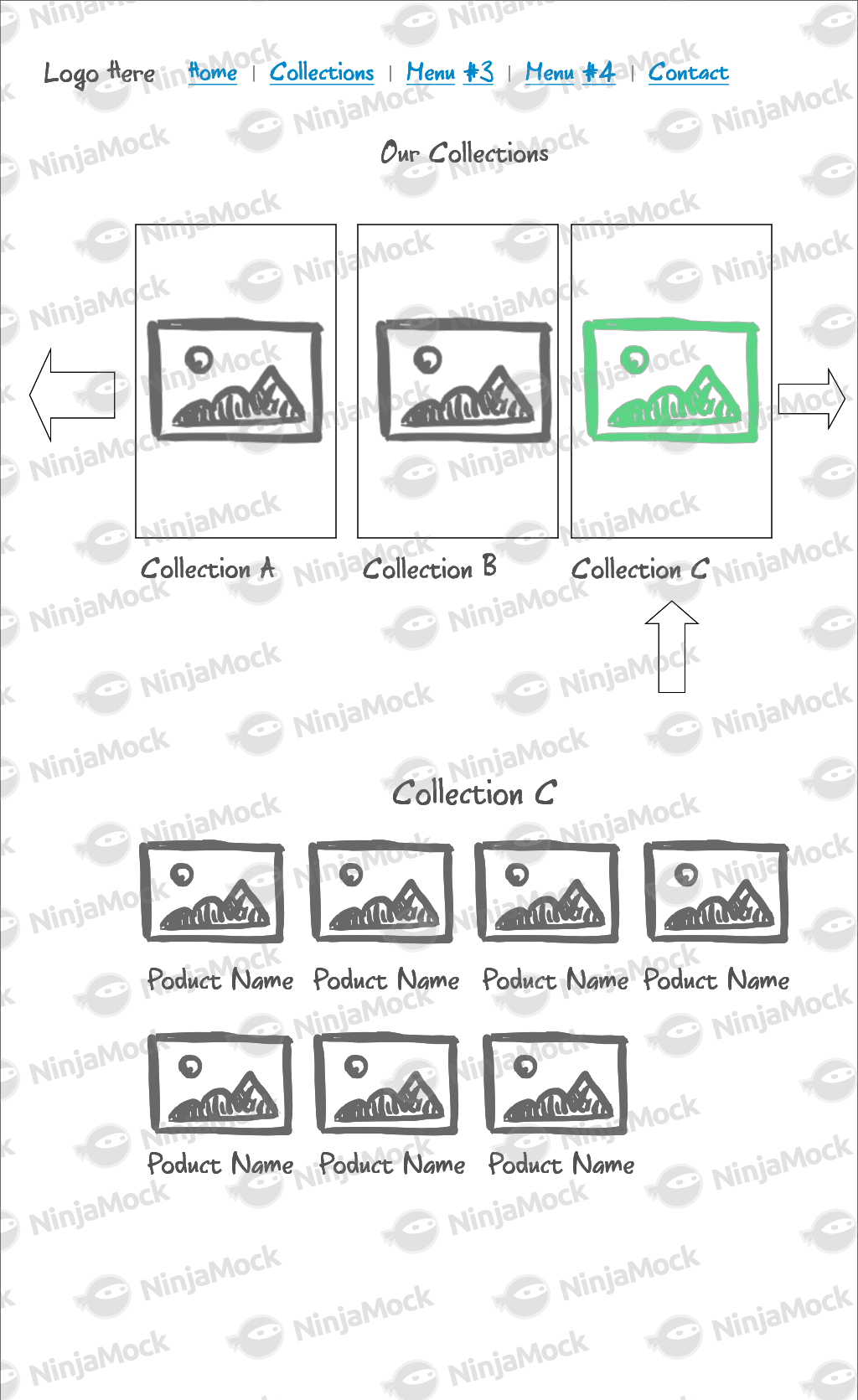
This is the mockup I have (mobile only!)

  1. The catalog is a single-page experience
  2. Collections are displayed in a draggable horizontal carousel with the collection name displayed. Theyr'e sorted newest to oldest.
  3. Clicking the left right arrows scrolls through collections
  4. Clicking a collections makes it the "active" collection. Its color changes and the top-down arrow points to it. The h3 title changes accordingly.
  5. All dresses in the active catalog are displayed. Clicking each dress takes the user to the dress' specific product page, with the usual CTA buttons (It's not E-commerce).

What are the main UX concerns and best practices in this design?

Are there any fashion brands using this method?

Inspiration is taken from Google's product results page ("2017 movies" for example)

enter image description here

1 Answer 1

0

In all honesty, I don't dislike this design, but as with any design, there are tradeoffs and pitfalls. With this one, one difficulty that might hurt your navigation is with the carousel of collections, you have the majority of you collections hidden by default (because you are only showing three at a given time). If the user misses those side arrows, they could be missing out on the vast majority of your inventory.

The second pitfall I could see would be defining that relationship that the 'active' collection is related to the dresses being shown below. I understand you attempted to solve this issue with the vertical arrow pointing to it, but I'm not convinced that is the most elegant solution, and you would need to test it to see if that would even be effective. Perhaps some type of animation where a bunch of cards flies out of the collection and land below on the screen. This might better establish that relationship.

Anyway, I think most people wouldn't have a problem with the way you currently have it implemented, but that's not to say there isn't tradeoff from a more traditional navigation method.

3
  • Thanks, what sort of 'traditional navigation method' would you recommend? (Taking into account the first 3-4 new collections are the most "important" to most users) Commented Jan 17, 2018 at 22:15
  • If the first 3 to 4 collections are the most important, then I don't have any issues with the design at all, as long as you can clearly show the relationship of the carousel to the dresses shown below. By traditional, I think left-hand vertical navigation bar showing the different collections and the rest of the screen showing a gallery of the dresses. Another kind of traditional navigation would be to have one page showing a grid gallery of collections, and once a collection is selected, loading a new page with a grid gallery of dresses belonging to that collection. Commented Jan 18, 2018 at 23:19
  • 1
    Thanks! Our solution was to use filpster.js for the carousel with the active element being oversized and then getting rid of the up-down arrow. Works well in beta usability tests. Commented Jan 22, 2018 at 20:14

Your Answer

By clicking “Post Your Answer”, you agree to our terms of service and acknowledge you have read our privacy policy.

Not the answer you're looking for? Browse other questions tagged or ask your own question.