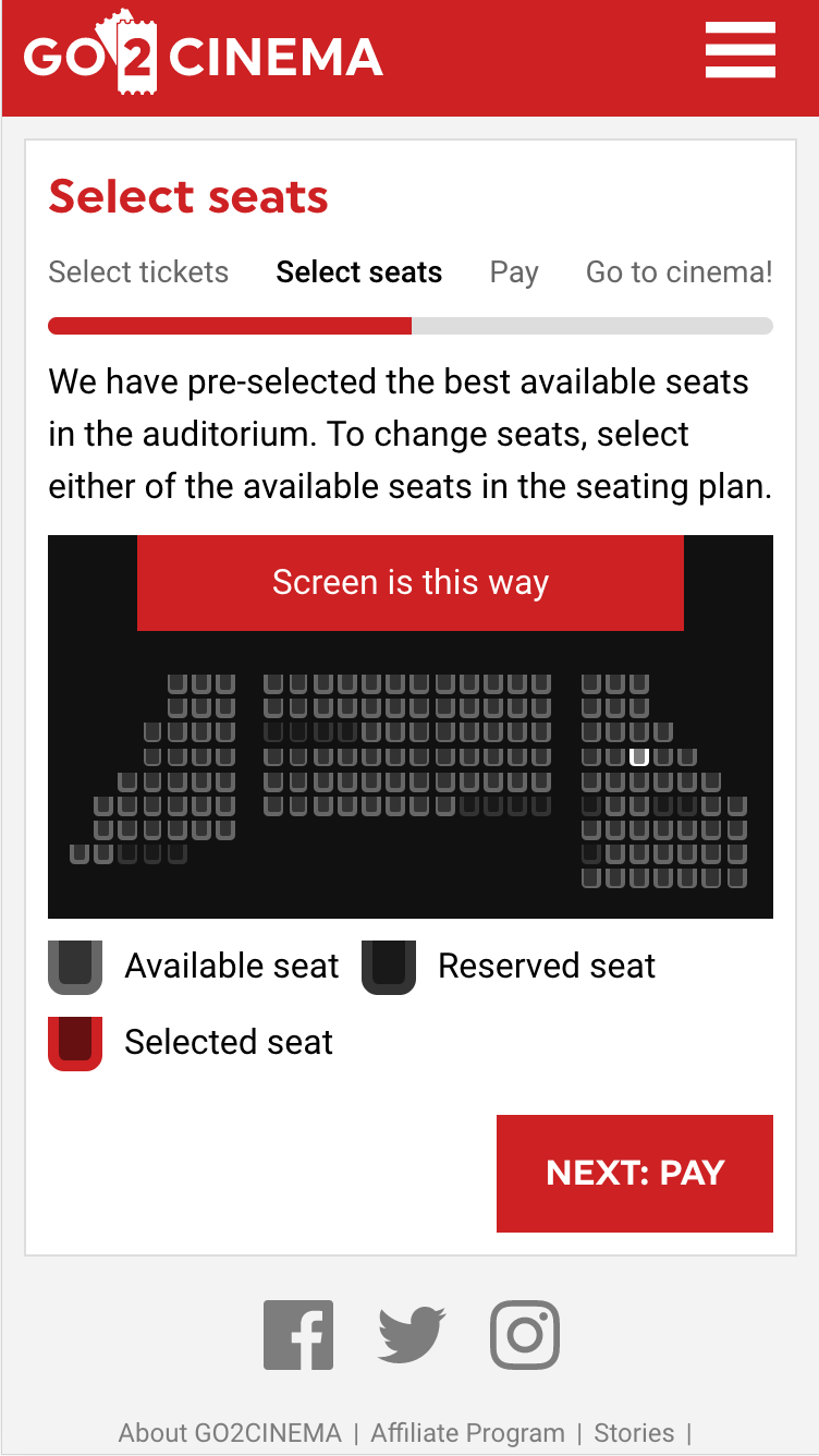
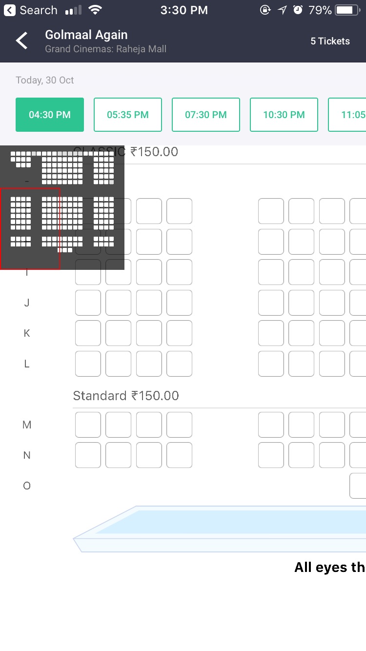
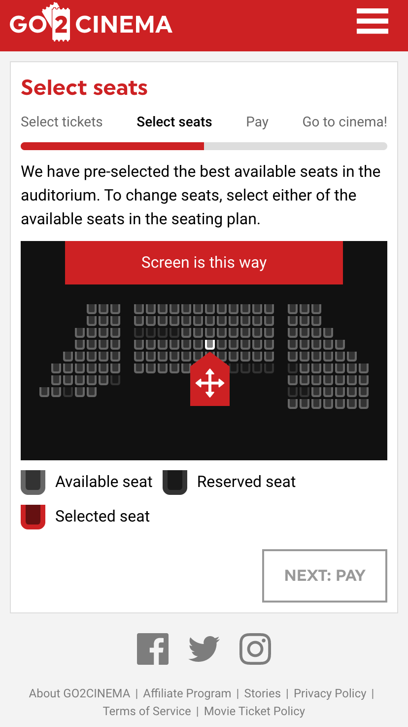
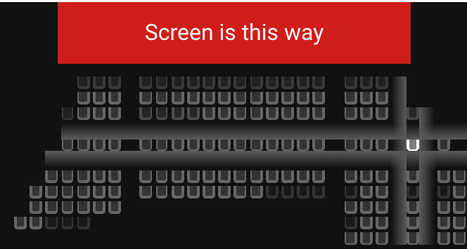
If you ever booked event / cinema tickets online, then you have probably struggled to select the seats. The larger the auditorium, the smaller the seats.
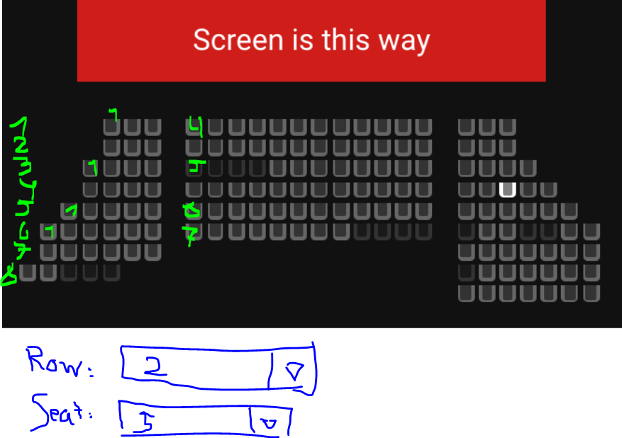
I am creating a cinema ticket booking website. The seat selection on mobile devices is causing a big UX problem. To illustrate the problem, I have attached screenshots of a medium sized auditorium (auditorium can be 2x or even 3x larger). The larger the auditorium, the smaller the seats become.
I am looking for a potential ux solution to make the seat selection simpler.
Things I have considered:
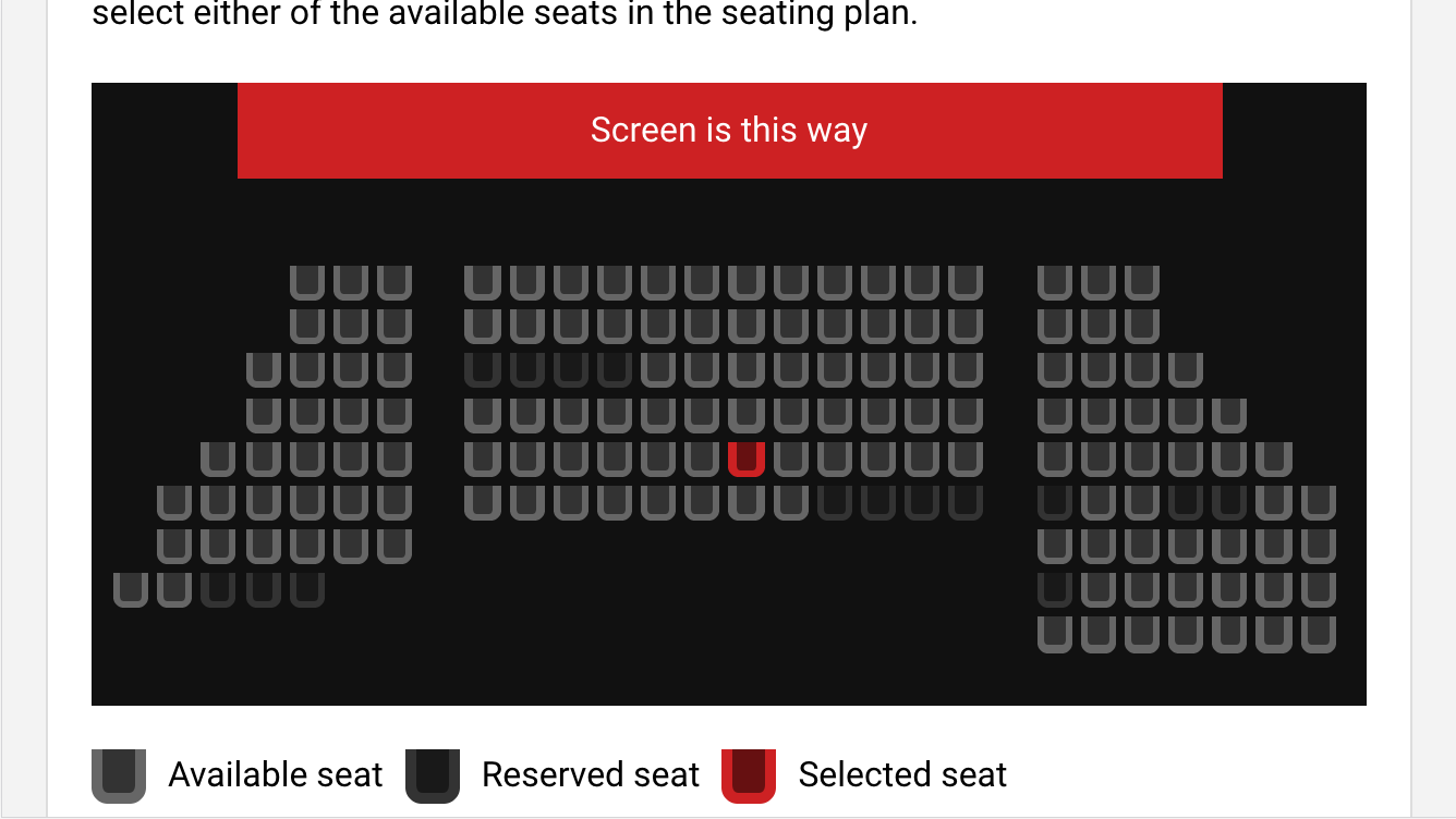
- Add a message that recommends to tilt the device into landscape (second screenshot). This does not solve the problem, but it adds a lot more space that can be used to size-up the seats.
- Dividing the auditorium into multiple areas that user can tap-to zoom in and zoom out.
The problem with the #2 solution is that such division would complicate selection of seats that span across multiple divisions/ division boundaries.

