0

My purpose is to create a report which shows the size of set/s.

For this, I am taking in minimum size & maximum size for each set.

Along with it, I am supposed to capture the order type and the sequence so that it translates to something like ORDER BY SET1 ASC, SET2_TO_3 ASC, SET1_TO_2 DESC, SET3 DESC, SET2 DESC

I have come up with the below prototype - which is undoubtedly "ugly" - especially the ordering pieces.

Though I can live with the text-box/es for setting size range - I am more than sure there must be a better way to implement the ordering functionality.

enter image description here Any pointer would be a great help. Thanks.

7
  • You used the 'usability' tag, but then suggest that the problem is that your UI is "ugly". Ugliness isn't a factor in usability, unless it keeps the UI from meeting its stated goals. What are the goal(s) of this UI, and how does your mockup fail to meet it/them? As far as I see, the goal is to the show the size of set(s) and your mockup seems to do this fine.
    – dennislees
    Commented Oct 3, 2017 at 17:43
  • Tables might seem boring, but the are also perfect for presenting certain types of information. Changing to some other type of element because you're not inspired, would be design for designs sake, not for the sake of functionality. If your problem is with things like typography and the spacing of the elements - if you just want to make things shiny - then you have a design problem, not a usability problem.
    – dennislees
    Commented Oct 3, 2017 at 17:46
  • How many orders will you need to shift in the sequence column, on average? When you say 'ordering functionality' are you referring to the overall UI, or the Sequence function itself?
    – Mike M
    Commented Oct 3, 2017 at 17:56
  • @dennislees I am relatively new to this forum - maybe my usage of 'usability' tag is not appropriate here.As you already mentioned - the mockup meets all the requirement.My concern is to look for option/s to make it 'shiny'.I agree - this is a design problem, not a usability problem.Thanks for your response.
    – Soumya
    Commented Oct 3, 2017 at 18:07
  • @MikeM I am referring to the "Order Type" and "Sequence" function here. I am looking for some UI elements which can be used to make it look more intuitive/friendly - if possible.Thanks for your response.
    – Soumya
    Commented Oct 3, 2017 at 18:09

2 Answers 2

0

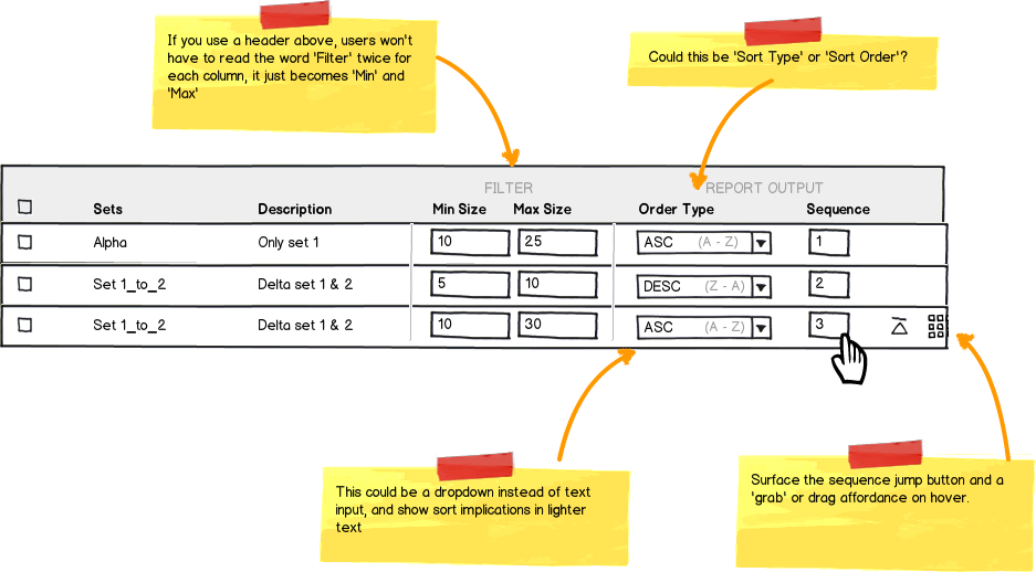
For reordering the Sequence, try allowing direct manipulation in addition to text input.

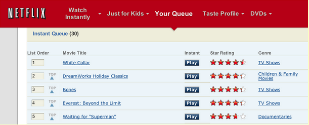
You can take a page from Netflix, in which they have a queue order function.

Netflix users can order their queue as needed, with emphasis here on quickly arranging the most desired movies at the top.

enter image description here

There's a couple of methods you can offer:

  • Numerical input (Just type in the sequence number)
  • Drag and drop rows
  • a 'Top' button to shoot it into the first position

You have a lot of room in your sequence inputs. You can save space by giving them a width that suggests the maximum digits encountered (i.e. if there's maybe 50 max you only need an input for 2 digits).

mockup

download bmml source – Wireframes created with Balsamiq Mockups

You can show the other options on hover, similar to the Grab handles on Gmail, combined w/ netflix 'Top' indicator.

Sorting

For the sorting, (unless I'm misunderstanding), it looks like you have text inputs.

Since there's only two values, you could do a dropdown to save space (and prevent input errors), and hint at the sort order implications in a lighter text to avoid confusion.

3
  • I believe order type is for ASCcending and DESCending sorting. Why do you have a number there?
    – Roman Susi
    Commented Oct 3, 2017 at 18:52
  • Ah! my bad; i was focusing on the sequence ordering interaction. :)
    – Mike M
    Commented Oct 3, 2017 at 19:23
  • @MikeM Thanks a lot for the detailed answer and for your time.All your comments make perfect sense.The comments really made the picture more clear.
    – Soumya
    Commented Oct 4, 2017 at 5:18
0

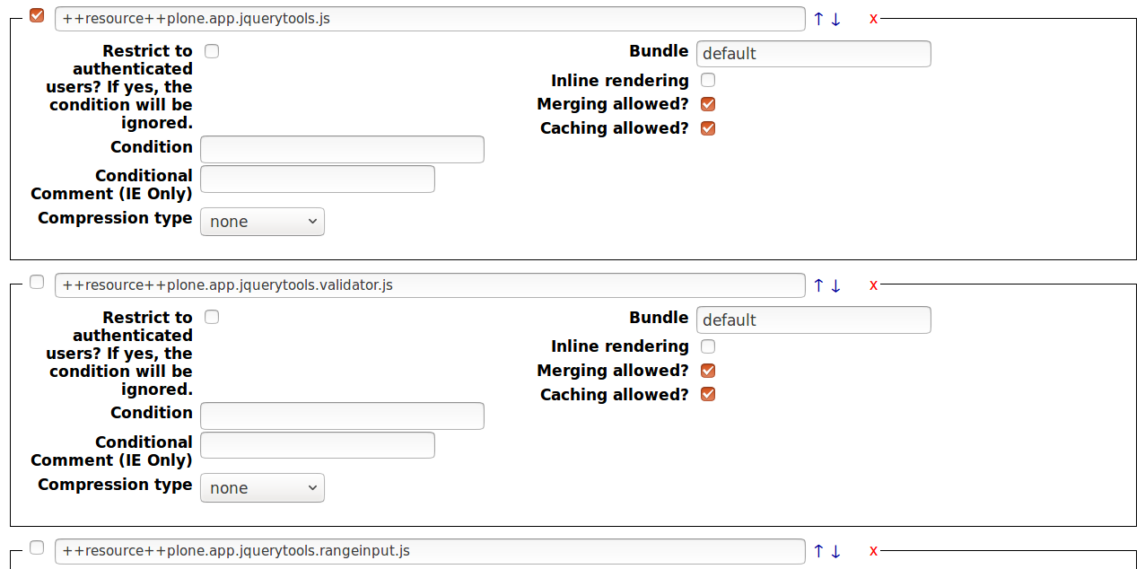
This (a bit bloated) example is from one of the Zope/Plone management views. You will have less options per row, but if drag-n-drop possibilities are limited in the UI toolkit, this approach may be quite usable.

enter image description here

Of course, "to the top" (⤒) and "to the bottom" (⤓) buttons can be added or even "go to Nth position" input.

Instead of ASC/DESC, visual markers can be used as well, eg, like those from Twitter Bootstrap 3:

enter image description here

Just make sure they are not confused with move up/down actions by placing them inside. Can be doubled by asc/desc text if it is appropriate.

For sizes, rangeslider (if available in the UI toolkit), if not - single sliders, if not even that - numeric inputs.

There maybe Select/Unselect all rows, if that is common operation.

This answer assumes limited UI toolkit functionality.

1
  • Thanks a lot for your time and your inputs.The range slider is definitely worth implementing.I will give it a shot.
    – Soumya
    Commented Oct 4, 2017 at 5:21

Your Answer

By clicking “Post Your Answer”, you agree to our terms of service and acknowledge you have read our privacy policy.

Not the answer you're looking for? Browse other questions tagged or ask your own question.