2

I´m currently planning to develop a software that generates a Product catalogue. The software reads data from the database then apply business logic in order to create the catalogue which will be outputted in PDF.

In order to determine the miniworld -The part of the company that will be represented in the database- and deliver a catalogue applicable by the end users, I am communicating with different stakeholders.

summarized, the expectation of some stakeholders maybe expressed as follow:

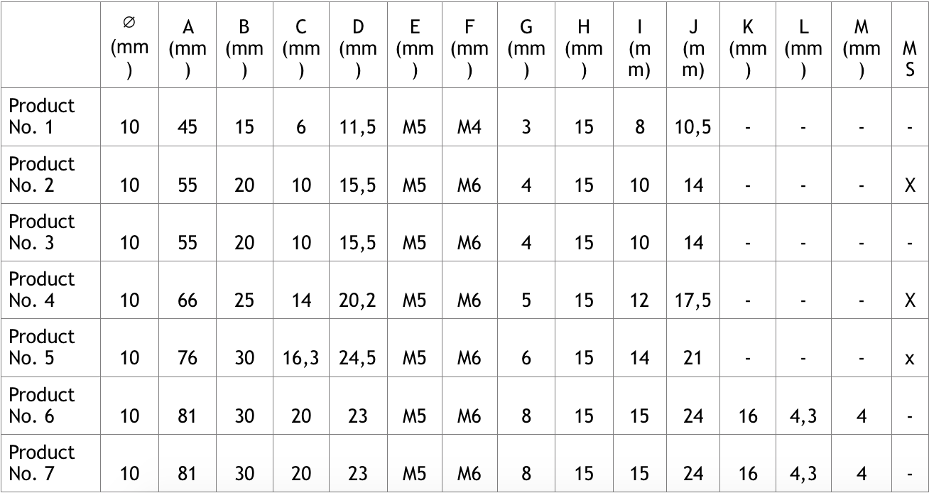
enter image description here

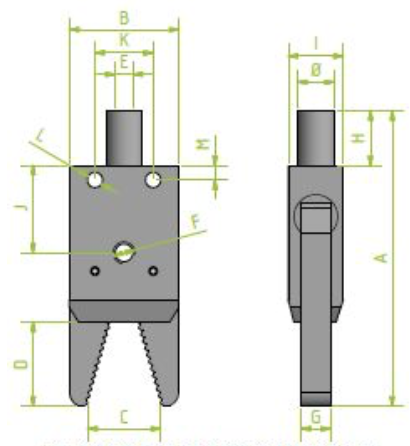
enter image description here

I find it really difficult to find out some patterns and to describe a product clearly and uniquely using this illustration. Because of that I would like to share my observations and get some feedbacks about design smells and improvement ideas.

  1. The characters A, B, C, ... appear as if out of thin air with no explanation. I asked if it is possible to give some self-descriptive property names. As a reply I got that this is common way to mark technical data. I don´t agree with that argument, because if something is very common we can not conclude that it is usable. At the same time I am wondering if the use of self-descriptive property names will make the dimensioned drawing unclear and the table will become more wider.
  2. According to the rule of logical flow the dimensioned drawing should be labeled from top-to-down and from left-to-right.
  3. Redundant usage of (mm) in the table header. As a suggestion I would take it from the table header and introduce a foot note which states that the measurements are in mm.
  4. According to the data in the table: the properties K, L and M do not concern Product No. 1, Product No. 2, ..., Product No. 5. These violates the design principle rule of Grouping. I would create two tables, where the first one containing the tuples of Product No. 1, Product No. 2, ..., Product No. 5 and the other contains the complementary tuples. The same rule can be applied on Product 2, Product 4 and Product 5 based on the property MS, where MS stand for Mit Sensor[in German] translated to English is With Sensor. Would this approach for splitting the table practical?

Could anyone give some suggestions or critiques in order to improve the design. I appreciate any feedback.

1 Answer 1

4
+50

Background: I'm currently working as a one-man front-end developer/UX/UI designer at a small company that manufactures highly accurate machinery. (Also, please forgive my descriptions of the example part--I'll do my best.)

In this case, you're dealing with highly technical data with the goal of communicating to (I assume) highly technical users as clearly and efficiently as possible. Usability, though important, is actually not the primary goal here.

You're constructing a reference document. Accuracy and clarity are your primary goals.

  1. You're right—A, B, C... do appear out of thin air. They may not mean anything to you, but I can tell you that it's a heck of a lot easier to talk about "J" than it is to talk about "the distance from the base of the clamp to the anchor point" or whatever it may be.

  2. I assume you're talking about the lettering here. The way I see it, there is an order to the lettering, just not a visual one. The "more significant" measurements tend to be labelled earlier. For example, A describes the entire height of the part, B is the entire width, C is the clamp range, and D is the clamp length. These are all very significant measurements, arguably more so than M (the distance from the center of the clamp's base mounting holes to the base?). Yes, labeling the measurements starting top-left and moving to bottom-right would make finding "measurement C" quicker, but now "measurement C" no longer represents one of your most significant measurements.

  3. Certainly it would be easy to factor out this common "(mm)" into a footnote as you describe. A couple questions for you: 1) (If these parts are being manufactured) How expensive are the parts you're dealing with? Would it be costly for a worker to mistakenly drill the holes in the wrong place because they didn't know what units they were working in? 2) (If these parts are being used) How dangerous would it be for an operator to misuse these parts because they didn't quite fit into the equipment properly? I think the decision to include "(mm)" in every header favors clarity over reducing visual noise.

  4. I wouldn't break the chart into multiple charts. If you're looking for Product #4, now you have to scan up to 3 tables, as you describe, because they're grouped by some arbitrary qualifications. If they're being grouped by type of part, that's significant (e.g. "Clamps," "Mounts," and "Presses"), but if they're just being grouped by whether or not they have those two clamp base anchor points (which measurements K, L, and M all deal with), then I don't think that's reason enough to divide your data into two tables. The fact that they share a table makes it easy to compare these related parts. It would be more difficult if I needed to compare Product #4's measurement C to Product #6's, but now they're on different tables for some reason...

In conclusion

Yes, you've heard that it's always done this way but you want to do it better. That's a really good thing! But I'd urge you to proceed with caution and not make a bunch of changes without first trying to understand why it might always be done this way. Ask a lot of questions. Find out how these sheets are used. Watch someone use them and find out what they think is helpful. I think there are a lot of good things about the way it's currently done, even if it's not as aesthetically pleasing or may disagree with some design principles.

Your Answer

By clicking “Post Your Answer”, you agree to our terms of service and acknowledge you have read our privacy policy.

Not the answer you're looking for? Browse other questions tagged or ask your own question.