7

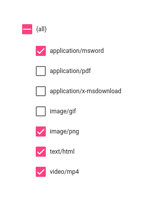
I have a list of checkboxes and would like to add a "select-all" toggle. I already have it working, including setting an indeterminate state when some of the items are selected. What I'd like to know is, when the list is a capital-L List, does Material specify how to place the select-all box?

I currently have it inline with the rest of the list, but I don't like the way it looks:

List styling

I'm thinking of putting it as a secondary action (on the right side) of the section header but that could introduce its own issues. I'm hoping there's a "right" way to do this but I'll settle for suggestions if not.

2
  • 1
    Just curious: what do you mean by 'capital-L List'? I'm not familiar with that term.
    – Mike M
    Commented Aug 29, 2017 at 13:36
  • Sorry, I meant a proper-noun "list" as defined in the Material Spec, as opposed to the generic term "list" or the web-specific meaning of <ul> / <ol>
    – Coderer
    Commented Aug 30, 2017 at 7:01

2 Answers 2

9

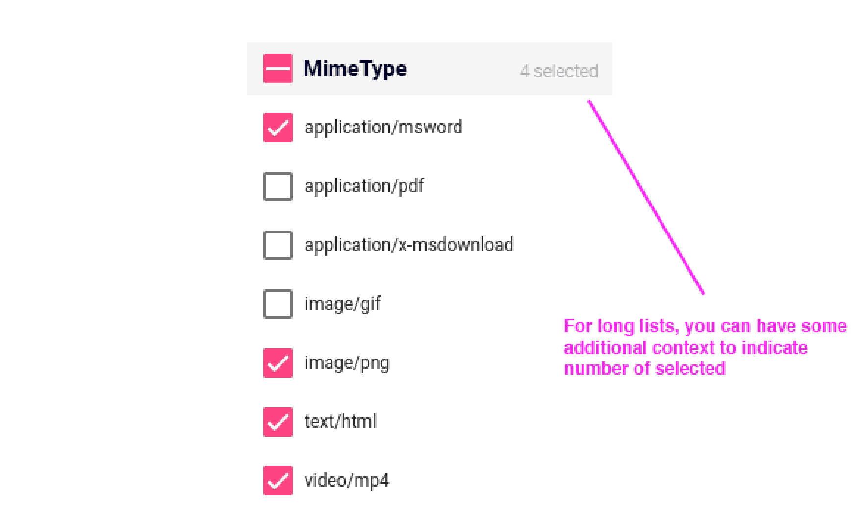
Try combining the section header title and master checkbox above the list.

I'm not sure what the rest of your ui looks like, but oftentimes a selectable list has the 'select all' up along the table header, or section header.

This way you can eliminate the 'all' option (which isn't an item in itself), and see the general state of selection right next to the section title.

Similar to this:

enter image description here

This way it emphasizes the list title, and you have a clear scan line down the list.

Material doesn't indent that often, usually only for sub items. For example if a checkbox or radio button has additional options conditional upon its selection, then an indented list appears under its parent.

In your case 'All' is not a parent item, but a master control and indicator in one.

With the example above you can maintain the alignment.

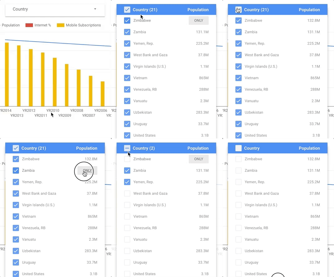
Another example: in a dropdown list control:

This is another example, most likely different than your case, but it provides one additional interaction: the ability to select an 'only'. This is great if you have a voluminous list:

enter image description here

I cited this example in another post:

1
  • This is more or less what I went with, though as in your animated example I think differentiating the header with color is important -- weight alone is not enough to make clear that there is hierarchy.
    – Coderer
    Commented Aug 30, 2017 at 8:24
1

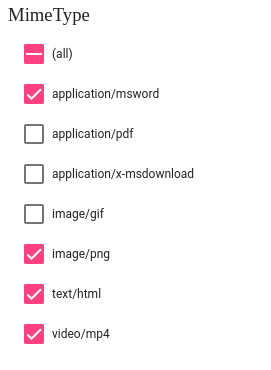
You can try indenting values coming below all. It will give a clear picture and would eliminate the problem of inline. Hope this solves the problem and let me know if you have any doubts.

enter image description here

Your Answer

By clicking “Post Your Answer”, you agree to our terms of service and acknowledge you have read our privacy policy.

Not the answer you're looking for? Browse other questions tagged or ask your own question.