I have doubts after seeing this article: https://conversionxl.com/10-useful-findings-about-how-people-view-websites/
1 Answer
Short answer; yes.
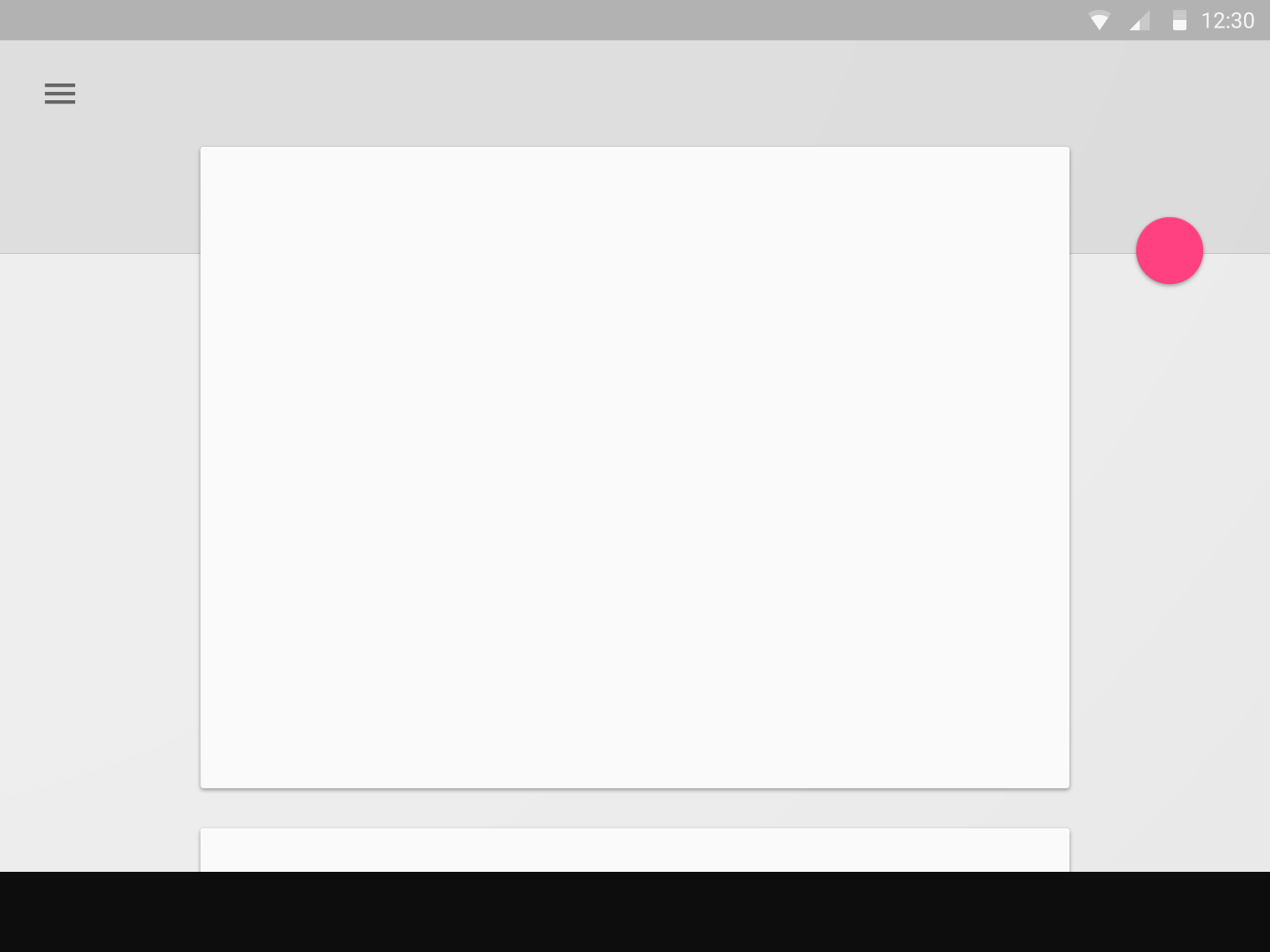
The floating action button is most commonly used in the bottom right of the screen. It is close to our thumbs so it is easy to touch on mobile. However, this is not a rule you have to follow. You can place it anywhere you want.
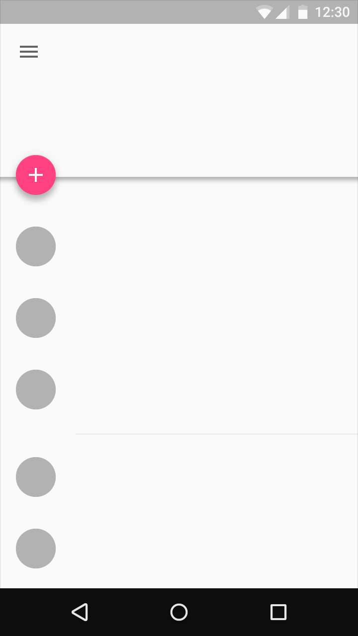
In previous projects I have placed the floating action button in the left corner of in the middle based on user preference (or for left handed users).
The Material Design guidelines even uses examples that show this. See images below.
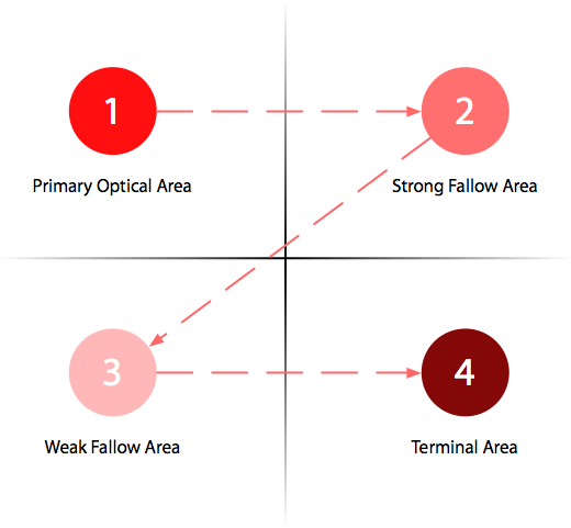
Gutenberg Diagram
The findings in your linked article are correct in stating that the left of the screen gets more attention. The first finding is very useful. It talks about the Gutenberg Diagram. Users expect buttons/actions to be in the bottom right corner, in the terminal area. That's where the floating action button in most cases is.


