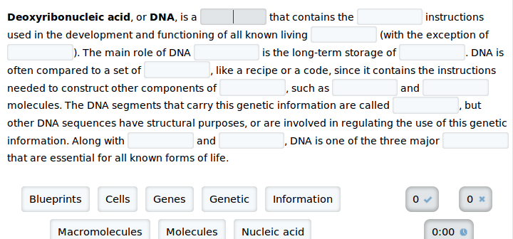
I think a lot of the visual disruption to reading comes from using any kind of line at all (box -OR- underline). Things immediately improve once you remove the -webkit-box-shadow and box-shadow from .input.
Then what I'd suggest is that rather than making the background for the blanks look darker than the enclosing text, reverse the situation so that the blanks are a bit lighter than the background you are using for the main text. This will make them seem more like "holes" and less like "barriers" or "blobs".
Keeping the box styling on the blank currently being focused on as a highlight would still be fine, since it's only on one (and one worth calling out). Once a correct answer is filled in, then perhaps that could be a case for using a subtle box while making the backgrounds match—I imagine that could be made not too disruptive.

