0

I've got the following task. I have to redesign the title part of the pages. Silly but as simple as hard to get the ballance with the stakeholders.

We have Page title and section titles. We need some convention for this page-title: section-title

Some thinks the section title to be gray, to be bold. Some say another.

My approach is the (title-hierarchy):

size:12 - Page title - BR

size:32 - Section title

My reason for this, is that i think the user can see still the page title, but the more important part is the section title.

Some feeds in my side: the title would take a lot of space, could cause a lot of scroll. I think the scrolling is not a big issue in case of we enlarging the title with additional 20-30px, and btw the white space is needed to separate.

I checked a lot of pages, checking best practices, typography. Seems to me there is no convention for this(that is correct as it depends on the environment and the neighboured elements, design, brand), just a later AB test what is working better.

If you have any idea let me know please.

1
  • I think a screenshot or mockup would help make it easier to answer the question.
    – Michael Lai
    Commented Jun 20, 2017 at 23:37

1 Answer 1

1

Instead of trying to convey hierarchy in the title, I would instead use breadcrumbs.

They've become the standard of showing hierarchy. There's a particularly great article from Jakob Nielsen regarding the benefits of breadcrumbs:

  • Breadcrumbs show people their current location relative to higher-level concepts, helping them understand where they are in relation to the rest of the site.
  • Breadcrumbs afford one-click access to higher site levels and thus rescue users who parachute into very specific but inappropriate destinations through search or deep links.
  • Breadcrumbs never cause problems in user testing: people might overlook this small design element, but they never misinterpret breadcrumb trails or have trouble operating them.
  • Breadcrumbs take up very little space on the page.

UX Booth site does breadcrumbs really well, but you'll find examples of breadcrumbs on almost every major website.


If you really need to display it to the right of the title, I worked on a project in the past which used a forward-slash to denote hierarchy. We also had to make the section title less vivid to enforce the hierarchy.

Hierarchical Title

This was used instead of breadcrumbs purely for stylistic reasons, but it seemed to work well from a UX perspective.


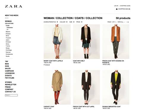
The Zara website used a similar method to what you're after. The hierarchy runs from left-to-right, which is what the user will expect.

Old Zara design with breadcrumb title

But it would've been better if they channeled their inner Information Architect and used breadcrumbs:

Proposed Zara layout with breadcrumbs

Or even just made the section titles less prominent:

Proposed Zara layout with less prominent section titles

1
  • Thanks Joel for your feed. We already use breadcrumbs, (under the title, i think its not the best position), btw we still needed to implement Page and Section title parallel. Your example Zara is great for me, i tried a lot of variations, and also the separator is consistent regarding to the breadcrumbs'. I read previously JN's article too, usefull stuff. Thanks again! Commented Jun 21, 2017 at 11:47

Your Answer

By clicking “Post Your Answer”, you agree to our terms of service and acknowledge you have read our privacy policy.

Not the answer you're looking for? Browse other questions tagged or ask your own question.