4

I'm looking for a better design for the display presented below.

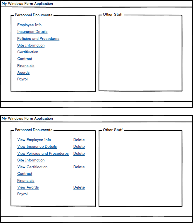
An example of how it works now: The group box is populated with "links". Each link is associated with 1 document. The user clicks on Employee Info which causes a dialog box to appear and the user browses to a document and clicks OK and then the Employee Info link changes to View Employee Info and the Delete link also appears. If the user then clicks View Employee Info, then the document (e.g. a pdf file) would be displayed. If the user clicks Delete, then the original link reverts to Employee Info and the Delete link disappears. The first window below shows how it looks at first and the second after some documents have been loaded.

It's not necessarily awful, but not great either. Any suggestions? This is an old Windows Forms application.

enter image description here

1
  • Maybe you can more clearly state the problem you're trying to solve, rather than just "can you improve this?" I took a guess with my answer, but... Commented Apr 7, 2017 at 14:06

1 Answer 1

2

If I understand correctly, the task is first the user selects (assigns) a document to a list item (Employee Info, Insurance, etc.). Once that’s done, the user can view the document or remove the selection. I think once you express the task devoid of implementation, you can see more clearly what you’re intuiting: the proposed UI has high potential to confuse the user:

  • Links are meant to link. Links navigate to the information indicated in their label. For example, the user will expect the link for Employee Info to show the user’s Employee Info. Instead the user sees a My Documents folder. Huh?

  • Links are almost always stable. Unlike buttons, there is no tradition of toggling their function. The UI has the same link that first selects a document then later views the document. The UI changes the label, but it’s subtle. Because links link, the label “View Employee Info” really means the same thing as the label “Employee Info.” Users may not realize the link's function has changed.

  • Delete is a link but doesn’t navigate. This is less likely to confuse because at least it has simple clear label. However, it’s still better to use command buttons for actions on data, not links. In this case, go with a lightweight button image since you’ll have a bunch of them.

  • Actually, the Delete label is not necessarily so clear. Does selecting the document copy the document into the app, or simply point to it in the users file system? Just as important, what does the user think the app does? How does the user know? If it’s pointing to the document, then the user might think “Delete” will erase the document from the file system, which the user probably doesn’t want to do, so never uses this function. Try “Clear,” rather than “Delete,” for removing a pointer to the document.

  • What if the first thing the user wants to do is remove document selections? Maybe they’re taking over from another user and don’t realize the previous user never selected documents to start with. However, because the Delete control only appears after a document is selected, the new user may think the app doesn’t support removing selections. They may not even try. This is another reason Delete should be a command button. With command buttons, the UI can use dimming to show the feature is supported, but not available in the current context.

  • What if the user wants to change the document selection? I’d guess this is done more often then simply removing a selection. However, because the selection functionality disappears after selection, this requires an awkward first-delete-then-re-select procedure. Why not make re-selection a one-step procedure?

  • How does the user verify which document is selected after it’s selected? The UI apparently does not show the file name. The user can view the file to see if it’s the right one, but often the user will have two similar documents on their file system (e.g., a spreadsheet that differs only in certain numbers), so this can make it tedious to verify the correct file is selected.

To address these issues:

  • Use a link only to link to the document itself. If no document is selected, there is no link.

  • Use lightweight command buttons for changes to data objects or their associations.

  • Consider “Clear” for removing a selection.

  • Use disabling for temporarily unavailable functions.

  • Support selecting and re-selecting documents with a dedicated button.

  • Show the document’s file name. Show the full path on mouse-over.

So a single line in the list looks something like this before selection:

Blank for filename, buttons for browse and clear (disabled)

And like this after selection:

Filename is a link, buttons for browse and clear

Your Answer

By clicking “Post Your Answer”, you agree to our terms of service and acknowledge you have read our privacy policy.

Not the answer you're looking for? Browse other questions tagged or ask your own question.