92

I am working with order page. When the user presses on Cancel Order button, he should choose one of the following:

  1. Cancel order.
  2. (opposite of cancel) order. (this choice means don't do anything with order) by default, this choice on other cases should be "Cancel".

What is the opposite of cancel on this case?

Keep in your mind, cancel is usually what you press to decline an action in a UI situation, and here on my second choice, I am trying to do that.

22
  • 4
    Is this when an order is already placed? So will the user be cancelling an out standing order? Or is this one of the last steps of the order process? Commented Feb 20, 2017 at 13:31
  • 17
    confirm order? or am I missing something?
    – Devin
    Commented Feb 20, 2017 at 17:12
  • 14
    Proceed: to carry on or continue any action or process.
    – MonkeyZeus
    Commented Feb 20, 2017 at 19:05
  • 26
    No one suggested "continue this order"? As a marketing bonus, it's quite engaging. Commented Feb 21, 2017 at 2:17
  • 4
    If I did something (e.g., click a button) to indicate that I wanted to cancel something, and a dialog came up with a "Confirm" option, I would select it to say, "Yes, I confirm that I want to cancel." Something like "Keep processing" ("Keep shopping," if appropriate) seems intuitive. This suggests that we should not be getting to this point via "Cancel"; as Ken Mohnkern says, "cancel" normally means nothing is going to happen.  The first command should be "Discard this Order." Commented Feb 21, 2017 at 2:49

13 Answers 13

205

Cancel might be too vague. I always like to be more descriptive when asking users to perform a quite destructive task. This often reduces any anxiety users might have.

mockup

download bmml source – Wireframes created with Balsamiq Mockups

Edit
As LightnessRacesinOrbit made me realise in the comments, mixing up buttons with links that act like buttons (or in this case it's a button styled as a link) might be confusing. This thought might be unsubstantiated, but nevertheless, I'm adding the following mockup:

mockup

download bmml source

21
  • 5
    This also stops the users from reacting instinctively to the buttons they were used to, like "OK" or "Cancel", and makes them actually read what this unusual (for a dialog window) sequence of letters means.
    – Ruslan
    Commented Feb 20, 2017 at 16:41
  • 5
    @Ruslan That's key. I can't count how many times I've "auto-clicked" a button because I assumed the meaning of an overly-simple label... only to be wrong. Commented Feb 20, 2017 at 17:18
  • 23
    Good answer. I'd like to add something... Because "cancel" is so often used to indicate that a state is being left unchanged, I'd suggest not using that word at all. So the button could be "Delete Order," then the confirmation can be "Are you sure you want to delete this order? [Yes, delete the order] [No, keep the order]." Commented Feb 20, 2017 at 19:00
  • 6
    That's true, @PaulvandenDool. But I think it's better in general to use words that are less ambiguous. Commented Feb 20, 2017 at 19:45
  • 6
    Mixing buttons and links this way is really terrible, from a semantic standpoint. But from a usability standpoint it can be quite helpful. I'm torn! Argh! Commented Feb 22, 2017 at 12:07
48

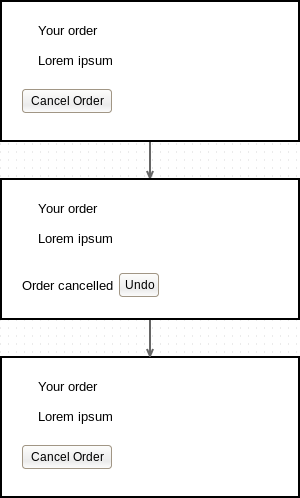
Have you considered giving the user an undo button instead? It reduces the cognitive overhead because no choice actually has to be made in the normal case and reduces the input from always having to do two actions (click cancel and then confirm/other) to only a single action when the user actually wants to cancel:

example undo flow

Wireframes made in Pencil.

14
  • 6
    The undo option is really good. Currently it is described in material.io (bit.ly/2m1vgly) and I think it is extremely user friendly. Commented Feb 20, 2017 at 20:14
  • 13
    This is not the same as the 2 button scenario, if the user don't know that it's possible to undo the cancel operation afterwards (since it's invisible before the action). It can, for example, lead to users afraid of pressing the button. In some cases it works, but it should really be tested. Commented Feb 21, 2017 at 7:49
  • 4
    Google and Amazon both use this pattern extensively. Of course users who don't actually want to cancel the order should be afraid of pressing the button. Users who click it by accident still have a way of saving themselves from themselves though, which they wouldn't do if instead of an undo button they get a confusing dialogue, and then click the wrong thing.
    – l0b0
    Commented Feb 21, 2017 at 8:26
  • 7
    @HenrikEkblom, if the user doesn't know that they will be required to confirm the 'cancellation', doesn't your comment also apply to the other answer? Personally, one advantage of the 'undo' option is that it is not necessarily a one-time choice - i.e. the user can possibly go back later and undo the action in some way (although this is OT for this question). FWIW though, I think that both the top two answers have their place and I find that this SE often leaves me thinking more deeply about the range of UX choices available, even for such a seemingly simple question.
    – zelanix
    Commented Feb 21, 2017 at 9:48
  • 2
    Most users that click a first "delete" button will confirm. Instead of annoying them with an extra action because, "of course I want to cancel the order, that's why I clicked the cancel button in the first place!". For those rare (?) times that it was indeed a miss-click, the undo option will make them all warm and cozy towards your fantastic app.
    – Laoujin
    Commented Feb 21, 2017 at 21:31
11

The first thing that came to mind given your example was:

  1. Cancel order
  2. Proceed with order

One goes back, the other one forward. Maybe too forward-ey though?

9

"Cancel" in computers has very well defined meaning of "don't do the thing". That's the root of the problem here, as here the thing we're doing is "cancelation(sic) of an order".

I believe the best way would be to avoid using the word "cancel" to describe an action, rephrase it to something like "revoke order" or "dismiss order". It's not natural, but at least not as confusing as "yes, cancel" - "no, proceed".

4
  • 1
    Thing is, in the world of placing orders and buying things, "cancel" also has a very well-defined meaning (arguably more so) that you can't just swap out willy-nilly. Commented Feb 22, 2017 at 12:08
  • 1
    @LightnessRacesinOrbit the fact that the word "cancel" has two well-defined meanings, in different context, and that in this situation they are in direct opposition, is exactly why the term should be replaced with something else. Perhaps "Discard order"? Commented Feb 22, 2017 at 21:08
  • 1
    Also consider people with only basic knowledge of English. Using computers might have taught them that cancel means "don't do it", but they might not know the other meaning of this word. I have learned the first meaning way before the second one.
    – user31389
    Commented Feb 24, 2017 at 14:38
  • @LightnessRacesinOrbit But author is already forced to swap out one of those cancels. I'm merely pointing out that swapping the other may be possible. It's up to him to decide.
    – Agent_L
    Commented Feb 24, 2017 at 15:40
5

I know another answer with Yes / No buttons has already been given, and accepted, but I just want to add this.

If a button says something and then a confirmation dialog pops up saying "are you sure you want to ..." and the same word, there is often a knee-jerk reaction to hit "Yes" without giving it much thought.

So the user hits a button called "Cancel" and the dialog says "Are you sure you want to cancel?" then the natural reaction is going for Yes. That's the button I clicked, so that's what I want to do!

A better approach would be to briefly describe what would happen without using the word "cancel" again. Or the words "are you sure".

This will remove your standing order. Proceed?

                      Yes      No 

4
  • 1
    Personally I find this confusing. Why not just directly label the buttons?
    – Midas
    Commented Feb 21, 2017 at 14:39
  • 1
    What with? "Cancel" and "Cancel not"?
    – Mr Lister
    Commented Feb 21, 2017 at 15:22
  • 4
    @MrLister Yoda would understand "Cancel Not"
    – Neoheurist
    Commented Feb 21, 2017 at 23:28
  • 5
    "Yes" and "No" are almost never the right buttons to use in any alert dialog, especially one with potentially destructive consequences like this one--they rely on the user carefully reading and interpreting the question, which people are generally bad at doing. Pretty much every major user interface style guide advises against it, and recommends labelling buttons with the consequences of each action.
    – calum_b
    Commented Feb 23, 2017 at 17:54
4

For me, the opposite of "cancel" is "continue", at least in your scenario. After someone presses "cancel order", the simplest confirmation would be:

Do you really want to cancel this order?

  • No, please take me back to the ordering screen so I can continue with this order.
  • Yes, I want to cancel this order.

I always provide the "Oops" choice first, when it's a negative action.

It slows people down and makes them reread the prompt.

1

My opinion is that the "cancel" button should be visible for the user, but in the case, it is the only button on the page, the user could be influenced and will be not in your interest that he change his decision to make that order.

I suggest you add a disabled button with "Confirmed" because he confirmed the order when he finished it or a button with "Edit" if he has this option.

1

"I change my mind" "-go back to order"

I've taken this approach and it has proven intuitive in the tests I've conducted

1
  • Back (back to previous page, back to listing, back to search, ...)
  • Exit
  • Quit
  • Leave
  • Close (not a good choice. Might be obvious to a developer when the order is being displayed in a windows, but ambiguous, since orders can be closed as well...)
  • Keep Order (this one has been mentioned above)
  • Discard Changes

In general, it makes sense to add a noun to the verb. "Close Window", "Cancel Order", "Cancel Edit", "Cancel Cancellation", ...

You might also consider to use graphics to enhance the text. For example, a "happy smile face" might provide a hint which button to press to not break things. Of course, some users will consider anything graphical as frivolous and maybe will even flag any graphics they encounter as a critical bug. Seriously.

1

I would use a different terminology rather than Cancel with a greater meaning and understanding what would happen.

I think the button should say something like the following:

enter image description here

  1. withdraw order
  2. draw-back order
  3. pull-back order
  4. discard order

then, use the confirmation as offered by @PaulvandenDool

1
  • The problem with this is that it needs to be easily understandable. I would not know what 1-3 means. Commented Sep 26, 2017 at 13:49
1

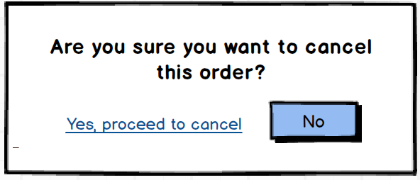
Objective of this confirmation box should be to reduce human error due to accidental, impulse or out of habit clicks. Therefore:

  1. "Yes, proceed to cancel" should be in a text-link format (underlined and blue color to be optimal). This lets users to make a deliberate choice to click it.
  2. "No" should be in a button form and should be in a 'selected' state by default.

enter image description here

0

What's wrong with a standard confirmation dialog...

 "Are you sure?"
 [Cancel] [Ok]

Ok confirms the operation and cancels the order. Cancel cancels the operation, ie. the order is not cancelled. "Cancel" always aborts a confirmation dialog / operation.

User hits Cancel Order on the parent page and Ok on the confirmation dialog - seems pretty intuitive and they don't need to read anything.

3
  • 5
    Neither “Cancel” nor “OK” are a valid answer to the question “Are you sure?”. You cannot honestly be suggesting this.
    – mirabilos
    Commented Feb 24, 2017 at 20:27
  • 1
    Argh! So I press [Cancel] if I don't want to cancel it? And something different if I do want to cancel it? This dialog doesn't need to ask "Are you sure?" - I'll never be sure which button's the right one to press. Commented Feb 26, 2017 at 11:05
  • "Familiar does not mean intuitive." I can't find the article again, but that was one of the first things I read when I discovered UX. That something is common does not mean it is intuitive. Try to explain otherwise to someone who has never seen that "standard confirmation dialog" before.
    – musicin3d
    Commented Feb 27, 2017 at 17:53
-3

Can also be something like this:

Can you please tell us if you want to cancel your order?

Yes, that's precisely what I am willing at doing.

No, I don't really intend to do such a thing.

3
  • 8
    But users don't read. Commented Feb 21, 2017 at 2:37
  • 1
    So many down-votes, yet the most up-voted and accepted answer is this, just worded differently.
    – Cypher
    Commented Feb 25, 2017 at 0:32
  • 1
    Sort of makes sense since the question is largely about wording....
    – ajd
    Commented Feb 25, 2017 at 7:08

Not the answer you're looking for? Browse other questions tagged or ask your own question.