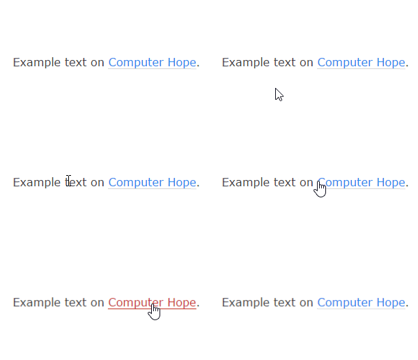
It's worth considering the historical order in which these things came into being.
Buttons existed from very early in the days of GUI computing. They had a shadowing effect to give a skeuomorphic impression of their being akin to physical buttons, which served to indicate they could be clicked much as one would push such a physical button. Indeed since you could be clicking a physical button on the mouse to do so (assuming you weren't tabbing on the keyboard to navigate), the skeuomorphism was backed up by that physical action.
When the cursor was over them they got the default cursor that indicated that while it may be possible to click or double-click whatever was under the cursor, they couldn't be typed in, and nor were they the dragging edge of a resizable object. Mostly the fact that they looked a bit like physical buttons sufficed to indicate that they were clickable.
When hypertext (of which the web isn't the first example, but was the killer app that brought it to a wide audience) emerged the clickable bits of text were indicated through underlining and (when colour was available) different colours to the non-linked text. It was still relatively weak as a physical signal so the hand-shaped cursor was invented as a further indication.
It was some time before <input> gave buttons when the type was submit or reset. Like the other types of <input> they were implemented through the mechanisms the OSs had for standard widgets and would have standard buttons. As the OSs put arrow cursors on such widgets, they had arrow cursors. That was fine as within the relatively limited range of features one could have in a web page at the time went, they were obviously buttons and obviously clickable. It would also be a bit weird to have anything other than normal OS behaviour at the time, since it would mean that web-browsers were acting strangely compared to other programs. If even many richly formatted applications (like games and some high-end office software which customised UI features beyond the OSs' standard) used arrows here, why wouldn't a relatively boring thing like a web page, which is just some black on grey text with some blue bits and maybe a few images floating to one side or the other?
When CSS made the presentation opportunities for web pages much richer (though they already had colour and font choices by now, albeit in horrid to code ways) buttons were still being rendered by calling into the OSs windowing system calls, so not affected by CSS. When CSS later made cursors one of the things that could be changed for an element, buttons weren't affected as they were outside of the scope of what CSS could change.
Browsers started drawing their own buttons so that CSS could change the appearance and also so they wouldn't "shine through" elements positioned "above" them in layered effects, but by now there was over a decade of the hand cursor being the normal cursor for a link and an arrow cursor being the normal cursor for a button. Even if one would argue now that buttons in browsers are no longer the same thing as buttons in other applications (which is a questionable argument still), consistency argues against such a change, particularly as the default; okay it would be technically easy to change it now, but it's technically easy for the page designer to change it now too, so why change the appearance of the pages of the people who haven't decided they want to change it?

 - Used for most objects.
 - Used for text links.