6

I am in the process of reviewing this UI.

enter image description here

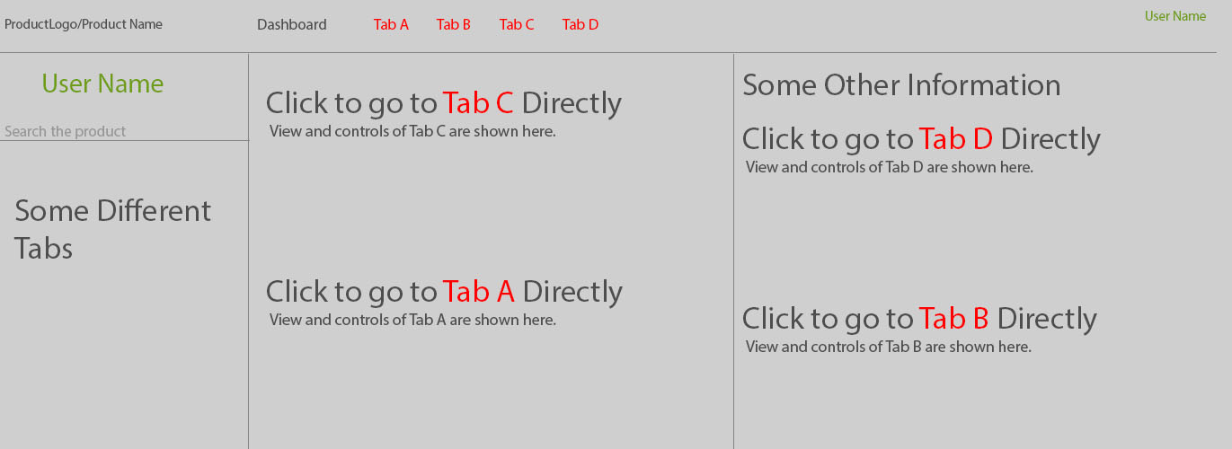
All the tabs on top navigation bar can also be opened directly by clicking the links available in the main area of the Dashboard view. In the UI, tabs that can be accessed from inside the Dashboard are placed at the same level with dashboard on top navigation bar.

I have multiple tabs in my UI.

  1. Dashboard
  2. Tab A
  3. Tab B
  4. Tab C
  5. Tab D

Since the Dashboard gives an overall view of the UI, it contains links to all the tabs A, B, C, D i.e. the Dashboard is a view of all the tabs in the UI. Clicking on any tab link from Dashboard view takes you to that tab and automatically selects that tab in the top navigation bar.

Should all the tabs in the top of the UI be placed at the same level as the Dashboard tab? My understanding is that these tabs come under Dashboard; Dashboard is the parent which contains all the other tabs. What would be the best possible navigation for Dashboard and other sub-tabs?

What other improvements do you think are required in this UI? Anything related to placement, positioning, UI principles anything which can make the user experience better is welcomed.

Thanks in advance.

2
  • 2
    Does the information contained under each of the tabs have the same weight of importance for each user? Commented Feb 16, 2017 at 10:17
  • yes, apparently information under each tab is of same importance for each user.
    – Ayse
    Commented Feb 16, 2017 at 10:54

3 Answers 3

2

I think the word that is creating confusion here is "tab". Let's call it a Menu Item.

Now, let's talk about the Dashboard. The purpose of this page is to give the users an overview of the most important/relevant links or items on the website. This means that the Dashboard isn't encapsulating the other menu items (tabs), rather it is holding the summary. Hence, it should be on the same hierarchical level as the other menu items.

Tab A, Tab B. Tab C, etc. are menu items as well that help the user navigate through the website and so, aren't sub-categories. So your UI is fine.

PS: I personally prefer having the menu items on the left rather than on top when a Dashboard is present. This allows me to implement User Profile, Alerts and Search bar on the top header.

1

For me the Dashboard doesn't sound like a tab. As for my understanding it should consider as a main page. Then the other links are going to be tabs, as you mentioned, those pages may design under Dashboard. Please have a look at this Dashboard designs.

Hope this will help you to get some idea.

1

As per my understanding, a dashboard is the landing page after the user has selected an item from the search result for example, and all the tiles comprising the dashboard are snapshot/overview of individual elements. So how I visualize the pattern in the navigation is position the dashboard on the top and others below it starting from top left being the 1st (below the dashboard) and bottom right the last. And yes I would also prefer a left size navigation rather than the top navigation. That is also because left navigation has better space for more no of tiles so space constraint can be overcome.

Your Answer

By clicking “Post Your Answer”, you agree to our terms of service and acknowledge you have read our privacy policy.

Not the answer you're looking for? Browse other questions tagged or ask your own question.