2

I'm trying to design an internal tool for software testing purposes. We have a system that consists of a number of servers. To verify that the system as a whole is stable we monitor different parameters of the system, such as memory, CPU, offline, backups etc.

Today we are doing such checks manually, meaning logging in to this system, checking different parts of it, to see if it is OK or not. This takes a lot of time, so the thoughts of this tool is to quickly see that all parts have been checked and for us to know where the problems are, so we can focus on them, rather on checking things that already are OK.

I've started with this wireframe matrix: enter image description here
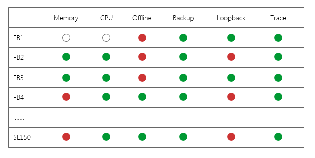
Green means everything is good and we don't need to dig into that area this time. Red on the other hand means a problem of some kind. For instance, the memory column will get a red dot if the system memory is increasing for many days (memory leak), but also if the memory is above a threshold it will be indicated as red.

To my question: How can I make it easy for the user to see why a certain server and area is marked red? Should I use tool tips when hoovering, or clicking the indication to show a new page with more information? Are there other solutions that I'm not thinking about?

3
  • Are there common reasons why a system would fail?
    – Janet
    Commented Jan 26, 2017 at 17:49
  • @Janet: I'm not sure what you are aiming for? In our team, we are building and running the system during software development, of which other teams have created there parts. You could say that we are doing the integration part of features. Our system needs to run for a very long time without failures in some of the areas visible in the matrix. By logging in to the system with a thick client that's part of the system we can browse it and find it areas are not stable. Instead of doing that, we want to pull the data from the sytem, hence the matrix.
    – Michael
    Commented Jan 26, 2017 at 21:31
  • If there are common reasons why the system fails, you could display icons or abbreviations for those failures instead of just a red dot. I'll create an answer showing what I mean.
    – Janet
    Commented Jan 26, 2017 at 22:29

5 Answers 5

1

Actually, it depends on how long the explanation/description for each problem.

For a short explanation (one or two rows of texts), simply show tooltip containing all explanation when hovering on the area.

However, if it has a lot of explanation you will still need a tooltip to contain a brief explanation alongside a button to direct user to the explanation page. Some experienced users might understand the problem without actually reading a whole explanation from the page.

For an easy example, you can make it like this

enter image description here

2
  • Interesting! Maybe I should go for a combination then? Showing a small info text in the tool tip and then when clicking the indication (or read more in tool tip) and go to a new page where the full data of the indication is displayed and the reasoning of why it's marked red in the higher level matrix.
    – Michael
    Commented Jan 26, 2017 at 7:44
  • @Michael Yes, that's exactly what I meant :)
    – Dolorosa
    Commented Jan 26, 2017 at 7:44
1

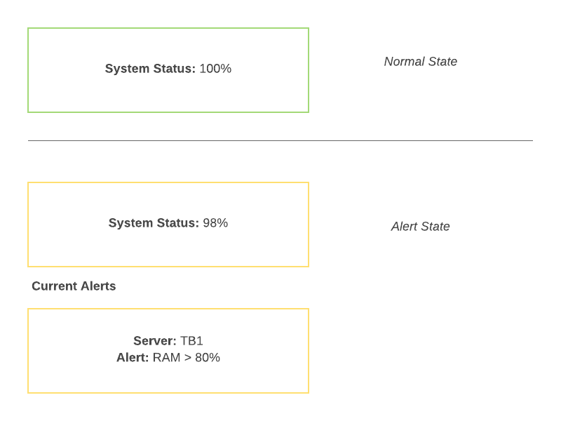
I know that seeing a bank of greens is a cognitive assurance that everything is OK, however it can lead to an overload of information where the user scans the information but doesn't really see the difference between the reds and the greens.

My suggestion would be to change it to a top level indicator where the user can drill down into the information, for example at the top you could have a 100% service level.

If that service level drops on any point on any server the percent could reflect the lowered state and you could produce cards for the failed items. That way the user is presented with pertinent information.

(apologies for quality of example, no design tools at the moment)

Example status page

1
  • Interesting! We are thinking of different levels, where the top level would show a green or a red state, similar to your 100% green normal state thing. If that indicates problems, user would drill down. That concept would go through all levels, where the matrix would be the second one. I like the idea of separating the alerts from the "normal" state, when errors occurs.
    – Michael
    Commented Jan 26, 2017 at 11:51
1

Check this question for the difference between Tooltip and Popover.

A tooltip clarifies. It either gives information about what happens or implies interacting with the element (clicking for example), or it gives a short description of what is the element.

A popover gives content. Content from the element that could be interacted with. It doesn't need to appear/disappear when the user hovers over the element.


If the information is "not too much" and the user would prefer staying in the table, showing the content in a popover could be a good idea. Two options:

  1. You could use a tooltip that indicates the element it is referring to (as it can become bit complex to follow the row and column), and an explanation of what happens on click.

    • Tooltip on hover: "Problem in FB4 Memory. Click to see more details."

    • Popover on click: Contains content and can contain links or buttons. Dismissed on click.

  2. Show a Popover directly on hover. In this case the Popover disappears on mouse-out.

    • Popover on hover: Contains relevant content but there shouldn't be anything the user can interact with, as it "disappears" when the cursor leaves the element (not the popover).
5
  • Thanks for explaining the terminology. I think a popover would make more sense in my case, since the user would prefer to see the whole picture (the matrix) and look at different errors (some might relate, like backup fails due to offline). Sometimes that short popover information is enough, but sometimes user needs more information, and can preferrably dig down to next level of detailed information.
    – Michael
    Commented Jan 26, 2017 at 12:01
  • @Michael if the popover will have a link, I suggest to show and dismiss the popover on click. This popover on click might have a preceding Tooltip on hover like the example I commented in the answer.
    – Alvaro
    Commented Jan 26, 2017 at 12:04
  • Ah, so like a tool tip on mouse over with minimum information and explanation of what happens on click. Then on click, display a popover with more data, still short enough but with a link to something like "More details" which would take user to another page.
    – Michael
    Commented Jan 26, 2017 at 12:07
  • @Michael I edited the answer with the two cases more detailed. I hope it helps :)
    – Alvaro
    Commented Jan 26, 2017 at 12:24
  • Thanks, that is very clear! I like it. Will try to do some wireframes on it, showing my colleagues.
    – Michael
    Commented Jan 26, 2017 at 12:28
1

Two observations:

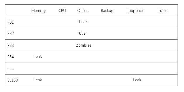
  1. Why do you need to show green (bad color choice for colorblind) if the server is OK? Can't you deduce it is OK if there are no problems? In other words, servers that are OK do not require action, so if the purpose of this view is to identify whether action is required, an OK signal is just noise. Problems will stand out more if white space is used more effectively.
  2. Why hide the reason? Seems like that is the most important information the user can derive from this view. If you only note problems, you can state the problem simply with a brief status or a code if users are familiar with the codes. Then there's no need to hover or click into details.

enter image description here

3
  • 1
    I really like your 2n proposal, but I don't agree with the first proposal. A blank field looks to me like there might be information which either is there but not showing or hasn't arrived yet.
    – Alvaro
    Commented Jan 26, 2017 at 20:14
  • @Eric Stoltz: I also like the second point! I must however disagree on the first one. The reasoning behind showing the greens are that we must know that those areas have been checked. It could be that for some reason data cannot be fetched for a column. Then we must know which have been checked and which have not. I agree that it becomes cluttered, and suggestions on how to reduce that clutter is welcome!
    – Michael
    Commented Jan 26, 2017 at 21:34
  • What if a question mark or similar were put where data has not been returned? Or retain the empty circles of your example, if that's what they indicate! Commented Jan 26, 2017 at 21:35
0

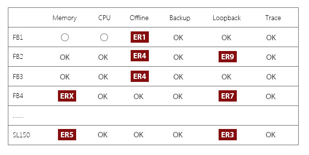
If there's common errors, you could display what the error is instead of making the user dig deeper. The quick sketch I created shows how you draw attention to the errors while still showing the status of the others.

Error matrix

Your Answer

By clicking “Post Your Answer”, you agree to our terms of service and acknowledge you have read our privacy policy.

Not the answer you're looking for? Browse other questions tagged or ask your own question.