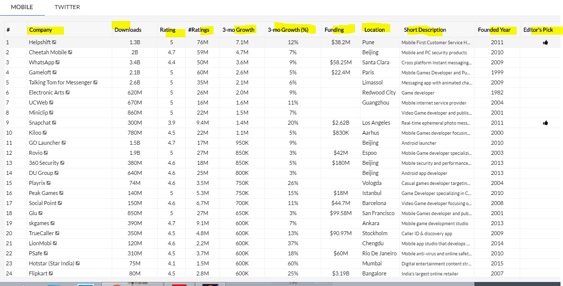
Is it good practice to show all content that is in desktop version to mobile browser. Can mobile browser handle this kind of data,With low bandwidth. How far is it legible to read with that huge content on small screen Here i have attached screen on table from desktop version and mobile view(responsive design). Will it be good if some fields are limited in mobile version. and what are Cons of responsive design for content heavy based websites with large data and table structures.
2 Answers
Well you can detect that you're on mobile and then :
- load less row if you're using server-side pagination
- filter some fields at the server-side and only display the most relevant column
However if your table is loaded from a static json or something like this, there isn't much you can do for the mobile application. Either it pass, or you mask the grid and don't load the datas for mobiles.
I would think that the most important question to answer is: Do people access the data tables from mobile - if so, what is their usecase? If you then think you would still go this direction you might want to look into responsive table solutions like the one from bootstrap: http://getbootstrap.com/css/#tables


