1

I am a frond-end web-dev, who gets tons of designs where texts are vertically centered according to something. Every time when I go and start to vertical align stuff I am going in an eternal struggle to make it happen correctly and always something gets wrong in some situation(window resize, longer strings, smaller strings).

Example: https://i.sstatic.net/LKSxi.jpg

For me this does not give us any value and the text should follow alignment as the other items in the footer?

I think vertically aligning UI is a bad practice but I cannot argument myself so that my PM's and CTO take this issue seriously.

Is it me and my ignorance or ?!

3 Answers 3

2

The important thing is your text to be legible and readable

It doesn't matter how you align it horizontally or vertically the important thing are:

  • having enough white space between elements:

    Making you text or UI elements too close to each other reduces the readability and legibility of your page. There is a whole book about this and I suggest to read it - White space is not your enemy.

    enter image description here

    White space (or empty space) is one of the most underutilized tools of design, yet is extremely effective. It can be used to visually open up a page, focus attention, help group like kinds of information, as well as provide a rest for the reader's eye and create the perception of simplicity and ease of use. (Watzman, 2002)

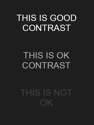
  • There should be enough contrast between the text and the background:

    enter image description here

    When the contrast between the text and the background is low, people without a perfect vision will start to have problems reading it. That is why we should always assure that the text is contrasting enough to the background so it will be easily readable, and won't force users to focus and lean it to read it.

That is what you basically need.

2

It's about vertical rhytm, as @andrewmartin said.

In design, vertical rhythm is the structure that guides a reader’s eye through the content. Good vertical rhythm makes a layout more balanced and beautiful and its content more readable.

from 4 Simple Steps to Vertical Rhythm

In western culture we follow left-to-right pattern. But even for other cultures this pattern works, as it's the Gestalt principle of continuity.

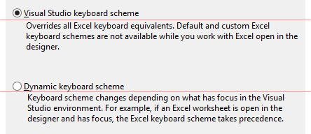
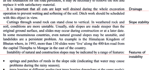
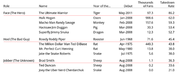
And you can see it everywhere: in GUI, in texts, in tables. Please look at red line on the examples (you can imagine and compare these with middle vertical alignment):
.

enter image description here
.
.

enter image description here
.
.

enter image description here

0

Vertical rhythm can be important to help users find what they want on a page quickly. However, that assistance could come in either form: regularly ordered or one or two items that stand out because they break the rhythm.

The best thing to do is return to the original designer and ask what the contingency should be: do you need to maintain regular vertical rhythm or should the rhythm break when something runs over more lines than the original design - a strong designer will have though about this and they may have just failed to communicate the solution to you - it's up to you to make sure you have all the information you need from them to realise their design in exactly the way they envisioned it (alternatively they may simply not have thought about it!)

Your Answer

By clicking “Post Your Answer”, you agree to our terms of service and acknowledge you have read our privacy policy.

Not the answer you're looking for? Browse other questions tagged or ask your own question.