4

We're building a product where we can either give one main Call to Action on home screen (Mobile app) which conforms to Hick-Hyman law and reduces cognitive load to make a decision easy but lowers discoverability of other features; while on the other hand we can put 4-6 shortcuts on Home screen, trying to let the user cash in on Availability Heuristics or user reacts to atleast one of stimuli and we can improve our engagement/retention, if done right.

So, what do we do? Any similar case studies to recommend? If nothing then, how do I test it out without going through full usability testing due to lack of time.

EDIT: Added wireframe for clarification. Major question came because of 1st and 2nd screen but now 3rd seems a better solution(Chucked) but still need to verify somehow.

Note: Other important features were to be accessed from bottom tabs and bottom tabs would still be there even if I choose something like 2nd or 3rd option.

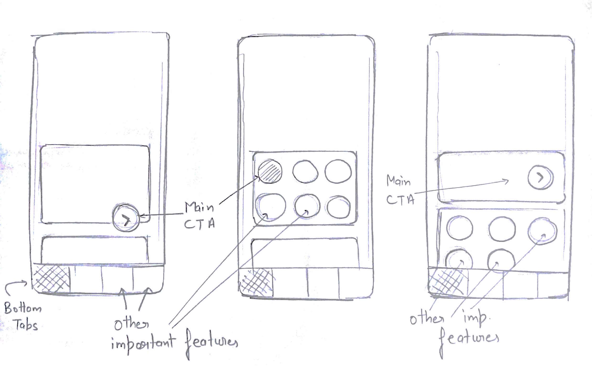
enter image description here

2
  • 2
    In my opinion it really depends in the actual case. If you could post some images we can discuss the exact case.
    – Alvaro
    Commented Nov 17, 2016 at 9:21
  • I do have my own hypothesis based on importance of features but I don't want to take a decision which just fits logically (which can very well be biased). My point is, how do I verify that Hypothesis? or Is there any example/case-study that I can compare to? Commented Nov 17, 2016 at 9:29

2 Answers 2

3

Depends on the importance of those 4-6 features you are thinking of using as shortcuts.

1. If they are not so important

it's better you use one CTA and as the user gets engaged with your application point out the remaining features.

2. If the features are important

then you want to think of Apple.com. For Apple, most of the products are important that's why they don't have one CTA, they have a large slideshow of banners along with the main top navigation.

EDIT:
For mobile app you go with showing feature shortcuts upfront because on small screens users may miss some feature as they are not visible at first glance.

4
  • Deciding on the basis of feature-importance would be the easiest way to move forward but I would like to be a little extra confident with our product. like, the example of Apple.com is good... but on an app a user typically visits again and again for one thing or another and I would like to make an informed decision here. Commented Nov 17, 2016 at 9:33
  • What's the source of this statement? Not being rude but personal experience doesn't count :) Commented Nov 17, 2016 at 11:55
  • 1
    @HarshitChoudhary It wasn't a personal experience - check some apps like 'Make My Trip' or apps that provide multiple services, for instance: airplane tickets, hotel booking etc.
    – Dipak
    Commented Nov 17, 2016 at 12:20
  • Just realised that I might have a biased opinion on most of the Indian products like Make My Trip, Zomato, Paytm etc. Unless someone suggests better, I might go with option 3 for now and believe these guys know what they're doing and do proper usability tests later in a month or two... Online testing now! is also an option as suggest by Kristiyan Lukanov. Commented Nov 17, 2016 at 12:34
1

Single or Multiple Call to Action (CTA)?

The key is ballance

I've seen a couple of A/B test on this problem, but they had mixed results. In some multiple CTAs were better and with others multiple CTA reduced the conversion rate. So the answer is: it depends on your current interface, users, context.

The problem is you can find balance through User or A/B testing. But if you don't have time for it you can follow this advice:

Advice

It really depends on the vertical length of the page and the pattern that your users scan or read your website. If they are not going below the fold then putting CTAs at the bottom of the page won't make much difference.

Heatmaps would be useful

If you can install a heatmap tracking of your page (which consists of just adding one JS library) you will get really valuable information. You can see how far down your users are scrolling with a scroll map and where they are clicking with click map. I suggest using hotjar or mouseflow as I've used them and they worked perfectly.

For short pages use 1 CTA and for long use 2 or 3 at maximum.

The number of CTA and their positioning should comply with where users are mostly concentrating their attention on the page. You want to find those places using the heatmaps and put CTA there.

In my opinion, there is no need for more than 2-3 CTAs on a single page because it clutters the interface and may discourage users clicking them because you are trying too hard to get them to your target page.

5
  • Personal opinion: A/B tests are good for nothing as they present a very limited view of the problem and if I were to go hire users for A/B tests, I would rather spend a little more time and conduct Usability tests but getting users for this product is no easy feat. Also, This is a mobile app and not website. Commented Nov 17, 2016 at 11:50
  • 1
    Good for nothing for similar problems, I mean... Commented Nov 17, 2016 at 11:52
  • 1
    @HarshitChoudhary Yeah user test would be cheaper to conduct. My opinion is to invest in user test not only for testing the CTA but finding other problems that will save you lots of time/money. For me It's totally worthed to invest $300-500 for online user tests because you get the results for 1-2 days and you can save much more time/money after that. Commented Nov 17, 2016 at 11:57
  • 1
    Hmm... haven't really explored online tests. Will check out. Thanks. Commented Nov 17, 2016 at 12:03
  • 1
    usertesting and whatusersdo are the most developed online platforms. Commented Nov 17, 2016 at 12:09

Your Answer

By clicking “Post Your Answer”, you agree to our terms of service and acknowledge you have read our privacy policy.

Not the answer you're looking for? Browse other questions tagged or ask your own question.