CONTEXT:
I need to display a large number of "policies" in a list context for user selection and inspection. Each of these policies may have two versions live at any given time, one on the staging (or testing) network, and the other on the production (or live) network.
Policies must be created and made active on the staging network, then once they are active on staging and properly tested, they may be pushed (without modification) to the production network, where they become live for the world to see.
Two of the same policy on different networks are, in fact, two entirely different entities, so we need to show details for both of them, since they might differ. They also need to be independently accessible for viewing and/or editing (policies on production can't be edited only viewed).
It is possible that a new policy may be active on Staging but not yet pushed to production; in this situation, the policy literally does not exist on the production network yet, so there is no version there to display in the list.
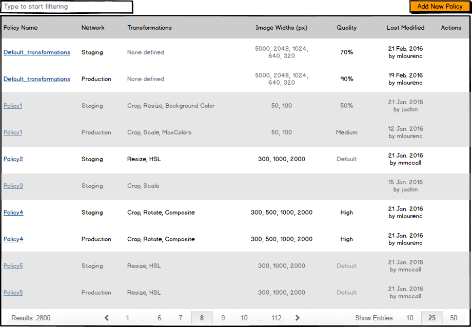
Because of this the default has been to display the same policy on the two networks each as their own line. This can, however, lead to a somewhat inconsistent-looking grid (which is also inconsistent with other tables in our interface, which almost always have a single line item for each named entity):
Having two line items for some policies and one for others has mildly confused some people, since they don't see this anywhere else in our system. We've tried to overcome it by grouping policies by table-row background color, but it only seems to make things LESS clear.
QUESTION:
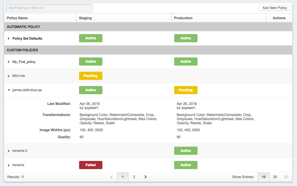
I would love to get people's ideas on what the best way would be to display these in a more consistent way. Without worrying about feasibility around back-end or front-end code, what suggestions might the community have around this? A tabbed panel for each network showing just those policies? Collapsible table rows with high-level info for each policy in the collapsed state, and details for each version when expanded? Just showing the name once but still having two rows for policies with two versions? A single row with a representation of each network that gives more information upon click or hover? Should there be versions of policies and the liveness on each network tracked at the version level below this? Would it be any clearer if we left it the same but just took out the table row shading?
We've considered all of these options, and each has pros and cons and level-of-effort-or-available-info-from-the-back-end issues. But from a sheer user standpoint and your initial gut feelings, which of these - or others - might work best?
Thanks all!


