4

I am building a software which has a tree structure filter. Selecting a node from the tree loads information about it in a table on the right.

mockup

download bmml source – Wireframes created with Balsamiq Mockups

What do you believe is the best option for node selection when the user clicks on an ARROW next to a node (just the arrow).

Version 1 - the node collapses, the node which arrow the user has clicked gets selected

mockup

download bmml source

Version 2 - the node collapses - no new selections - the table on the right still displays the previously selected nodes' information.

mockup

download bmml source

What do you guys think? Thank you in advance

2
  • This is a fairly common UI pattern, isn't it? How does this typically behave? It's a good idea to make things work the way users expect them to. Commented Aug 1, 2016 at 13:31
  • 1
    @KenMohnkern - Hey Ken. We are using React to build the software and it has Version 1 as default. Google drive on the other hand, use Version 2. Mac's Mail client uses a different approach - if you collapse a mail folder - it deselects the previously selected item without selecting anything new. We searched through some libraries and actually found both approaches.
    – Loro
    Commented Aug 1, 2016 at 13:44

2 Answers 2

2

Think scenarios

Let's forget about 'correctness' and think what users might want to do here.

A user wishes to see the details of some node. She navigates to the node of interest, and clicks it. The node details are shown on the details pane.

I suspect that that's all there is to it. If the user is now collapsing the parent node of the selected node, that should mean she is now looking for another node, so what's on the details pane doesn't really matter much (unless you can think of why would that matter).

Think mobile

On a mobile device, the left (master) and right (detail) panes are likely not to co-exist side by side. Rather, a click on a node on the tree will take you to the details screen, from which you can go back to the tree using 'back'. See illustration below.

If you think a mobile version of your app can use such pattern, then it's another argument in favour of just keep the details pane as is.
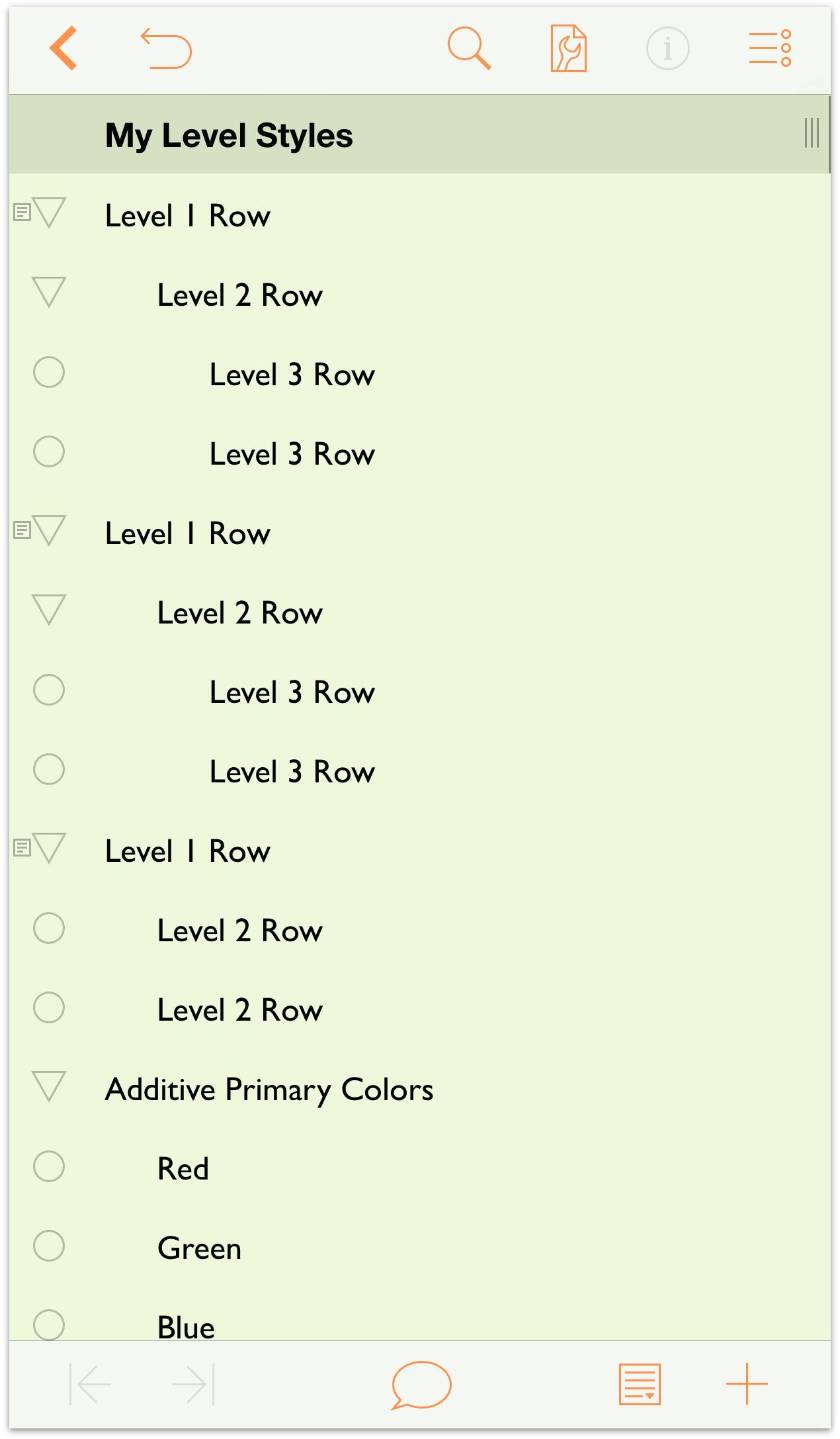
a mobile app showing a hierarchy of items

Think again

Collapsing or expanding a node does not constitute a selection. I'd argue that you shouldn't change any selection upon collapse/expand.

Add 'show on tree' option if needed

If you find it useful, you can always provide a breadcrumb on the details bar or an option to show the corresponding node on the tree. Something like the Show in sidebar option in the context menu:
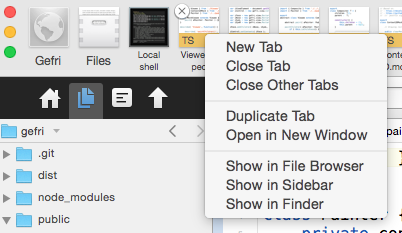
A code editor showing a 'show in sidebar' option for an open file

0

Version 1 doesn't really make a lot of sense. If the user was trying to select the node, they'd click on the title.

By clicking on the arrow they're trying to find something in the collapsed menu, or collapse a section they don't need open. Neither suggests that they want to select that section.

Your Answer

By clicking “Post Your Answer”, you agree to our terms of service and acknowledge you have read our privacy policy.

Not the answer you're looking for? Browse other questions tagged or ask your own question.