This is a long configuration page (form) which can have multiple steps as for each product, configuration needs to be done. (each step can represent each product) Now if there is/are few information message(s) (not error or validation messages but purely information but might be critical at times), how to and where to show such messages? Currently, those are identified only when user clicks first step submit button, and then shown on top of next step. But from my POV, those are irrelevant for next product configuration/step bacase it is related to first product. There is absolutely nothing that we can get any explicite user action. If we would want to have, it could be only displaying the message after the step action button and then let user click 'OK' to go ahead - on dialogue. But this seems unnecessary to me. as user actually does not do anything. Please suggest how to take care of showing message on appripriate place.
3 Answers
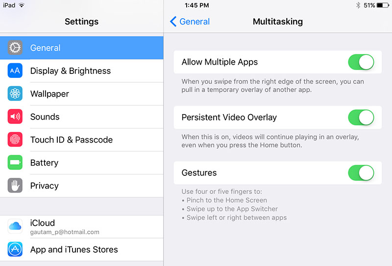
I love the way Apple is showing help text or more info text in settings for each step where ever is applicable.
I think in your case you could take some inspiration.
There are 2 key aspects to showing a user informational messages.
Context. The message has to be along side the item(s) it is related to or the user is not going to understand what it is and how it relates.
Process flow. The message needs to be either before or after the related item(s) and it does matter which (see below for "rules")
If your message is telling a user how to fill in a form then the message needs to be on top (users are reading from top to bottom) and thus you want to give them the advice up front so they can enter the right values.
If however your message is "confirmational", e.g. "By submitting this form you are agreeing to our ToS..." Then placing it at after the form content is best as you don't want or need to distract the user with this info before they fill out the form.
Regardless of placement, keep messages short, simple and to the point.
Finally make sure the styling of the message (and any iconography) matches the tone of the message. E.g. Don't use a scary red error message style to tell the user "You will be able to add attachments after saving this task." As it is just informational.
-
Thanks but these messages are not about help while filling out the form. In fact it appears once you hit the bottom action button of the first step after validating some criterias and then it show on next step. Next step and this message is not relevant. Thats the problem hence where to show becomes the problem. Commented May 18, 2016 at 12:39
-
What is the message then? I think we need to know this in order to provide the best answer. Commented May 18, 2016 at 12:41
Are the messages related to specific fields on each page?
If you do not want to show some sort of dialog to the user before moving onto the next step, then maybe show some quick notifications/toasts related to the item/action the user just finished interacting with.
For example:


