4

Im building a mobile application that allows users to ask each other for help with homework questions. Users also have the ability to message each other directly.

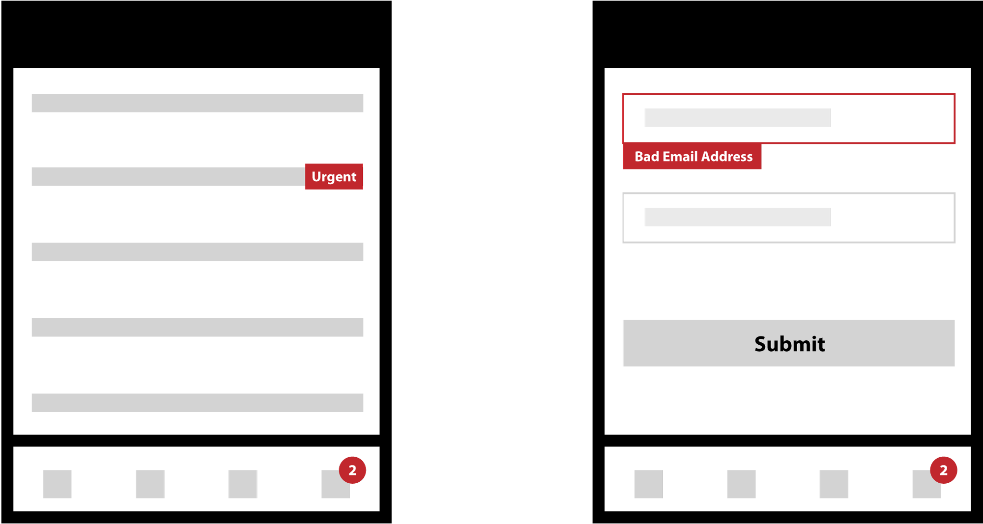
On the page of my application that lists the homework questions (see below left), a list item (homework question) can sometimes be set as urgent for questions from users that are in a rush.

As you can see the urgent marker is red.

I also want to have new message notifications that appear in the applications footer navigation, this element is red too.

Finally, I use the same red on a separate form page as a validation error alert.

enter image description here

My question is:

Is it OK to use red for each notification/alert element in the wireframes attached? Or is each scenario a different type of notification/alert and therefore in need of distinct color to not confuse the user between error, alert and notification?

1 Answer 1

1

Firstly, colour should never be the only way of distinguishing different messages. One of my pet hates is coming across system status indicators that simply show red or green!

You haven't done that - You have three different ways for users to distinguish the different messages: The 'urgent' flag sits to the right of the list item, the validation failure sits below the failed field with a key-line to ensure the field is correctly identified, and your notification symbol is a small round circle at the bottom of the screen marking which icon is asking for attention.

Anyone viewing this without proper colour vision would easily be able to distinguish the different things going on.

In other words: Yes, it's OK.

Your Answer

By clicking “Post Your Answer”, you agree to our terms of service and acknowledge you have read our privacy policy.

Not the answer you're looking for? Browse other questions tagged or ask your own question.