3

I am building an app whose main purpose is providing Text to Speech service for those who doesn't know English very well. It can read the words you type in, add/delete/edit playlists, and let the user change settings like pitch, volume, speech rate etc.

Here is the UI where the user can enter a word/sentence and have the phone read it out:
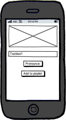
mockup

download bmml source – Wireframes created with Balsamiq Mockups

A few days ago, someone told me that I should probably add a "translate" feature. This is because people with bad English sometimes don't know how to spell the word that they want to say. If a translate feature is added, then they can enter the word that they want to say in their mother tongue and have it translated to English and read out.

The problem is that I don't know where to put this feature. If I add it like this:
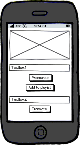
mockup

download bmml source

The user will enter the text he/she wants to translate into Textbox2 and tap "Translate" and the translated text will appear in Textbox1.

However, I think this makes the UI seems super complicated. It's too messy and just gives people a headache. Also, this makes it seems like the translate feature is as important as the TTS. But I don't want it to be this way. I want the translate feature to just be a "side feature".

I just don't want the user to be distracted by the translate feature.

I also tried
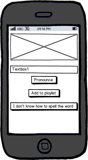
mockup

download bmml source

When you press the "I don't know how to spell the word" button, a dialog will pop up and ask the user to enter the word he/she wants in his/her mother tongue:
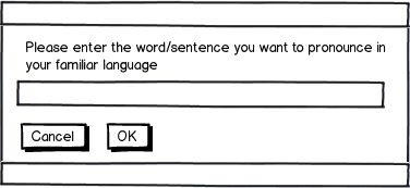
mockup

download bmml source

But that button looks really weird. You see, the other buttons are kind of small and with few words in it. And this really long button just pops out of nowhere. Looks bad.

Any ideas on where can I put this feature and at the same time not distract the user with it?

4
  • Why not just put "Translate" on the third button but still have the popup come up?
    – DasBeasto
    Commented May 12, 2016 at 13:47
  • @DasBeasto People might think the "Translate" button translates the text in Textbox1 into their mother tongue or something. Right?
    – Sweeper
    Commented May 12, 2016 at 13:49
  • I think it'd be more likely they'd type their mother tounge in Textbox1 and expect it to translate to english in the same box (which may not be a bad idea). But I just think "I don't know how to spell the word" is bad label because that may just be English speakers with bad spelling expecting you to correct it not translate it.
    – DasBeasto
    Commented May 12, 2016 at 13:51
  • @DasBeasto hmm... I think you have a point. But I think I need to listen to more advice before I can make a decision.
    – Sweeper
    Commented May 12, 2016 at 14:10

1 Answer 1

1

I agree with your third approach - but I think the way to remove your concern about importance is to use a clearer visual hierarchy on your calls to action buttons.

At the moment, all three of your CTAs are look the same, so the user will see them as equal importance.

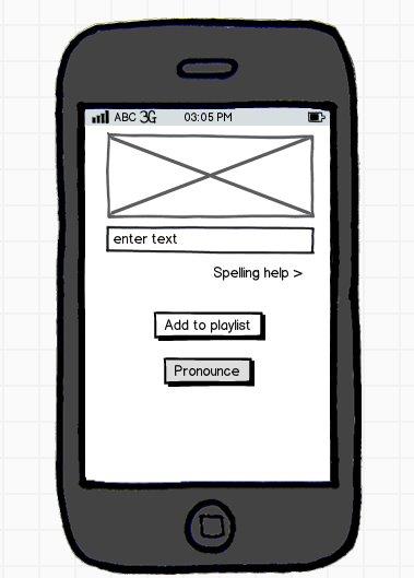
If you make them visually distinctive, you can make it clear what is the primary CTA (in this case Pronounce), and what is a secondary (or tertiary) CTA - which is where your spelling help functionality sits.

enter image description here

1
  • I like this solution although I'm not sure spelling is the right label. Maybe translation help?
    – LNubiola
    Commented May 12, 2016 at 14:31

Your Answer

By clicking “Post Your Answer”, you agree to our terms of service and acknowledge you have read our privacy policy.

Not the answer you're looking for? Browse other questions tagged or ask your own question.