1

Background:

I want to visualize my progress in bouldering in a nice graph.

At my lokal climbing gym boulder problems come in different colors: white -> very easy; yellow -> easy; green -> not so easy ...

Of each color there are multiple problems (approx 10). The total number varies at is also difficult to count, so I don't know it. Also counting all the problems I have solved of a given color becomes tedious as well. So I count the problems solved if that number is small or the number not solved yet if that is small.

Using this data I want to visualize my progress over time.

Basically I want to visualize data where each data point consists of multiple tuples of the following kind for each point in time:

(category, direction, value)

category has a limited number of values (approx. 5), which have a strict order. The actual values are positive integers including 0. Direction is the meaning of the value: "Number of problems solved" or "Number of problems not yet solved."

Note that there are multiple tuples at any given time. For example one might have all but 2 of the yellow problems solved and 3 green problems solved.

What would be a good way visualize this?

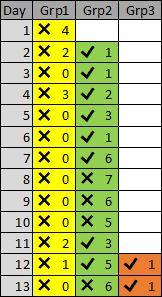
Sample Data (as asked for in the comments) Format: Day as integer; category; direction; value

1; yellow; not solved yet; 4
2; yellow; not solved yet; 2
    green; solved; 1
3; yellow; not solved yet; 0
    green; solved; 1
4; yellow; not solved yet; 3 
    green; solved; 2
5; yellow; not solved yet; 0
    green; solved; 3   
6; yellow; not solved yet; 0
    green; solved; 1
7; yellow; not solved yet; 0
    green; solved; 6
8; yellow; not solved yet; 0
    green; not solved; 7
9; yellow; not solved yet; 0
    green; not solved; 6
10; yellow; not solved yet; 0
    green; not solved; 5
11; yellow; not solved yet; 2
    green; solved; 3
12; yellow; not solved yet; 1
    green; solved; 5
    orange; solved; 1
13; yellow; not solved yet; 0
    green; not solved; 6
    orange: solved; 1

Properties that I think would help

I'd expect the following properties of a solution:

  • time goes from left to right, because that's the way I'm used to see time lines represented

  • higher values are displayed higher on some kind of y-axis than lower values

  • problems not solved values are displayed higher on some kind of y-axis then solved values, because they stand for a bigger achievement.

These are not requirements, but just things I'd expect from a solution.

5
  • Can you provide some sample data so I can try and get my head around the information that you wan to represent? I always enjoy a good datavis challenge but I have to get a feel for the data first. Thanks.
    – Michael Lai
    Commented Mar 25, 2016 at 23:30
  • @MichaelLai added some examples Commented Mar 26, 2016 at 4:54
  • Okay, let me have a think about this. Can you also give me an example of how you would use this information at the moment as is? This will also give me an idea of how I can group/structure/present the information in a way that will help you extract the information you want visually in the most efficient manner. Thanks.
    – Michael Lai
    Commented Mar 26, 2016 at 6:53
  • @MichaelLai right now I just go over it in my head to motivate myself, like: "If I can solve another green problem, I'll have more of those solved then ever" or "They redid all the yellows, but I climed already most of them again, so just 3 more to finish them all of again" Commented Mar 26, 2016 at 10:52
  • If you are trying to put values on the y-axis, then also putting the not solved values on a higher point on the y-axis then the solved values, you need to indicate what it is worth otherwise the plotting of this information will not be accurate.
    – Michael Lai
    Commented Mar 26, 2016 at 21:32

1 Answer 1

1

I am afraid that I still have a little bit of trouble understanding the data, so I will go through the process that I used to come up with a concept and hope it will either help you clarify the data or create something that you can use yourself.

  1. Break down the data into individual components and encode them in some way: there are four pieces of information and they each have a value and a way of encoding the information, so in this instance the day is a number, the problem is a colour, the values are numbers and the direction is a boolean (two opposite or complementary values).
  2. Group the data into the smallest meaningful unit of information, which in this case is the 4 pieces of information. Any extra units of information will be grouped together and placed alongside the previous group of values.
  3. Group the data into a bigger block of information, which in this case is the days because you can solve any number of problems in a given day.
  4. Arrange the data according to their logical order, which in this case is the days because there is a chronological ordering of the information by the days.

If you can be more specific around the use of the data it will help me to understand and refine the initial concept.

enter image description here

An update based on comments and feedback:

enter image description here

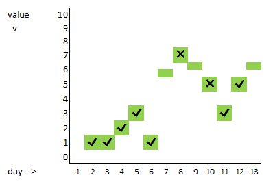
The only way I can see of putting the solved against the not solved is to split a row in half and put one higher and the other way lower like this:

enter image description here

2
  • While all the data is there in doesn't convey the fact, that it is a time line, nor that 2 yellow solved is better then 1 yellow solve and 2 yellow not solved is even better than that. Commented Mar 26, 2016 at 17:30
  • @JensSchauder Hopefully the last iteration addresses most of the requirements
    – Michael Lai
    Commented Mar 26, 2016 at 21:42

Your Answer

By clicking “Post Your Answer”, you agree to our terms of service and acknowledge you have read our privacy policy.

Not the answer you're looking for? Browse other questions tagged or ask your own question.