5

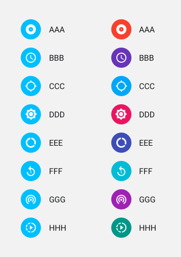
I would like to know if there is any specific studies regarding color vs iconography in differentiating and identifying icons. Differentiating and identifying, defined as being able to make a quick binary distinction and being able to match the icon from a one-for-one list of names.

My hypothesis is that different icons with the same color will be able to differentiate but difficult to quickly identify (note: assumption that all icons are identifiable). The different colored icons should offer more affordance to quickly identify but 8 different colors was too many colors be able to sequence effectively (can't cite, could be completely wrong)

Context, I think I would like to use the different colored icons vs the same colored icons, however, design guidelines are limiting to a monochromatic palette and unless I can offer a more concrete reason to make exception to color guidelines, I will be stuck using a single color.

Exceptions and outliers: Like I noted, this is based on the assumption that user will be able to identify the icons with ease. The examples I've used were random similar looking icons. Also I've read studies that research positive vs negative vs solid vs outlines, however I will exclude those examples and specifically talk about circles with negative icons (don't know the correct term).

EDIT: The placement/order of the icons is currently in a list, alphabetized by title.

example

6
  • 1
    A lot of times, people will also use placement to identify items in adding to recognizing the icon or color. (e.g. leftmost icon, last icon in the 1st group etc)
    – nightning
    Commented Mar 9, 2016 at 23:05
  • @nightning you'll have to reiterate your point, not sure what you mean? The use case I present, the icons are only meant to belong in a vertical list, each icon paired with a unique title.
    – occur
    Commented Mar 9, 2016 at 23:15
  • @occur: even so, placement does play a part here. You wouldn't be reordering the list all the time now would you? Unless you want to do something like Windows' infamous personalized menu's? Commented Mar 10, 2016 at 7:10
  • Can you expand on 'being able to match the icon from a one-for-one list of names'? One concern, if the names in the list are similar, or don't elicit a connection with their respective icon, that will make things more difficult for the user. Commented Mar 10, 2016 at 9:34
  • @BrettDeWoody That was terrible wording on my part, I just meant to keep it as high-level as possible. The icons will always be ordered alphabetically, in conjunction with title. See new reference image.
    – occur
    Commented Mar 10, 2016 at 16:32

1 Answer 1

7

I can't give you any studies but what you're trying to solve is a trade-off between visual load and the speed of distinguishability. While different colors undoubtedly help users to find the right one quicker, it will make your UI appear more cluttered making the overall user experience worse. Although this could be tackled by using a strict color scheme, you'd still struggle with having enough colors to make the distinction work sufficiently again, depending on how many icons you have, and how many might be added in the future. Also the question arises about which color to choose for which icon? While you are trying to use color as a distinguishing factor, the problem is that most colors themselves have conotated emotions or meanings to people and you might end up conflicting them with the meanings of your icons.

What should be considered as well is that color coding is only one option to add distinguishability (See also Jacques Bertin's Visual Variables on this matter). For example, the positioning (as in order and grouping) together with the frequency of use of those icons can already be enough for your purposes. If your users will need to use these icons a lot, chances are that they will remember their positions and be able to find the right one immediately after a few times, even without any color coding.

Another thing to consider is if there are icons that trigger actions that are either important or destructive enough that it would make sense to give at least them (and only them) a different color (usually red or orange, to signify 'caution'). As this only adds one single color to the layout, it wouldn't be as problematic as coloring every other element.

Your Answer

By clicking “Post Your Answer”, you agree to our terms of service and acknowledge you have read our privacy policy.

Not the answer you're looking for? Browse other questions tagged or ask your own question.