2

I am currently trying to figure out the best way to display filterable leaderboard-like data in my web application. The app functions as a type of online-voting competition. When people sign up with their team, they have to choose from one of several different categories. These categories do not compete against each other, but should be visible on a shared leaderboard.

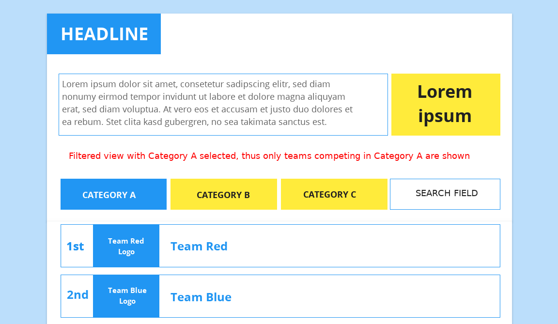
How it's supposed to work in its current incarnation

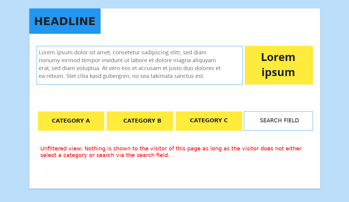
Since everybody can vote for any of the teams in any of the categories, my initial thought was to not display any of the competitors before the user actively filters the data with either the pictured category buttons (A, B and C) or by searching for a known competitor via the search field.

What I've got so far

I have embedded a sketch of my ideas described above. There is a functional web application with sample data, but that is not yet accessible from outside our dev environments - I hope you still get the general idea.

Unfiltered view

Filtered view

Problems reported by users

Users tests with a small group of users so far have shown, that some users will not click any of the buttons and assume that there is nothing to be seen and thus leave the page without voting.

In a second set of tests where on of the categories was pre-chosen and thus this category's elements (competitors) were shown, users have noted, that this may lead to an unfair advantage, as these competitors will always be popping up first when someone visits the leaderboard for voting.

My Question

What is the 'best way' to present this kind of leaderboard without confusing or angering users because of bad UX or perceived unfair advantages?

2 Answers 2

2

2 Solutions come to mind,

1. Hide all options but provide some cue to users

Basically go with the first option, however instead of showing nothing, you could display a small message asking the user to take action. I made a quick snapshot to demonstrate this (please ignore the jaggedness of the arrow :P )

enter image description here

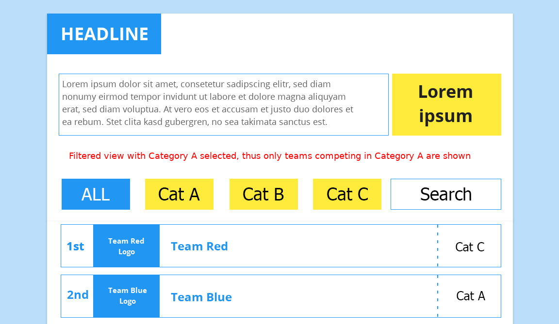
2. Add a pre-selected "All" Button next to categories and display a randomized common pool

You could also add an "All"(Or equivalent) button along with all the Category options. This will be pre-selected to display a common randomized list instead of lists from a certain category. The user can then filter this list by what ever category they wish you view.

Something like this

enter image description here

1
  • Thanks for both of your ideas! I especially like the idea of adding an additional "ALL" button and adding the category to each of the contestants data. Since a co-worker came up with a similar idea to your number 1 suggestion, we decided to give this a try first. In any case, I will mark this as the best answer. Thanks again!
    – wntrmt
    Commented Mar 8, 2016 at 13:21
0

Placing a little arrow direction up to down near buttons for all categories show that there is more information if they click on it. Without this little arrow it is hard to understand they are refering to a button.

I know that this is not quite same but I ment like this.

enter image description here

3
  • Are you suggesting adding such an arrow to all buttons or just the currently selected one? If you meant adding arrows to all buttons as a visual cue, that might indeed help to make it clearer that there is more to see. Have you seen something like this used anywhere else? I really have no idea what an appropriate icon / arrow could look like in this case.
    – wntrmt
    Commented Mar 7, 2016 at 13:34
  • @wntrmt I have add picture
    – ihsancemil
    Commented Mar 7, 2016 at 15:34
  • Thanks for adding the picture. I now see what you meant. I am still wondering if such an arrow is enough of a visual cue to have people understand that they need to select a category before any data appears.
    – wntrmt
    Commented Mar 7, 2016 at 16:19

Your Answer

By clicking “Post Your Answer”, you agree to our terms of service and acknowledge you have read our privacy policy.

Not the answer you're looking for? Browse other questions tagged or ask your own question.