2

I am revising a set of form fields that require users to manually enter someone's first name, last name, professional code #, etc. to be a drop-down menu with fuzzy matching.

The user would begin typing the person's name and the list would filter results alphabetically and by their professional association (licensed, non-licensed, etc.).

It would look similar to the image below, but users would also see sub-headers in the drop-down. So 'licensed' list of ~5 names, followed by non-licensed list of ~5 names, etc.
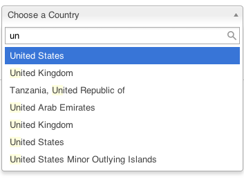
enter image description here

What is the best way to test this design? Should I just do a comparative study against our current form?

2
  • What is the hypothesis or KPI driving this change? Commented Feb 2, 2016 at 22:23
  • Good question! Any time a user forgets the name they need to enter or types in the wrong name, the form becomes an action item for our business center. We are trying to reduce the number of these action items by making it easier to find and correctly enter a name.
    – MadCM
    Commented Feb 3, 2016 at 18:46

2 Answers 2

1

While usability (or segment) tests could confirm this pattern's helpfulness, I would suggest first confirming that your criteria are appropriately served by this UI.

For example:

  • Are there any reasons that displaying fuzzy matches would confuse the user? (i.e. Are there any similar names/matches that would be difficult to distinguish from each other?)
  • (or) Are users expected to already have confidence in who they're searching for, where this UI only speeds up searching, with no possibility of confusion?

If this form pattern is unlikely to introduce any new errors (like unintended matches), a simple segment (A/B) test against your current form should be appropriate. If you are concerned that this pattern might introduce new errors or behavior that's harder to catch, a usability test would be appropriate (objective comparative test or otherwise).

0

I noticed that the drop down arrow is pointing up, indicating that you can click it to close the drop down without making a choice. I've been recommending this approach as a intuitive visual aid (and it extends the current pattern of toggling the icon for open/close).

Your Answer

By clicking “Post Your Answer”, you agree to our terms of service and acknowledge you have read our privacy policy.

Not the answer you're looking for? Browse other questions tagged or ask your own question.