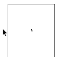
5

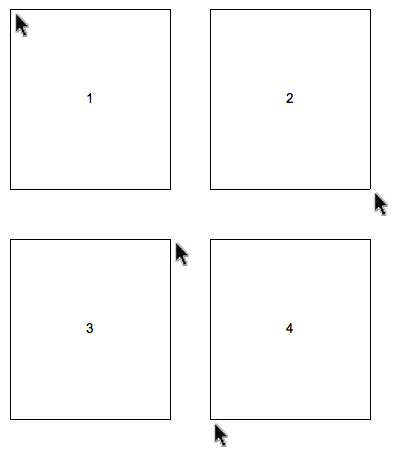
We're in the middle of designing a web application with a right click menu, and I was thinking where to position it relative to the position of the cursor.

There are different solutions:

enter image description here

Solution 1 is the standard in OS X and Microsoft Windows. But which solution do you prefer, and why?

1
  • 4
    It should be noticed that solution 1 is only the standard, if your cursor is high enough -- otherwise, solution four is the one used. In Windows, at least, the same is not true if your cursor goes too far right. Try that one out for yourself -- it's interesting.
    – Daniel
    Commented Jul 11, 2011 at 22:48

5 Answers 5

10

1. Is the standard for both Windows and OSX. You should go with this.

Update: (Note that when clicking at extreme bottom of screen it will automatically display as 4,when at extreme right it will display as 3, and at extreme bottom right it displays as 2.)

This seems to make sense, you right click, and are at the top left position of the list of options. Usually when you get a list, you will want to start from the top.

8
  • 2
    4 is also standard if you are low enough on the screen that the menu will not fit below the cursor. Commented Jul 11, 2011 at 12:46
  • 1
    Good point Charles. 3 is also standard for being all the way to the right when it won't fit. Commented Jul 11, 2011 at 12:55
  • 1
    Thank you for confriming what I thought. I think 1st is the best as well. On the other hand I saw 3. in Win7, that was the main reason for asking. Commented Jul 11, 2011 at 13:54
  • 1
    @Roland - where did you see #3? I have never seen that in Windows 7 Commented Jul 11, 2011 at 14:28
  • @Charles - Right clicking in the extreme right area. Commented Jul 11, 2011 at 14:52
4

The optimal position is #1, the top left corner, for text that reads left to right and top to bottom. This positioning allows for the text to be easily read and for the user to move the mouse and their eyes in the same direction that they normally read.

But when the mouse is positioned close to the edge of the viewport the panel should be displayed so as not to be hidden or trigger scrolling.
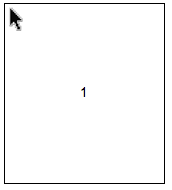
enter image description here

If the mouse is close to the bottom left of the viewport the panel should be displayed above the mouse as in your #4 example.
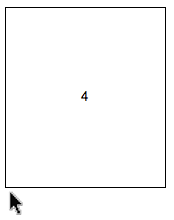
enter image description here

When the mouse is close to the bottom right it would resemble #2.
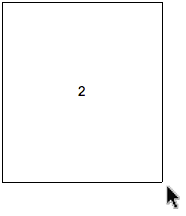
enter image description here

If the mouse is to the right and is far enough above the bottom of the viewport for the panel to be displayed example #3 would be used.
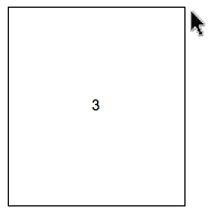
enter image description here

0
3

Interestingly, from the Fitts' Law point of view, the optimal one would be

enter image description here

which reduces the mean distance to target to half.

Well, the really optimal would be one where the cursor is already on top of an option, but that's not going to end well.

4
  • Why would it not end well if the cursor was already on top of the most commonly used item?
    – JoJo
    Commented Jul 12, 2011 at 5:03
  • Well, action menus don't usually come with a pre-selected option. Navigation menus might, but action menus don't - as a rule. In most cases it's pretty difficult to know with confidence what's the most commonly used item. And even if we did, it's just too error-inducing. It may be wrongly interpreted as a default or a system recommendation. Commented Jul 12, 2011 at 5:20
  • 2
    The really, really optimal position is a pie menu, with each option radiating out from the center. Which raises the question, Are radial contextual menus better than vertical list menus? Commented Jul 13, 2011 at 12:54
  • The default option can be based off of the user's usage patterns. It doesn't have to be a system recommendation that's absolute for everyone. A good analogy is Firefox's address bar. It counts the number of times particular keywords you type lead to particular links. It will place your most common links per that keyword on top of the list.
    – JoJo
    Commented Jul 13, 2011 at 22:16
0

I like (4), because it's the least biomechanically arduous (whether you are making the gesture with a mouse or trackpad).

Granted, if there established ways of doing this (as other commenters have suggested), then it probably makes sense to go with those, because that's what people are used to, and it will speed up their workflow accordingly.

2
  • All 4 options put the cursor hotspot in one of the corners so the distance to each element is the same on average. Am I missing something that would make option 4 better?
    – 3Doubloons
    Commented Jul 13, 2011 at 15:46
  • Well, this might just be my take on it :o) but if you're right-handed, as 90% of people are, try moving your mouse/trackpad hand on the upwards-and-right diagonal, as though you were moving the cursor between 3 and 2 on the grid shown above). Now try making the opposite diagonal movement, as though to trace between 4 and 1 on the grid. See how the first diagonal only requires a tiny movement in your wrist, compared to the other diagonal, which requires you to move your whole arm? Commented Jul 13, 2011 at 20:56
0

(1) does not cover the element / line you just clicked on, and does not cover the start of the next line / element.

This preserves most relevant context to make a decision while the popup is covering the document.

"next line" rationale: because it might contain relevant information too, and the most important of that (such as name/title) is usually at the beginning of the line.

Specifically I hate hover popups that cover the current/next line. When scanning a list sequentially, this blocks the current or next item, so much of mouse waving is involved.

Your Answer

By clicking “Post Your Answer”, you agree to our terms of service and acknowledge you have read our privacy policy.

Not the answer you're looking for? Browse other questions tagged or ask your own question.