I'm working on a redesign project of an ecommerce. The shopping cart page has 3 CTA. 1. Go to checkout process 2. Continue shopping 3. Delete order
The last CTA isn't usual in ecommerce, but is important to keep it because users of this kind of ecommerce may want to leave the order and delete it for safety reasons (their pc is used also by other people). Where can I put those CTA?
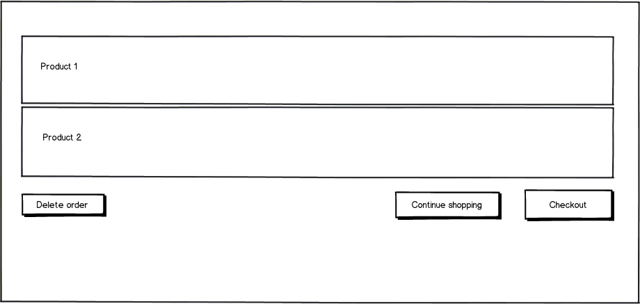
One solution could be:

download bmml source – Wireframes created with Balsamiq Mockups
In this way the button delete order is far from the other 2 but visible. The other 2 are close each other because they represent 2 possible alternative (1. I've finished my order 2. I need to add something else) but they're not destructive.
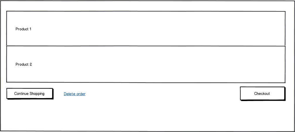
Another alternative could be

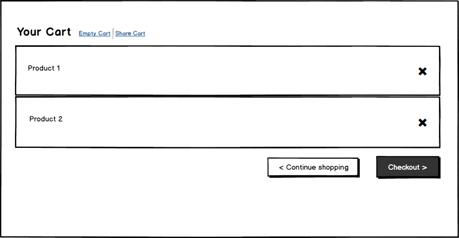
What do you think about it? Do you have better alternatives?
Thank you

