0

I'm interested in any examples of a two color progress indicator. The user will be looking at a web page consisting of a list of reports that are a combination of approved reports and reports pending approval. By default, though, the list will be filtered to just show the list of reports pending approval, as the user will need to take action to approve these reports (however they can also see approved reports, in the event that they want to unapprove a report).

The objective I'm trying to achieve is to communicate to the user that are 'n' number of approved reports and 'n' number of reports that are pending approval.

The way I visualized it in my head is something that looks like a progress bar, where a portion of it is filled with a green color (or some color that indicates that an action has been taken) with a number inside that portion of the fill that represents the number of approved reports, and then the rest of the bar is filled with a different color, which represents the number of reports pending approval. The user should be able to click on the number of approved reports or on the number of reports pending approval and the list of reports displayed to the user will filter based on what they've clicked on.

This is just an idea that I have, but I'm open to suggestions on alternative ways to communicate this information to the user, and, any examples are greatly appreciated.

Thanks in advance!

1

2 Answers 2

2

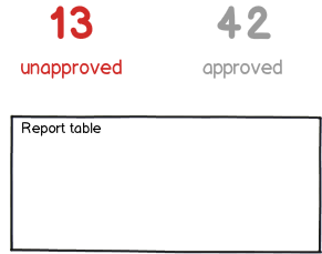
I would not make this so complicated. I would have 2 large numbers, with the label below them. Selecting them should act like a filter or tab on the table of reports below. If they are to act on the reports pending approval, make the color stand out - your link color or red if it's incredibly urgent. The approved reports should be a very readable gray because those are already acted on.

mockup

download bmml source – Wireframes created with Balsamiq Mockups

0

I am considering that all reports are independent of each other, there is no grouping factor (Eg: Set of 50 reports belonging to X submitted. Now if 25 done and 25 pending which means 50% done 50% remaining). I assuming reports can be submitted in system any time which mean number will fluctuate.

Here are few ideas:

It is not only about showing status but component should also look interactable, so that user can click on that. Below toggle pattern can be used in case if you want to show two different types of reports and on toggling user will be able to see filtered reports. However this pattern has one drawback which is user will not be able to see complete list (I am not sure if that is required in your case). Also few people may argue that filtering is not the correct purpose of toggle button.

enter image description here

Other pattern which I believe is more powerful and flexible than above one.

enter image description here

In this pattern user has complete control what should be listed on screen and what not. Also it is little futuristic unlike toggle as you can add more states to this in future (For eg : I've added rejected).

We can also replace to checkbox with radio button if you feel user can accidentally select all them and may confuse himself.

Your Answer

By clicking “Post Your Answer”, you agree to our terms of service and acknowledge you have read our privacy policy.

Not the answer you're looking for? Browse other questions tagged or ask your own question.