0

The problem: One of the fields (Account code) have thousands of possible inputs, however one would not typically remember the code (its there for accounting purposes). However, long time users do.

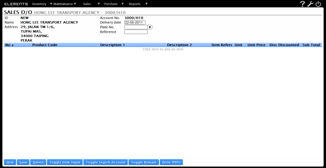
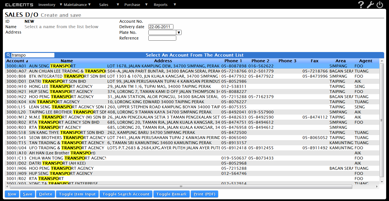
Current solution: When the user first create the bill, the first screenshot appears, prompting the user to select an account from the list. Once selected, the user will be returned to the default screen(second screenshot). Editing(though rare) requires the user to click "Toggle Search Account" button below to be brought back to the first screen.

It looks fine on first glance, but I don't think it is very intuitive.

Alternate solutions:

Autocomplete: Should theoretically work, but the space would not allow be as flexible as search and provide enough information.

Considerations must be given to allow full keyboard navigation.

So, anyone could provide a better design or ux?

`search account
`default view

PS: this is a web based software

1 Answer 1

1

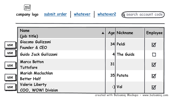
I would not roll in a searching feature with your submission form. I would create a separate search box for finding the account codes. Next to each search result, there is a "use" button which would redirect them to the submission form with the account code pre-filled. I don't know what your application does, so I have no better word than "use".

enter image description here

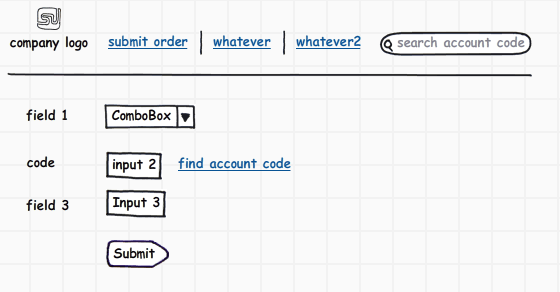
Here would be your submission form. It won't load a bunch of results because, as you said, the advanced users already memorize the codes. Most modern browsers already save text field inputs, so autocomplete is already there. For the novice users, they are provided with a link next to the account code field which offers to help them find the right account code. Clicking this link would draw attention to the search box and focus the cursor on it.

enter image description here

Your Answer

By clicking “Post Your Answer”, you agree to our terms of service and acknowledge you have read our privacy policy.

Not the answer you're looking for? Browse other questions tagged or ask your own question.