3

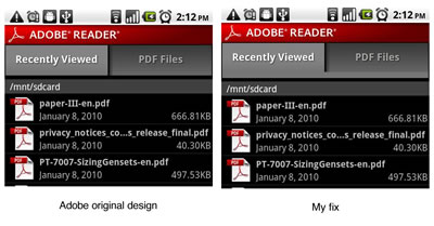
I found myself confused today, when using the Adobe Reader Android application, navigating its tab interface. I wasn't sure which tab was active because the active tab state was recessed and dimmed, which led me to this question.

In general, when a tab is in active state, should it appear in greater visual weight (e.g. stronger colour/ bigger/ etc) than the rest?

Also, are there any accepted UI guidelines for expressing the different tabs states?

3 Answers 3

7

Tabs should look like tabs, not like buttons:

Adobe Reader tab state problem

4
  • 1
    I agree with the tweak, however you are representing the opposite. The image on the left actually represents "PDF Files" as active. I think with your approach the recessed darker state would still throw me off. Commented Jul 1, 2011 at 17:36
  • Yea, I know that. I'm just too lazy to redraw tabs completely myself. ;) Commented Jul 1, 2011 at 17:47
  • Agree completely. This is one thing that bothers me about Expression Blend, because they couldn't seem to grasp this design concept. Commented Jul 1, 2011 at 22:03
  • Have you any evidence that users differentiate between tabs and buttons, in general? The problem is this case is that both tabs are visually two similar, that is, a problem about too little contrast, not necessarily about the tab not being glued to the tab pane.
    – drabsv
    Commented Aug 10 at 12:48
2

It doesn't always need to be brigher - that depends on the color scheme that you're using. If your app is bright, then it should be darker. It does need to be more prominent and to stand out from the other tabs. But you're almost always going to have this problem when you only have two tabs - because then you can't know which one is different from the others - they're just both different from each other. The way to solve this is to have it blend in with the color of the tab box itself, and this indication will have more weight than most other things you come up with. For instance, in @Dmitry Semenov's image, if one of the tabs was simply black, it would be immediately clear and unambiguous.

0

It depends on the general design and colour scheme of your site. If your site is full of rich colour, it might be sufficient just to make inactive tabs a pale grey.

Like Mirjirisky above (who writes a very helpful answer), I'd also advocate doing whatever you could to make the active tab appear contiguous with the tab box itself.

Your Answer

By clicking “Post Your Answer”, you agree to our terms of service and acknowledge you have read our privacy policy.

Not the answer you're looking for? Browse other questions tagged or ask your own question.