3

What is the best pattern when filtering through a list via a search input in combination with a toggle filter?

Here's a list of name with Inactive users filtered out: enter image description here
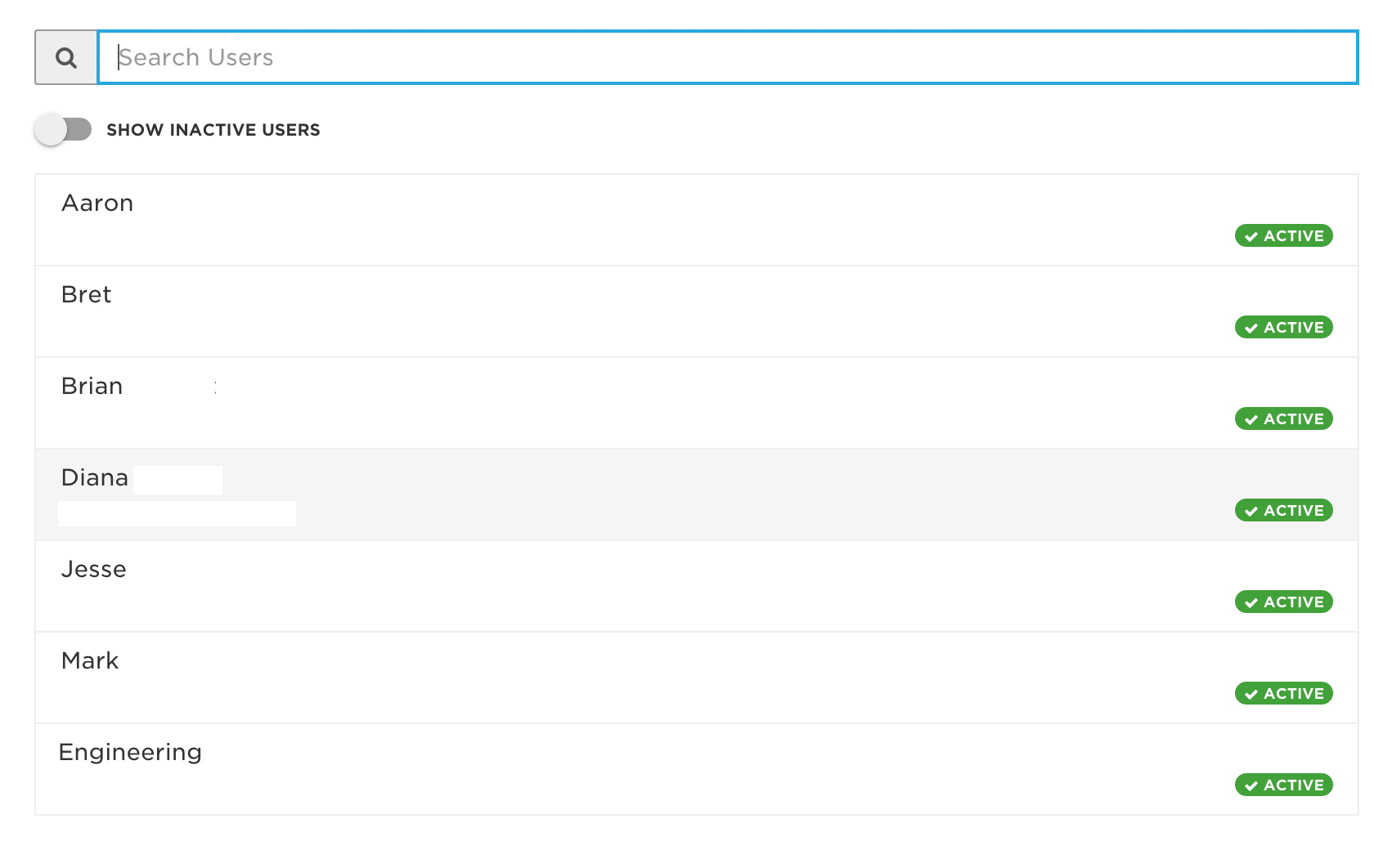
When a person using the search filter, should it only search the current state of the list (in this case inactive users filtered out), or should it search all users?

I'm stuck in the middle on this, as it might seem more helpful to just search all without the user having the toggle "Search inactive users", but I'm concerned it might also take away control from the user. I will do usability testing, but wanted to start here.

2
  • do you search 1 user at a time? Commented Nov 3, 2015 at 14:54
  • Yes. Because of that I've since changes the placeholder for the search input to say "Search for a user". Commented Nov 3, 2015 at 15:40

2 Answers 2

2

A usability study would definately give you a good answer as to what your users expect.

General Assumption

In most cases search should return all users regardless if they are active or not. I am assuming this because, you are searching for a profile which then you may want to modify / update / etc. One of your flows could be "find an activate a user".

Issues:

  1. You are most likely may cause confusion if a search is made for let's say "John Smith" and results don't show that user but you know he is in the system. In other words that filter may cause more confusion and frustration rather than solve a specific issue.
  2. Showing just a name may not be an extensible approach if you are running at the enterprise level where you may have several people with the same First and Last name. Maybe adding some other PII would help the user to choose the proper person from the list.

Summary

  1. Your design pattern to show labels for "active" and "inactive" users is great, that is one way you can visually differentiate the result list items.
  2. I would remove the filter and show all "active" and "inactive" users assuming your search will help you find group of users you may want to activate or deactivate.
1
  • Thanks Igorek. I prototyped out the behavior of searching all users. It feels better than just searching just active users. I changed the search input to say "Search for a user" and once the user starts searching the "Show inactive users" toggle filter is hidden. This also led me to think that having the toggle filter was redundant (you mention that in your summary point #2). And yes, I will definitely do usability testing to validate this. Thanks. Commented Nov 3, 2015 at 15:48
0

Some observations:

It wont't have to be a big deal if the users can clearly see if the data is filtered/unfiltered and you are showing state clearly. There are several ways of doing this as your "active" badge.

Then you should evaluate the defaults. If the most time users search for active users, you could put a checkbox (the slider is not really user friendly) with "Show only active users" checked by default. And place the checkbox (or any kind of control for the filter) in a good place (where it is right now or on the right) with a good size.

Btw, the size of the search input plus the space between the names and the active/inactive label is huge thus bad UX. My eyes has to fly all across the ocean to check the state.


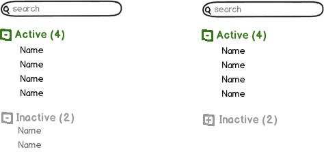
I've just thought about his alternative approach, where you don't event need to think about defaults, showing state in each item, etc. It's the simplest design I can think of right now.

mockup

download bmml source – Wireframes created with Balsamiq Mockups

Your Answer

By clicking “Post Your Answer”, you agree to our terms of service and acknowledge you have read our privacy policy.

Not the answer you're looking for? Browse other questions tagged or ask your own question.