1

I am working on a Windows application that has a set of On/Off radio buttons, specifically "Low Power" and "Normal".

Low Power button/Normal button

I have arranged them so that the Low Power button comes first, and the Normal button is second, which is the default setting.
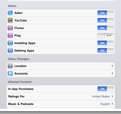
enter image description here

In iOS, these buttons are also arranged in this order and I am used to this, so this supported my decision for ordering them in the way that I did.

So my question is, is there a Windows convention for this?

Do they recommend ordering these in any specific way? We always consult the Windows UX guidelines when making decisions to make sure we are not straying from standard conventions whenever possible, but I have not been able to find any guidance.

5 Answers 5

5

If this is the route you're going for then have On then Off, because how often do you say/see Off and On instead of On and Off? Plus platform convention on Windows is generally positive then negative (e.g. OK then Cancel).

1

I'm not sure I can recollect having seen quite this sort of thing on windows. Usually it's either a check box showing checked state; separated radio buttons with one selected; or a toggle button indicating active state.

I realise that essentially your functionality maps onto radio buttons, but it feels kind of a mixture of the three all rolled into one.

Maybe it's because I find your first image confusing. Is the current state Low Power or Normal? It could be either because I don't know if selected is indicated by the brighter white colour or the highlighted blue colour. Therefore I don't know whether it's trying to indicate current state or the state it will be in if I click on it

iOS at least either says ON or it says OFF - but never both words. My suggestion is to change the label to 'Low Power Mode' and make the controls such that it clearly indicates the current state, rather than showing two state-names in one connected object.

5
  • I agree. I don't like the toggle slide button (and I don't find the iOS-version to be any better). Toggle-button-groups are not very uncommon in windows, though (eg the alignment-buttons in the paragraph group: ribbon.anirdesh.com/Images%5CRibbon01.png). And some vendors do provide good slider alternatives. (Eg: tmssoftware.com/site/advsmoothslider.asp) Either way it is very important that the state is unambiguous! Commented Jun 29, 2011 at 12:47
  • Toggle button groups, yes - but typically they are not used to represent binary states as in the case of this question - for example there are no binary options in the image in your first link - only opposing actions (increase font, decrease font), or multi-state groups (alignment/justification). Binary states utilize a single toggle button - eg as used for Track Changes or for Protect Document Commented Jun 29, 2011 at 13:09
  • Hehe. Take a look at this screenshot from MS Visual Studio 2010: i2.visualstudiogallery.msdn.microsoft.com/en-us/… (Source: visualstudiogallery.msdn.microsoft.com/…) Commented Jun 29, 2011 at 13:30
  • If you just have two states in a multi-state groups (eg. [left alignment] and [right alignment]), I would definitely go for the same toggle-solution that the MS Ribbon example has with the four states [left]-[center]-[right]-[block]. How would you toggle this? Toggling left- and right-justification with only one button sounds like a bad idea :-P Commented Jun 29, 2011 at 13:47
  • Hah! well found! How would I toggle left/right alignment? - (theoretically) - well because one of them (left lets say) must be the 'norm' and the other (right) represents right alignment being either on or off, but that specific example is a bit contrived (if you don't mind my saying so :-) Commented Jun 29, 2011 at 14:14
1

I think in a simple On/Off-state the order in the second image is the right ones. The positive option should be left of the negative. In example in the first image i would prefer this order of Jørns second example.

0

I would say that you should display the choices in ascending order from left to right. Just like your suggestion.

Not logical:

Select one:  [High] - [Medium] - [Low]
or
Select one:  [5] - [4] - [3] - [2] - [1]

Logical

Select one:  [Low] - [Medium] - [High]
or
Select one:  [1] - [2] - [3] - [4] - [5]
0

Make it simpler, use checkbox.

[*] Low Power Mode

Your Answer

By clicking “Post Your Answer”, you agree to our terms of service and acknowledge you have read our privacy policy.

Not the answer you're looking for? Browse other questions tagged or ask your own question.