4

I'm making a simple collaborative whiteboard app just for fun and I originally had a color picker with all the colors but the few friends I showed it too said it was too much and they aren't artists and would prefer if there were just 16 or 24 "good" colors that they could pick from.

I found this page for an optimal 16 color palette but even this I don't think is necessarily ideal for an online painting app (probably would want more saturated/brighter colors for some of them). Also, this would be 24 colors.

I figure you absolutely need black, grey, white, red, blue, green, yellow, orange, brown, purple, pink like Wad suggests, and past that I suppose just varying shades of each, but I am not an artist nor an expert in color theory so I'm not sure how exactly to come up with such a palette, even after some googling.

What would be a good palette with 24 colors that would allow users to paint just about anything they wanted without thinking "oh I wish they had this color for this object"?

2
  • 1
    FWIW, a lot of the 'whiteboard' drawing apps on the iPad limit the colors down to 4-6. Which I think is a great idea. After all, on a whiteboard, you'd never want to deal with more than that anyways.
    – DA01
    Commented Sep 27, 2015 at 21:36
  • 2
    Laura, since this is generating a lot of answers, could you please update the question so it's more accurate as to what you are asking for? You explicitly state in your question that this is a whiteboarding app, but then in a common you state that it is, in fact not a whiteboarding app. Clarity would help us a lot here.
    – DA01
    Commented Sep 29, 2015 at 8:54

6 Answers 6

11

enter image description here

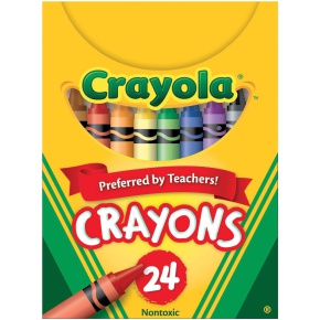
I would use there 24 Colors found in 24-pack Crayola Crayons.

red, yellow, blue, brown, orange, green, violet, black, carnation pink, yellow orange, blue green, red violet, red orange, yellow green, blue violet, white, violet red, dandelion, cerulean, apricot, scarlet, green yellow, indigo and gray

I'm sure some sort of research went into getting the most used colors they can into that pack.

You can use this link to get the HTML color codes of all Crayola Crayons

7
  • That's a pretty good idea. This may be a stupid question but there wouldn't be any copyright infringement issues if I just use all their colors exactly, right? Commented Sep 27, 2015 at 19:18
  • I can't imagine there would be those are all pretty standard colors/names. But I couldn't tell you for sure so it's be advisable to check with someone more familiar with law.
    – DasBeasto
    Commented Sep 27, 2015 at 19:19
  • Actually, looking at it now, I don't think these colors would be best. So many of the colors look so similar. I think maybe Crayola might have included very similar colors for popular colors so that more than one person could use them at once or so they'd have a reasonable backup if they lost one or used one up. See how similar some of the reds and blues are? i.imgur.com/1Oc3wrI.png Commented Sep 27, 2015 at 19:49
  • Note that there could be copyright issues here. A particular palette of colors can be protected. So if you go this route, just don't be stealing all of their color names. (Yes, orange is orange, but calling particular yellow 'dandelion' may be proprietary to crayola. Either choose a different yellow, or call it a different name)
    – DA01
    Commented Sep 27, 2015 at 21:51
  • After looking a (very small) but into it I would agree more with @DA01. I can't find any information on if their colors are copyrighted but a quick search shows two different results for Dandelion 12. Which to me shows there is no 'standard' for this color as there is for yellow and orange. So using these exact colors with these exact names could be problematic. Again not saying you shouldn't just saying you should tread lightly.
    – DasBeasto
    Commented Sep 28, 2015 at 13:11
7

You are asking what 24 colors to use, but I think the bigger question is 'is there an ideal number of colors to even offer in the first place?'

Looking at a couple of the sketching apps on the iPad, you will notice they they use very limited palettes.

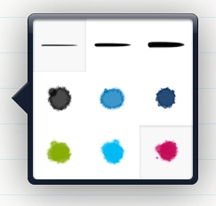
Paper, for example, has palettes of 7 colors:

enter image description here

Granted, Paper comes with a bunch of different palettes to choose from, but I think the key point here is that--at least for sketching--there's a certain comfort in having a defined set of just a handful of colors.

Bamboo Paper (one of my faves) also has a limited palette:

enter image description here

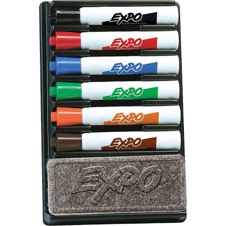
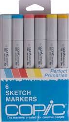
These are likely based on the fact that most folks, when sketching or wireframing with markers or pens, tend to have a limited set. There's good reasons for this, as the whole point of sketching is to get ideas onto 'paper' as fast as possible. Stopping to ponder which of dozens of colors to grab is a lot slower then having a nice solid set of 6 or so:

enter image description here

enter image description here

In conclusion, for a whiteboard app that is also collaborative I'd advocate a much more limited color palette than 24...and would suggest limiting it to something closer to 6-8 for the following reasons:

  • It's a sketch app. Speed is the key, so make picking colors faster with a smaller set to choose from.
  • It's collaborative. If you need to grab the 'blue' marker, there should just be one blue marker, rather than 6 shades of blue to have to pick through.
  • Fewer colors means you can make them a) more distinctive and b) more cohesive.

If people find that simply too limiting, you could offer up the option where they could customize the 6 colors to anything they want, but I'd still push for a very limited set of colors to choose from when drawing.

3
  • I'm sorry to do this to you because this is a really good answer but whiteboard app was just an example I used in the question because everyone understands what that is. My app isn't actually a whiteboard app and I do need a 16-24 color palette. Commented Sep 27, 2015 at 22:58
  • 1
    @LauraHenry when it comes to user experience, context is everything so it's best to be a explicit as you can when describing the intended purpose. I'd still argue that in most cases, less is more but without knowing the actual specifics of your user's needs, I certainly can't say for sure. Any additional info you can provide would help us provide you with better answers. So point being, if this is not a whiteboard app, then don't tell us it's a whiteboard app. :)
    – DA01
    Commented Sep 27, 2015 at 23:21
  • This approach of "something closer to 6-8 colors" agrees with "The Magical Number Seven, Plus or Minus Two". That's Miller's Law, which broadly states that "the number of objects an average human can hold in working memory is 7 ± 2".
    – sammy34
    Commented May 21, 2016 at 14:19
2

figure you absolutely need black, grey, white, red, blue, green, yellow, orange, brown, purple, pink

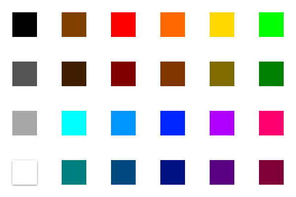
This is my suggestion for your color options based on color theory that, should you go with this method, once you have your base set picked, should leave you with a min of 24 colors.

  1. Set your base colors: These should be your basic colors and they should be in this order: red, orange, yellow, green, blue, violet. This base color group are your hues - a mix of the primary colors and complementary colors. Black and white should always be available, separately from your basic color values.

  2. Add white and black: Now add tints and shades, to triple the amount of colors you have. Tints are color + white, or a lighter color. Shades are color + black, or darker colors. You could create 3 levels of white and black for each color, or simply allow the ability to increase or decrease the amount of white or black for each individual color or all colors as a set. If this isn't clear, search for tints vs shades on Google.

  3. Add grey: Next, take your hues, and mix them with equal amounts of white and black. These are your tones. (Note that just as you can get different tints and shades depending on the amount of white to black you add, you can get the same thing with grey if you don't add white and black equally.) If this isn't clear, search for tints, tones, and shades on Google.

If you've followed along through this point, you will have quadrupled your colors to at least 24, if you just offer one hue plus one shade, one tint, and one tone for each base color.

  1. For the color brown: Brown is a mix of different colors, so the final color you get depends on which colors you mix together. One way to achieve brown is to mix all 3 primary colors equally (red, yellow, blue) to create brown. Digitally, you can allow your users to select a set brown, or you can allow them to mix colors and create their own. This wikihow page shows mixing colors to create brown.

Ways to get even more color: If you choose to modify your base colors, such as making them all more yellow, or more blue, or more red, etc, this change would carry through all hues, tints, tones and shades. So, potentially, you could have your base set of 24 * however manyothe.

Opacity: If you offer the ability to change the alpha level - opacity - then you've potentially provided even more color and layering options for your users.

I am happy to help, and I hope this has helped. Here is a nice little site that explains the color wheel (base hues), and the tints, shades, and tones. http://www.craftsy.com/blog/2013/05/hues-tints-tones-and-shades/

As a general comment, though, I do feel that the content of this question is more suited for graphicdesign.stackexchange than UX.stackexchange, since graphic designers professionally deal with color significantly more than UX designers.

2

The best palette very much depends on the exact nature of your application. A drawing app for little children will require different and slightly more colors than a scientific collaboration app. The question does not indicate whether colors will be solid and whether they would apply to all kinds of virtual tools (like pen, brush, marker, pencil, crayon; background, border, text).

You might want to consider what people will probably like to draw or paint and which contextual colors they will need for that. Maybe that will include some color effects rather than actual colors, e.g. glitter, sparkle, shine, semi-transparent, opaque, pastel, neon, soften, smear, spray, camouflage, inverse, rainbow … This way, users might be able to mix colors intuitively on the canvas to get the blend they want.

That being said, here’s a made-up list for several common (non-solid) colors found in physical writing, sketching and highlighting tools.

  • 1 pencil: anthracite/coal
  • 5 classic pens: black, navy, blue, red, green
  • 6 neon highlighters: yellow, orange, magenta/fuchsia, lime, cyan, violet
  • 4 metallic gel pens: bronze, silver, gold, pink
  • 2 rubbers: white, gray
  • 6 pastel brushes: peach, lilac, salmon, ivory, blush, mint

Other scenarios afford semantic colors, e.g. text / foreground, background / canvas, emphasis, highlight, commentary, which then could be changed in an instant by switching palettes.

1
  • +1 for "very much depends on the exact nature of your application". Context is everything!
    – DA01
    Commented Sep 28, 2015 at 16:58
1

Well here's one! After finding your post, I decided to check google search for some examples. This is what I found.

24 Slot Color Palette

Found at: http://www.clker.com/clipart-24-color-palette.html

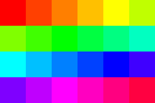
The color hue "wheel" is 360° of the color spectrum. If we break it up into 24 sections we get 15° of change between each of the choices.

Personally, I think the colors are way to close to each-others neighbors to use in tandem, but it's the best example of what your looking for I think.

Palette 2:

Here is a color palette which features black to white options and 10 color choices with 50% intensity alternatives.

black and white - 10 color palette - normal and dark variants

It's based on colors separated by 30° of hue (360°/12). It offers greater color diversity by increasing the separation of colors and intensities.

Below is another revision with darker colors, more suitable against a white background, and replacing the in-between green/cyan color with a brown choice.

Palette 3:

24 color palette with brown added

Here's the latest color palette concept. It contains brown and features darker tones for visual recognition against white backgrounds as the next two images show:

color palette cells against white

small color palette cells against white

As you can see each color stands out from white visually. The white cell in the palette can be useful too, such as writing in a black region or one of another color, don't discount the white's usefulness. This should cover any color use cases for most situations.

Edit:

Added a new one with 4 less colors. I think the white optimized cyan options are nice, had to kill the baby blue, and ended up removing the magenta hues.

20 piece color palette

9
  • 2
    I agree with your opinion...most of those colors are so close it defeats the purpose of having 24. Another issue is that these are all the same intensity (and a high intensity at that). That might be OK, but then again, might not fit the particular context of the types of illustrations the users need to create.
    – DA01
    Commented Sep 28, 2015 at 16:57
  • I've updated my answer for you, how does Palette 3 work for you? Commented Sep 29, 2015 at 4:56
  • All valid! But I'd still argue 24 is just more than is needed.
    – DA01
    Commented Sep 29, 2015 at 5:51
  • How many have you decided on? Commented Sep 29, 2015 at 18:17
  • Was that question for me?
    – DA01
    Commented Sep 29, 2015 at 22:39
1

As a real-life-medium painter/sketcher, I don't think your aim to cover all possible needs of users with only 12/24 hues here is realistic. Even big colored pencils sets of 128 shades miss out some colors and have too many of those that are barely used.

Professional artists prefer to compile their own palettes manually by picking 6-12 shades depending on their topic and style. Companies like Faber-Castell/Copic even issue separate sets of 6 to 10 paints/pencils/markers that cater to different kind of work (like industrial sketching, fashion sketching, landscape painting and so on). For instance, a set for industrial sketching would include 3 shades of cold grey, 2 shades of warm grey, 3 shades of blue and a few warm tones. A set for a nature/landscape painter would focus mainly on green and earth tones. Whiteboard palette for diagrams & charts is, again, entirely different from this.

So what could help you with narrowing down the palette is

  1. Deciding who are your app users and what do they need a palette for.

  2. Then you can draw inspiration from the existing solutions and use the tools like Color.adobe.com and Paletton.com.

  3. And then as you have chosen the palette of 5 at color.adobe.com, you can insert that into the Illustrator and expand it or use hacks like ColorPickingTool to derive palettes from the photos that have harmonic combinations.

2
  • 1
    Adding on to your answer, I would also look at the Google material design colors
    – Daniel F
    Commented Oct 11, 2015 at 2:29
  • At a step 3, yes. Good thinking.
    – Zoe K
    Commented Oct 11, 2015 at 9:15

Your Answer

By clicking “Post Your Answer”, you agree to our terms of service and acknowledge you have read our privacy policy.

Not the answer you're looking for? Browse other questions tagged or ask your own question.