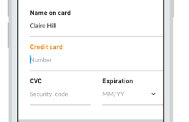
11

On devices with small screens floating labels can improve readability, since the size of the placeholder's text tends to be considerably bigger than the one in the small labels and the latter just serve as a reference for the field after it's filled and the placeholders are not visible. Fair enough.

enter image description here

But I don't see how they improve the usability of forms on desktop. I think:

  • People are not familiarized with them.
  • They add unnecessary cognitive load with the animations and different states of the inputs (even more if there are optional fields).
  • placeholders are not friendly with people low contrast sensitivity.

N.N. reference about label vs placeholders states the disadvantages of placeholders as labels and with this patters there are still some problems left:

  1. Fields with stuff in them are less noticeable.

  2. Users may mistake a placeholder for data that was automatically filled in.

So if your web is primarily used from desktop, is there any good reason to use floating labels instead of the fixed small ones?

5
  • 1
    It seems that the NN report only partly rakes the playing field here, as it only discusses the "placeholder-only" solution, which is indeed not a good idea actually; I do agree on the fact that you might look over them, since they look like they're already filled in. Good addition
    – Xabre
    Commented Aug 14, 2015 at 16:57
  • 3
    I got a little carried away in my answer but the short answer is consistent fixed labels are almost always better!
    – DaveAlger
    Commented Aug 15, 2015 at 0:55
  • Can you post an example of what you mean by 'floating label'?
    – DA01
    Commented Aug 15, 2015 at 1:51
  • @DA01 I'm referring to this bradfrost.com/blog/post/float-label-pattern . I've added the link on the question too. Commented Aug 15, 2015 at 2:09
  • Thanks! I went ahead and added the image in case the link dies in the future.
    – DA01
    Commented Aug 15, 2015 at 2:18

5 Answers 5

9

1. Pre-filling a text input increases cognitive load

The function of a text input is to get text from a user. We need to tell a user what kind of text we are expecting and this can be done using labels, placeholders, inline hints, etc.

A label directly above the text input is the best way to communicate what a user should input. As you have already noted, placeholder text is not easy for everyone to see and even if a user can read the placeholder text there are other questions they now need to deal with...

  • Is this already filled out by me or someone else?
  • Is this an example of what I should enter?
  • Is the input disabled since the text is gray?

We always look for ways to reduce the cognitive load on the user which is just a fancy way of saying, what can we do to make this more intuitive so our users don't have to think as hard?

We decided on using fixed labels, fixed help text (instead of placeholders), and fixed validation error messages in a vertical layout. The font sizes and padding for the various parts change based on screen size making them easier to see and interact with but nothing changes position.


2. People understand that inputs with nothing in them are empty ☺

Most of our users saw a text input expecting them to enter an email address just by looking at the screen...

input empty


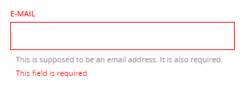
3. Validate once an input loses focus

People can get frustrated if you show them the error of their ways while they are still interacting with a text input. For this reason, don't validate anything until after the input loses focus.

input required


4. Positive validation can put users at ease   ✔

Reassuring a user when they do something correctly can also reduce the cognitive load. A small check mark is an easy way for your application to say, Thanks, I got it!

input reinforcement

1
  • 1
    These images are all from a mobile device view. I was going to post screenshots of how it looks on a larger screen but the answer was already getting too long.
    – DaveAlger
    Commented Aug 15, 2015 at 0:52
2

This is a long discussion. For starters, this is a mobile driven solution, and like with almost anything in "mobile first" scenarios, there's a lot of voices attacking or defending the literal translation of these mobile solutions.

First of all, I'd strongly recommend you to read the why and how the floating label pattern was created, by his creator. As you will see, there were a lot of considerations to build this, and it was enhanced by other people after his first deployment. However, you'll see there's absolutely no mention of desktop.

Does this mean you shouldn't use this on desktop?

Well, I don't think it's that easy. Personally, I tend to translate mobile to desktop as much as possible, so maybe I'm biased, but I'm convinced that most people is used to mobile very day, and common desktop affordances are easily overriden by the mobile revolution. This, and the consideration of whether to spend more time(=money) on something that has no clear advantages or disadvantages, makes me consider many of the "mobile only solutions" as default and translated to desktop. And floating labels is one of those solutions I like to use in desktop.

Think about this: floating labels emerge as a solution for space restrictions on mobile screens. So you could logically say "hey, I've a lot more space on desktop", which is true. But... is that absolutely true? If I use a responsive design, most elements will resize and/or change placement based on a grid. When all is say and done, you'll notice that most of the times you will end with approximately the same sizes within elements (namely a form). Furthermore, if I have more real estate, does it mean that I have to use it for a form? Now, (take this with a pinch of salt because I work mostly on teh marketing side of things, but) FOR ME, the form filling is the final goal. I NEVER make a form field wider than 360px so it fits on most mobiles, and if I have space, I use it to convince the user to actually FILL THE FORM. So as you can see, in most cases space is not an issue for me and I can easily use floating labels on desktop when needed: it will always be the same no matter the screen size.

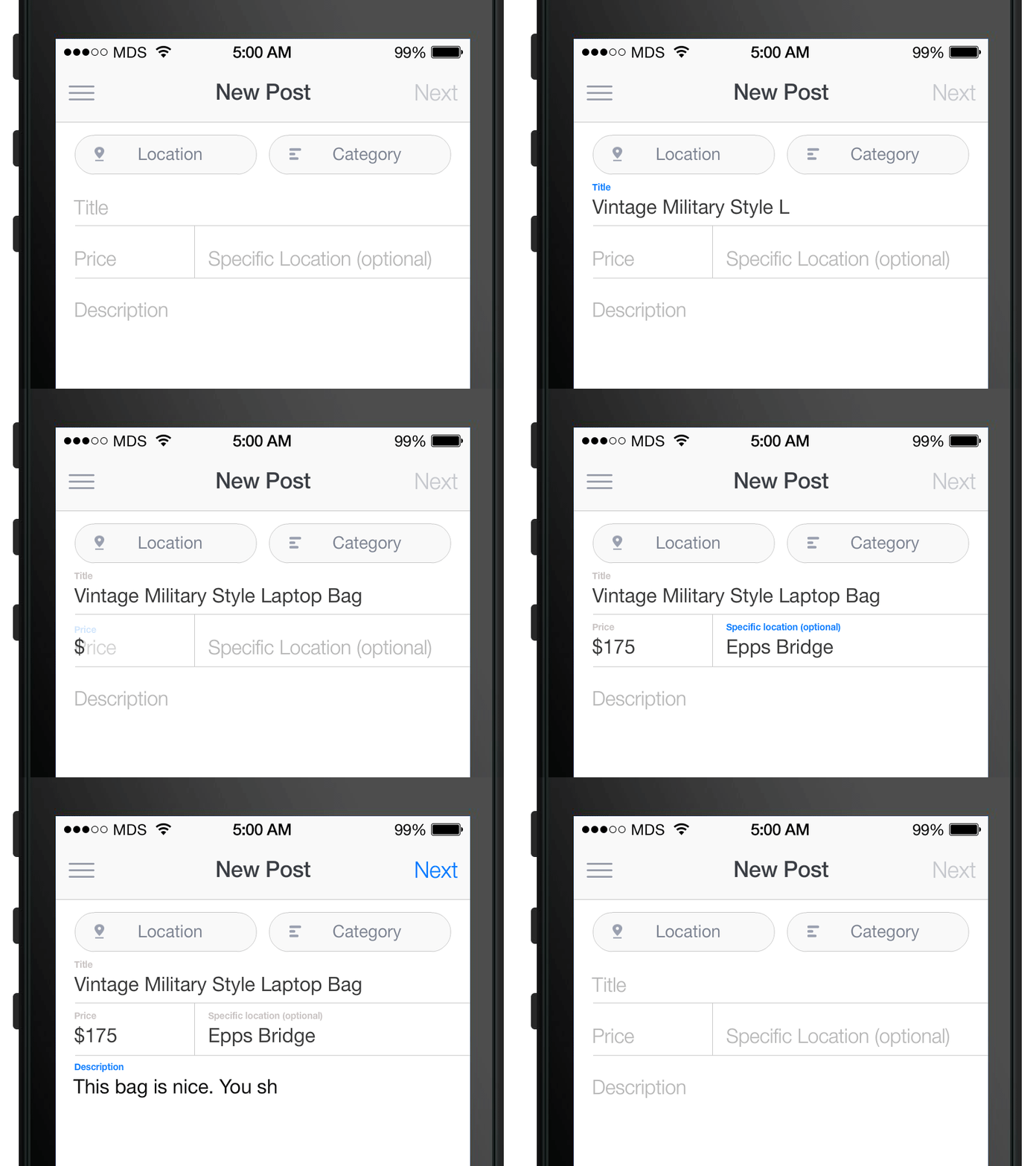
All the blabbing above is to tell you why I personally have no problems with floating labels, and use them or use static labels as the project needs it. But let's go to real world implementation. See below:

enter image description here

As you can see, most of the things Nielsen mentions on that article are overriden, and some visual cues are added for additional ease of use. Granted, there are some issues still, like using these labels as placeholders when fields are really complex, but that is a case by case consideration. To see the pros and cons, take a look to Floating Labels article by Brad Frost:

Float Label Pros

  • User keeps context

The main advantage of this pattern is that the user keeps the field’s context after they’ve focused and entered a value. This provides for a more accessible, less frustrating experience.

  • Clean and scannable by default

This pattern allows for a clean inline label experience by default, and only becomes a little more cluttered once the user has filled things out.

  • Elegant

It needs to be said: this pattern is sexy. You usually can’t say that about forms. It looks good and the animations are a nice subtle touch.

Float Label Cons

  • Still doesn’t provide room for both label and placeholder

Because the label is occupying the same space as the placeholder, there’s no room for additional hinting.

  • Small Label

The label becomes small and possibly hard to read, but at the same time it’s not as big a deal. Once the user has interacted with the input, the label becomes a reference rather than an instruction.

  • Potential for code abuse

Based on the few demos I’ve seen, there’s the possibility of wrecking accessibility and semantics.

(...)Ultimately, I think this pattern is a great way to overcome a lot of the shortcomings of inline labels. I can’t wait to see the concept taken further.

In short....

I think this is an element you should consider on a case by case basis, and depending on your needs. Additional tracking and research might be needed if doubtful, but I think it's a great solution nevertheless

2
  • I think there's one large additional con: the fields don't look like fields and aren't immediately identifiable as interactive.
    – DA01
    Commented Aug 15, 2015 at 1:54
  • @DA01, they will look anyway you want, not necessarily as the example, you have regular "old style" input fields, Material Design, Angular and whatever you can think of
    – Devin
    Commented Aug 15, 2015 at 2:49
2
  1. This pattern can’t support both a label and a placeholder.
  2. Placeholder text is rendered differently across browsers/versions. Extra effort is required in coding.

For reference: http://www.webaxe.org/floated-labels-still-suck/
https://blog.marvelapp.com/floating-labels-problematic/

May be you can try this pattern which supports both label & placeholder.

enter image description here

0

I think they are a perfect solution, as the interaction is right where the explanation is of what you'll fill in. Its as close as it can get, so there should be no confusion as to where one should click to start editing. It's the most natural mapping :-)

Sources:

https://en.wikipedia.org/wiki/Natural_mapping_(interface_design)

0

After going deep into Google Material Design (GMD) specs over the past 4 months, I have decided to use GMD for all desktop and Android design work, and retheme for iOS specific work.

After lots of thought about the feasibility and usability go GMD on desktop, I decided to use the "Filled" versions of the GMD inputs.

Text field boxes increase text field identifiability and scannability by using a transparent rectangular fill to enclose the label and input text.

A text field box uses a rectangular fill (10% white or 6% black) as a primary affordance, masking the ends of the input line. A ripple motion occurs in the hover and press states.

See here:
https://material.io/guidelines/components/text-fields.html#text-fields-field-variations#text-fields-text-field-boxes

This is the best of both worlds - input is more easily discovered, and the floating label pattern is applied.

Your Answer

By clicking “Post Your Answer”, you agree to our terms of service and acknowledge you have read our privacy policy.

Not the answer you're looking for? Browse other questions tagged or ask your own question.