1

I have the following question: we are developing an enterprise application. One of the main views which exists in the app is a typical table of records. Users can sort the table, filter the table, do quick or advanced searches etc. Users can also click on any row in the table in order to drill down & see more details.

Now we need to add a feature where users will be able to import records from external files. We are wondering what would be the best way to notify end users that the record has been imported / created in the system? We can think of two ways at the moment:

  1. Show a pop up message, something like: "Record was imported successfully. Go to record". "Go to record" is a link. When clicked, users go to the screen where the record is opened fully. This is how gmail, jira and other apps handle import / creation of new records when done "outside" the table. Pop up messages help with the situations when the newly created / imported records do not meet the current filters' criteria or the screen sort is such that they would appear at the very bottom of the table. In such situations users would not be able to tell whether the import / creation succeeded. But pop ups tend to break the flow.

  2. Another approach would be to temporarily show the newly created / imported records at the top of the table marked with a different color / font (even if in certain cases that would og against the current filters / sorting order). The "new" records would persist at the top of the table until user refreshes the screen, re-applies filters or performs any other action that would result in screen's being reloaded. We think this option should be smoother (no popups) but less obvious for inexperienced users (they would need to know where to look for the new records). On the other hand users who are importing files from outside the system can hardly be called beginners.

I am quite certain there are some web apps which take this approach, but am not able to find any at the moment. Would appreciate if you could point me to them.

Which option would be better from UX perspective? Option 1, 2 or maybe a combination of the two?

Thanks as always for your help.

2
  • I also seem to recall that there was a similar question posed at these boards, but I have problems locating the discussion... So if someone has the link I would appreciate it.
    – Odie
    Commented May 25, 2015 at 13:02
  • Related: ux.stackexchange.com/questions/64480
    – Izhaki
    Commented May 25, 2015 at 20:52

2 Answers 2

1

This is a common problem with a list view that is filtered/sorted/paginated (see this answer for a diagram).

In general, any records added to such list (and in some cases even records modified) will require data reload. If you wish to focus users on the new set of records, there is also an issue that the previous view settings will be lost although these might still be important for the user.

So whichever way you do it, there will be some possible issue showing these new records on the existing list view.

Sometimes, solutions like 2 make sense - if no other use case suffers from the list view data being changed after an add action.

But the solution you gave as 1 - showing these records in a separate place is less likely to work better, all use cases taken into account.

1
  • Ok, thanks for the tip. We have considered pros and cons of the two solutions for for the time being we are going w/ Option 2, i.e. showing the new records as the very first records in the table & making them colored.
    – Odie
    Commented May 28, 2015 at 11:34
1

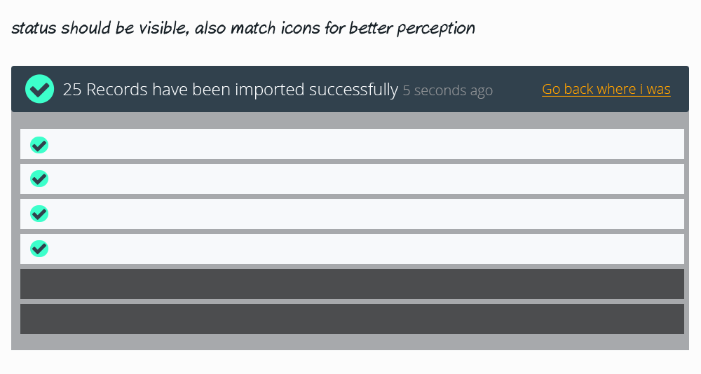
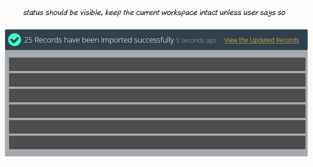
I would like to combine both with an option and more control to user to switch between updated and his original view where he was browsing....

I would go with UI guideline which is "System status should always be visible" and combine it with "User control" (my second option)

See my visual solutions below

Solution for imported records message

Now the second solution where user controls whether to view the updated records or not

I would suggest animating the tick icon after completion to get user attention...

second option with more user control

I hope it solves your problem

1
  • Thanks for the comment. I like the solution with the statuses and links at the top of the screen. I have stored this idea as a future improvement.
    – Odie
    Commented Jun 15, 2015 at 7:17

Your Answer

By clicking “Post Your Answer”, you agree to our terms of service and acknowledge you have read our privacy policy.

Not the answer you're looking for? Browse other questions tagged or ask your own question.