3

So I need to make a form with about 10 different inputs in it. Normally, I would put this on a single page and have the user scroll down. This seems like the easiest way to do it most of the time. But in this form, I need to user to perform a number of things.

I need them to:

  1. Choose between three options of a single product.

First here is some information on the products option 1: the base product itself option 2: an addon to the base product option 3: both the base product and the addon

  1. Ask them to login
  2. If option 2 - user selects which product from option 1 to attach their purchase to.
  3. all 3 options have different forms that need to be done.

What would be the best way to display this information? As far as I can see, I can only see these options.

  1. 3 seperate forms
  2. 1 long form with elements that hide and show based on what radio buttons they choose for products - not sure how they would log in
  3. 1 multi step form with different "screens" showing up depending on what the user selects.

What do you guys think is the best way to display this?

5 Answers 5

1

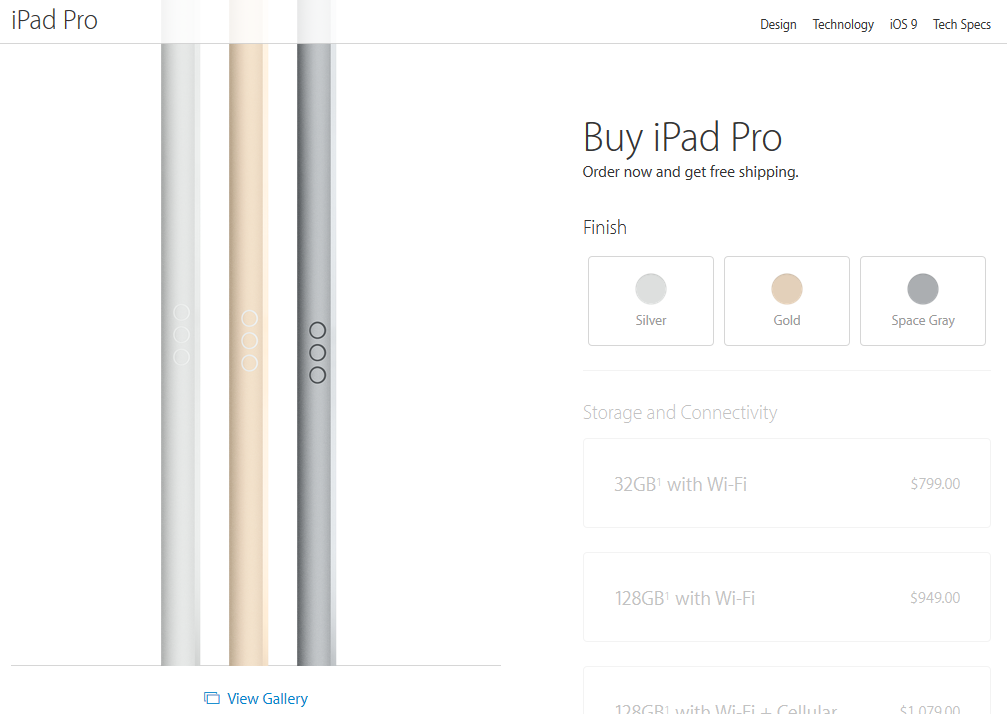
As far as I can tell the best process that I can see for you would be do something similar to what Apple do with the iPad pro.

  1. Each option that is selected gets collapsed with it's value and a change link
  2. For the login it seems like you'd need a form of AJAX login so that the can carry on with the flow of the process.

Step 1:

enter image description here

Step 2:

enter image description here

Step 3 (detail):

enter image description here

0

I don't think there's a single "best" way that fits all cases. As always it depends on the specifics of the site and users. That being said, what you are describing is a branching scenario, and for users who are not likely to do the task frequently and repeatedly, I prefer a multi step form, where the content of each screen depends on the previous selection. That way you limit the display to what is essential at each step minimizing clutter and confusion.

I don't think there's a real difference between this and a single page form that progressively shows and hides content based on the choices, but the former is pretty easy to understand because the steps are clearly separated into chunks, and it also allows for a simple way to go back.

2
  • "Going back" is possible in all of the offered solutions, therefore it is a bit redundant to mention it. Commented Jul 25, 2015 at 9:24
  • Emphasis on simple way back, i.e. using the browser back button or a prominent "previous" button on the page. Not all the offered solutions offer a simple way. With a single-page progressive disclosure form the user has to scan back and undo the choices they did earlier, which is possible, but not as simple. Nothing redundant about mentioning that.
    – illuminaut
    Commented Apr 19, 2016 at 16:21
0

Yes it depends on the context and who is using the form and how often.

I've just come out of a series of tests with a system that has many forms. The old system preferred progressive disclosure where the questions were split into pages instead of being loaded on one page.

It totally annoyed users "why do I have to keep clicking next, why can't they all be on the same page?" but that's because they were frequent users of the system and needed efficiency.

Your case is perhaps different and you may separate steps because each step is very important and you need to capture attention.

For my situation, I have advised client to adopt your option 2, which is best of all worlds because it minimises clutter and eliminates having to go to different pages.

so that's my advice.

0

The problem must have different ways of solution, the appropriate solution must address user ease to do intended task with delightful experience. To select appropriate product or features RADIO buttons can be used. So basically it will decrease the form fields and only required form fields will appear to the user. STEP by STEP approach is always better in form fields (avoid scrolling as much as you can) this is a good reference to see how many form fields should be handled: http://www.axisbank.com/personal/cards/credit-cards/credit-cards.aspx

0

Form complexity gets reduced by choosing to show those fields first that will reduce further choices. In your case, the 'add-on' could be shown as an optional extra after the customer chooses the primary product. If the customer just wanted the add-on, they won't be on that product page anyway.

Your Answer

By clicking “Post Your Answer”, you agree to our terms of service and acknowledge you have read our privacy policy.

Not the answer you're looking for? Browse other questions tagged or ask your own question.