Yours is a typical case of help text - it is complementary.
Complementary elements
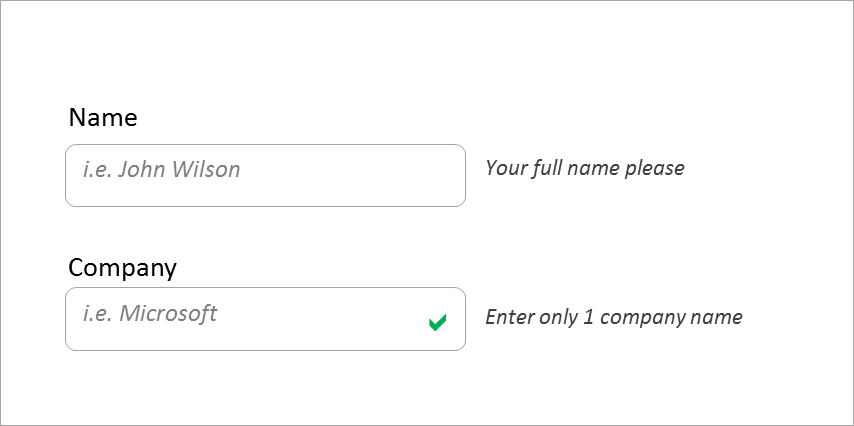
Complementary means that there is another visual element (label/placeholder) to indicate the nature of the field in a short and generic way, and the help text provides a longer and more detailed description.
In your example, it seems that first time users will need the text (as the labels are not very clear), but experienced users will not (they have already learnt what the label means).
Since there is another element to provide a shorter description, which is all experienced users will need, there is a strong argument to have the text after the field - it won't be in the way for experienced users, but easily seen by first-time users.
Accessibility
However, the issue of putting the help text after the field is that screen readers will only get to it after the user has focused on the field.
This can easily be addressed by providing either the label or the field a title or aria-label attributes.
Progressive disclosure
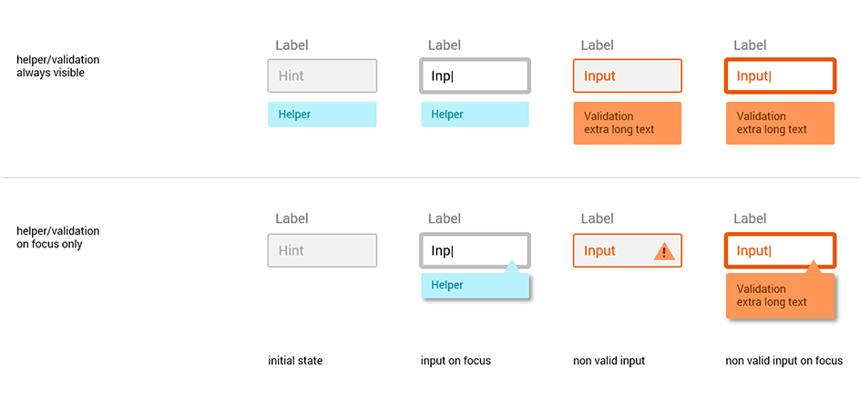
If this form is more likely to be used by experienced users, it could be beneficial to make this help text 'on-demand', like having a question mark that provides the help text on hover/click, or to provide it only when the field is focused (title or a tooltip). This will save visual noise.
Placeholders vs labels
Placeholders disappear once the user starts entering text, label do not.
Placeholders are appropriate for single-visit type of forms, meaning the user fills the form and never goes back to the filled form again. Login and register pages are such example.
If users can revisit the field form (such with 'edit song details') labels are much better as unlike placeholders they will be seen.


