7

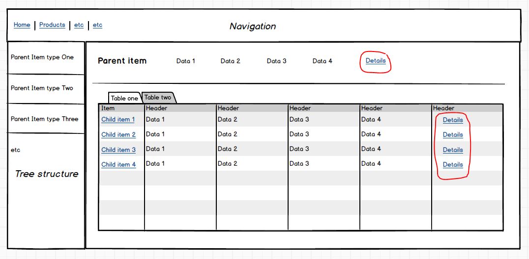
I have a system where we have a hierarchical structure of items (x nr of child items) where data from the parent is displayed as a "header" and the child items (and data associated with them) are displayed in a table below. When selecting a child item the pattern is repeated, so it moves up as the parent (with a breadcrumb added to access the first parent) and its child nodes in a table below.
enter image description here

For each item there is associated detail information that will look basically the same for each item. It will be quite a lot of information, so it might require quite some space. The question is how to solve the pattern for this? Is there a clever way to access the details? Should it be a new page and it that case how should you navigate between the pages? Should it be a big modal window? Other ideas?

Thankful for any input

1
  • to clarify, are you saying that the parents have children, and children have "detail views". OR Are you saying that a child can also be a parent of additional children? Commented Oct 2, 2015 at 20:32

3 Answers 3

3

A precedent that comes to mind is the interface for editing track metadata in iTunes. If you select an individual track you get a dialog with the various fields, and if you select multiple tracks you get a very similar dialog, but the individual fields now apply to multiple tracks instead of just one. If you are only viewing information, and don't need to edit it, then there is a lot of scope to extend this idea.

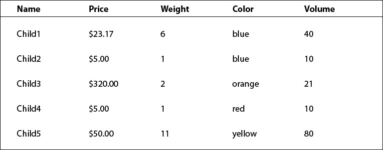
If your table view looks like this: screen 1

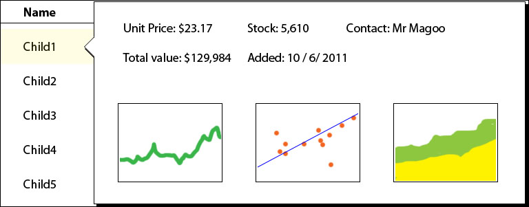
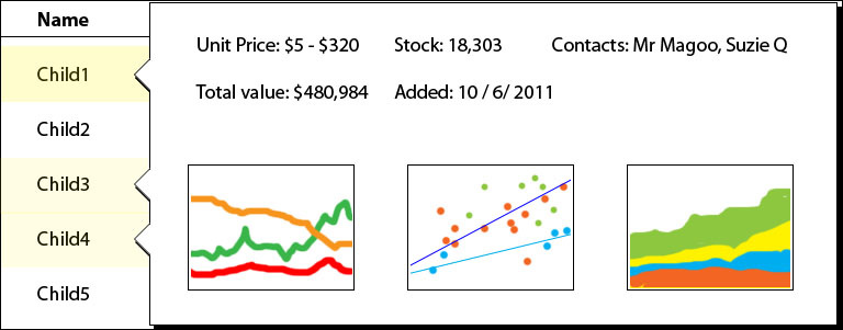
then selecting an individual item (and, say, pressing a "details" button) would give you this: enter image description here --visually, a popup covers all of the original table apart from the first column. In implementation terms, this is a whole different view, but the important thing is that it looks like a temporary window has popped up in front of the table (the "speech bubble" presentation in my sketch is deliberate). The user probably intends to return to the table when they're done, and this keeps that option clearly in sight.
If the user selects multiple items, you can then display an aggregated version of the details view: enter image description here

(I hope it's clear from the sketches what I'm getting at). Exactly how the aggregate view would work would depend on what makes sense for your particular data; maybe the "price" field shows an average price, while the "weight" field shows a total, and the "color" field shows a range in the form of a small chart. Combined with ideas like sparklines, this could be a very effective pattern for showing complex data in a simple interface.

0

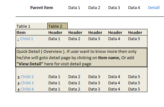
Refere My Image, i am not getting clearly that what you want to say but as far as I understand. I create this mockup. You can use Expander in for detail page. In that expander display overview of detail page. i.e. Name, Number, Qty. etc. and put there "View Detail" or "Read More" Option. Also you can add that function on title click too.

If user want to know more after read overview, s/he will definitely read more and visit detail page.

Also it is good idea to create detail page separately. But do not forgot to add BACK link/ Button there.

enter image description here

2
  • Thanks for the input. The problem is that there is no possibility to have a Quick Detail. The content is in such a form that it will directly require quite a lot of space (lots of figures and charts) And if I'm to add a detail page, how will that fit in with the rest? Do you see it as a new page in the top navigation?
    – Sarah
    Commented May 5, 2015 at 10:11
  • @Sarah hmm, let me think on that :) Commented May 5, 2015 at 10:20
0

You have a lot of options, but they depend heavily on the data you need to display.

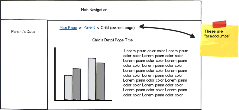
New Page + Breadcrumbs

This is a fairly common approach. You direct your users to a new page, but you leave breadcrumbs so they can find their way back. This preserves the parent --> child structure, and gives you all of the real estate you need.

mockup

download bmml source – Wireframes created with Balsamiq Mockups

Scrollable Side Panel or Modal

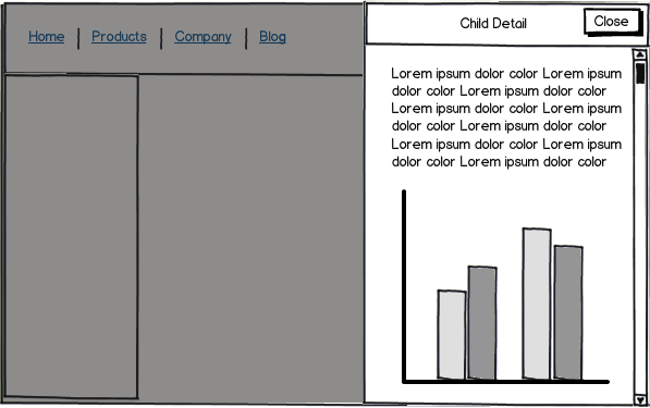
I generally hazard against using Modals, but their new cousins (Scrollable side panels) are proving to be much more UX friendly. After clicking a child row in the table, your eyes are immediately drawn to the pane as it slides out:

  • Navigation is not a concern, because it is easy to return to the previous state
  • You have much more real estate at your disposal, and the result is easier to make mobile friendly
  • Depending on screen size, some data from the previous state is still visible

mockup

download bmml source

Expandable Table Rows

As @Shivam Pandya pointed out, "Expandable Table Rows" (appears after clicking a table row) are nice for providing snapshots of additional information. W There are a couple of different ways to implement them, with the following being the most popular:

  1. A "Quick Detail" view that provides the information your end user cares about in 90% of the cases when they need more information. You can embed more actions in this expanded view like:
    • Basic CRUD operations (edit/delete/view full detail)
    • Email, Print, or other utility/business logic items
    • Allow for additional rows to be expanded at the same time


  1. A "Full Detail" view that provides all of the additional information associated with the table row. Essentially, a larger version of the "Quick Detail" that removes the need to navigate to a new page. The biggest change here is that you should only allow for one expanded row at a time if you take this approach.

Your Answer

By clicking “Post Your Answer”, you agree to our terms of service and acknowledge you have read our privacy policy.

Not the answer you're looking for? Browse other questions tagged or ask your own question.