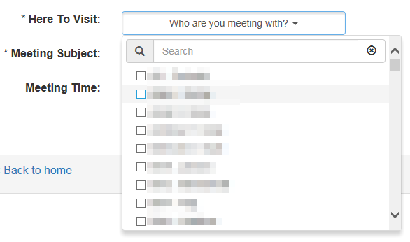
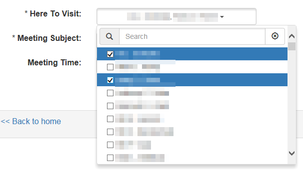
I wanted to get some feedback on a design concept we are working on. I am concerned there isn't enough affordance for the user to understand what the dropdown is capable of. In short, some of our dropdowns allow you to select multiple values. But to do so, the selection stack under the control.
My problem is, when first seeing the drop down next to the standard one, you don't know which is the multi-select vs single. Any thoughts on how we can improve the affordance?
See examples...


Jane Smithbox editable? It looks like an input box. If not, can you edit the image so that it's less confusing. It's important that questions are well-phrased on StackExchange as you are likely to get a good answer.