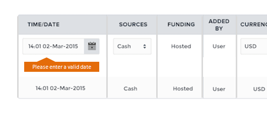
Example: Errors on a single row where some of the column is a form field.
With error messages it's all about association.
I don't have the experience with implementing it with tables, but I don't see why you can't apply the rules for forms to tables.
For forms, it's best practice to show the error message directly below, above or next to the input field that contains the error.
Assisting the error message with a red color (or orange for less pressing issues like weak passwords) will help to. For example red letters and/or a red background color for the error message. And/or a red border and/or background-color for the input field containing the error.
One other thing is to validate while typing or right after typing so where possible, you can show errors before the user submits the form or in your case, adds a payment row.
Animation can help too with helping the user in fixing the error quicker. Flashing the red background color from bright red to a more dull red (a dull red background-color with a brighter red font color is a widely used style for error messages) will help draw attention. I've also seen examples where the input field vibrates shortly.
The problem with tables is they're often big and space is scarce.
Giving the row or cell a red background is already a big step towards error association. But where to show the message?
As I said, you might have lack of space.
You could show the error message at the top of the table. Looking at the image you attached, the input row is at the top of the table so any message is close by.
But if an error can occur further down in the table, the message can be to far away when displayed at the top of a long table.
In that case you can think about appending a row containing the error message after the row containing the error.
Or a tooltip with the error message pointing at the cell containing the error (this will cover part of the row(s) below it).
Or the error message in a fixed position somewhere on the screen (top or bottom right) like some modal.
Tables often have many elements, so the easiest way to communicate an error in the table is to place the error message right next to the offending element, so that it's very clear to the user where in the table she should focus.
For example:
