7

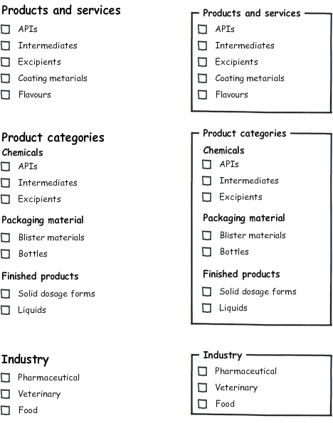
I have a list of checkboxes under header titles (at least three, one of them has sub headers, all in one page), something like this:

enter image description here

Problem is, these checkboxes may end up with 10 elements per group, I really don't know how to go about making them more user friendly, any ideas?

Note, I can't use the suggested way in other questions of a search box and move selections to another box, I have one group too many... second, the elements are pretty well defined and database driven, no search is required... third, it's only 10 - 15 elements

1
  • Could you add a link to the question/answer with the solution that you can't use? Commented May 26, 2011 at 7:48

2 Answers 2

10

Without knowing anything about the information architecture or the users work-flow, I've taken your suggestion as a starting point and added a few improvements based on the gestalt principles and visual hierarchy.

Then the main grouping should be done without underlined header (due to the law of proximity/grouping), and the sub titles should have a slightly different font (due to the law of similarity).

Eg:
enter image description here

1
  • problem is im talking about 10 items per group and 10 items per sub group, these boxes are going to extend vertically so long that it solves part of the problem only.. i needed a way to make them use space wisely tho
    – Ayyash
    Commented May 28, 2011 at 9:16
6

Classic faceted navigation design issue. Here are some things we've done:

  • Show the first 5 elements per group by default with a "More..." option that expands the list to show all of them. It's hard to pick which 5 to show. I prefer to show the "first" 5, eg. alphabetically, but business goals sometimes dictate showing the "most used" 5 or something similar.
  • If each individual category doesn't have too many results associated with it, step one level up and remove this level of selection. Eg. make the subgroups checkboxes and get rid of the "solid dosage forms", "liquids", etc.
  • Sort alphabetically, which increases scannability and readability. Right now when I go through the list, it's hard for me to find anything because I can't predict where it'll be based on any kind of sorting. Sort alphabetically because it's immediately obvious ("A... B.. oh!") and because it scales.
  • Use all the tips Jørn E. Angeltveit gives to improve the visual design by changing up colour, typography, size, etc.
  • Once facets have been selected, rather than forcing users to go through the list again to deselect things, keep a list of "what you've selected" somewhere in the UI that allows them to remove selections there.
3
  • 4
    I only partially agree with your first suggestion: Not showing all elements should only be done if the content is predictable for the user but not if the user doesn't know what's behind the "more..." button. +1 for the rest of the suggestions.
    – Phil
    Commented May 26, 2011 at 8:33
  • @Phil Sort alphabetically and print "12 more..." to make it easier to predict what else there is. But I agree, the first option isn't ideal.
    – Rahul
    Commented May 26, 2011 at 9:34
  • 2 and 3 are things i didnt give much thought to, i'll work it around a bit and see how it goes
    – Ayyash
    Commented May 28, 2011 at 9:20

Your Answer

By clicking “Post Your Answer”, you agree to our terms of service and acknowledge you have read our privacy policy.

Not the answer you're looking for? Browse other questions tagged or ask your own question.