3

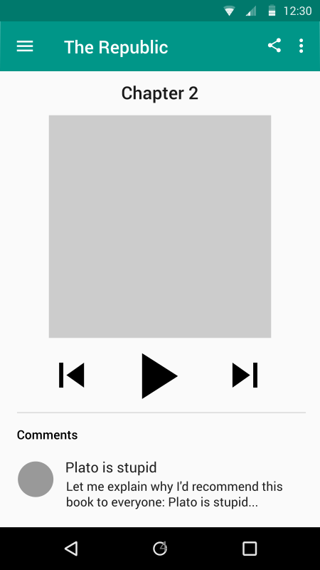
I'm designing an android app, using material design, where people can listen to and comment on audiobooks. When a user finishes a chapter, he or she unlocks the comments for that chapter. These comments are displayed below the play, pause, and skip buttons, like this:
enter image description here

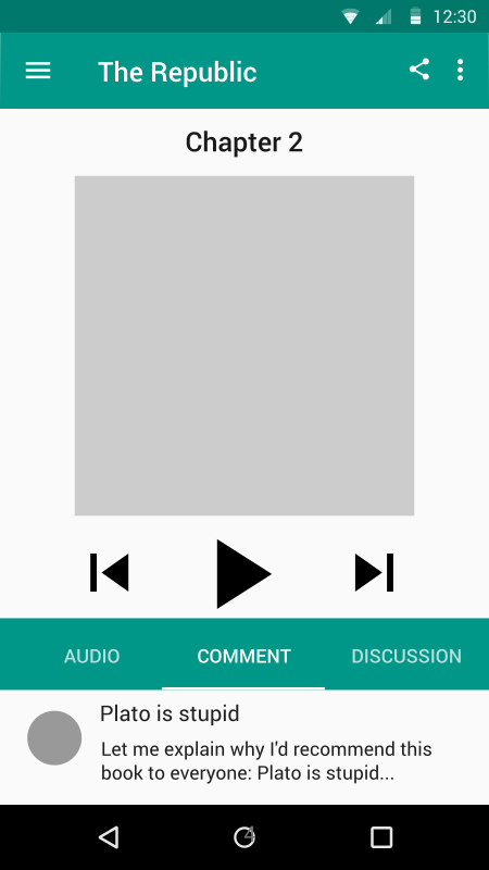
The problem is that there are three main types of comments: typical written comments, audio comments that are recorded in app, and discussion questions that can be answered. The way I can think of to organize these comments is by using tabs, like this:
enter image description here

This method looks bizarre because the tabs are so similar to the header and it goes against the material design guidelines. So my question is, is there a better way to organize content that is halfway down the screen?

6
  • What is the bottom sheet (black background) used for?
    – tohster
    Commented Mar 6, 2015 at 12:57
  • That is just the android navigation bar (the system wide navigation). Commented Mar 6, 2015 at 13:25
  • Ah right, I forgot they include that in the material design wireframes. Thanks!
    – tohster
    Commented Mar 6, 2015 at 13:27
  • Is there a reason why you have to have the book cover on this screen? That seems to be taking a lot of space for something they already know they are listening to.
    – UXerUIer
    Commented Mar 6, 2015 at 16:03
  • @Majo0od Good point, not really. Originally there weren't any comments, so it was just for aesthetics, since there was space. Commented Mar 6, 2015 at 20:59

3 Answers 3

3

I agree that it doesn't look great.

Do you need to feature a specific comment?

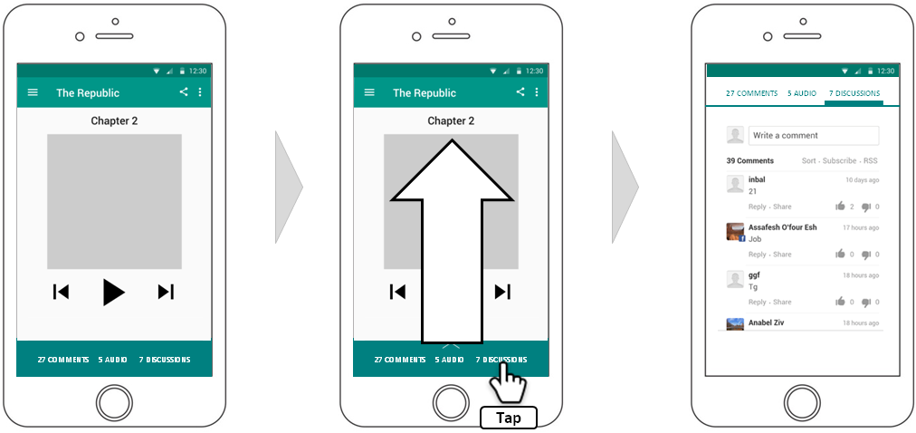
If not, then I think a successful approach with material design is to have a bottom sheet that slides up to full screen with the tab control:

music

These would not be tabs but as the sheet slides up it can morph into a top-aligned tab control, with whatever tab the user selected when she tapped on comment, audio or discussions.

For a media player it's nice to keep the interface simple. You have a lot going on in the page, so removing the featured comment and simplifying the tab control into a dark bottom sheet may help calm the interface.

3

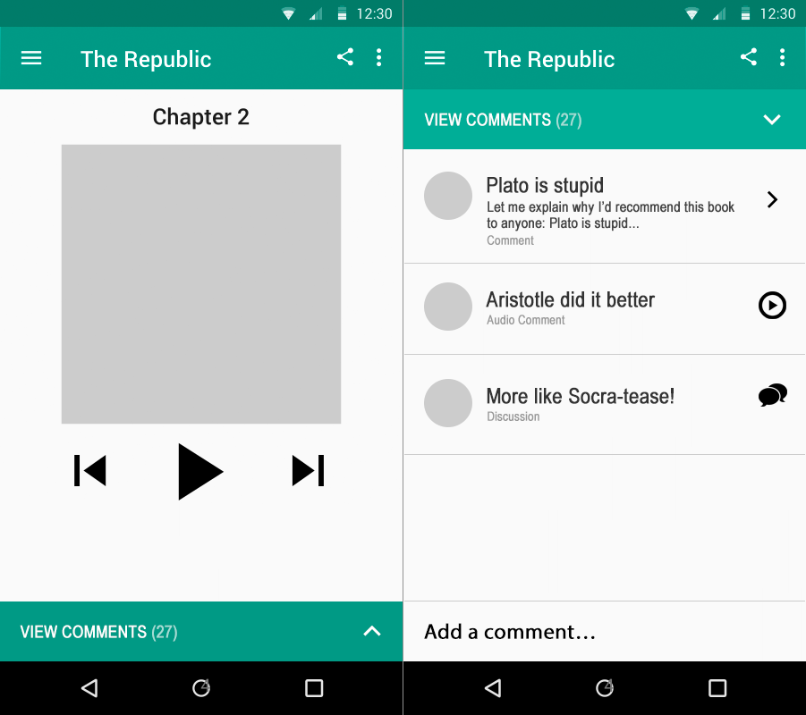
Are you married to the idea of the tabs? What if you simplified the entire view and provided all replies, with an appropriate action to view/listen? This allows the user to quickly browse all the replies without having to jump around.

Suggestion for on-tap actions per comment type:

  • Comments: Either expands or slides over
  • Audio Comment: Audio plays immediately, with the icon changing to a pause button
  • Discussion: Slides over to discussion panel

Proof of concept for an interactive comments panel

I also wasn't sure where you were inviting users to add new comments, so I threw a rough placement in for that as well, but you'd need to consider the three types of comment.

0

I don't think the tab bar pattern is bad in itself but the current one looks visually too heavy. How about a lighter colored tab bar like this one seen in the material design guidelines?

light colored tab bar

Your Answer

By clicking “Post Your Answer”, you agree to our terms of service and acknowledge you have read our privacy policy.

Not the answer you're looking for? Browse other questions tagged or ask your own question.