5

Looking around at high-profile sites such as eBay and LinkedIn, it seems pretty standard to show filter options on the left after a search has been performed. It also strikes me that the results shown are not in a table format, but in a list view e.g. "one" column.

In the business application I am currently redesigning, the results will be shown as a table with many columns, I know tables are a little old-school but the data being returned is quite complex that a table is the best option.

Due to each column being filterable, there appears two options:

  1. Show the relevant filter at the top of each column (like in Excel)
  2. Show all the filters outside the grid on the left (like in eBay)

My preference would be option 2 as I like the general usability of filters all on the left. My only problem is that I wonder whether more sites would actually use in-column filtering if they were to present results back in a table rather than a list.

I can't find any examples of consumer applications that present results as a table in which every column is filterable, so can't see any trends or examples to learn from. Thanks!

2
  • When filtering on tables, like in Excel, you often have a list of all values and check the ones you are interested in. Depending on your values, this can be a good or bad approach. If you display dates for instance, a range seems more efficient. Unless you can create a custom filter to do that, you may have one more argument to defend the left-side approach. We used the search form approach in conjunction with DataTables's single filtering field on an application I previously worked on. Users could search with the form (AJAX), then find a single result by filtering.
    – Chop
    Commented Jun 15, 2015 at 5:53
  • 1
    Ebay results are still a table, the fact that each row is connected along it's columns visually does not lessen this, it only hides it.
    – insidesin
    Commented Aug 14, 2015 at 10:01

3 Answers 3

1

This is a common question for applications that display large numbers of tabular data. A few thoughts:

  • While you didn't propose it as an option, it's worth mentioning that it is not a good idea to use both faceted navigation and tabular filtering. Doing so will create a confusing user experience where actions on tabular filters will also trigger faceted navigation to unexpectedly refresh.
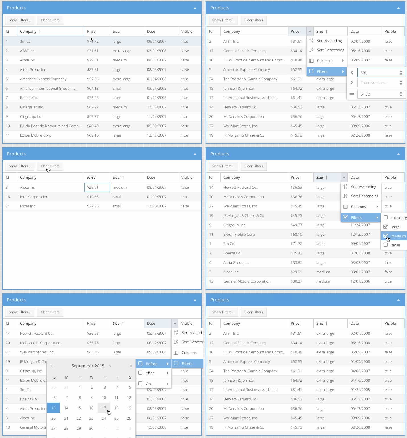
  • If the data is best represented in a tabular format (usually reserved for content where filters are mostly numerical or date ranges), build a filtering mechanism across the top of the table. Provide effective filters depending on what each column contains. For example, dates and prices should be ranges, repeating properties (like locations) should be multi-select, etc...
  • If tabular filters are indeed used, ensure the current state of filters are displayed within the user experience. If this cannot be accommodated, make sure to at least highlight the columns with active filters.

The below example isn't perfect, but it illustrates the points made above:

enter image description here

All of that said, if your results are more unstructured (like a traditional search result), abandon the tabular display and rely on the traditional faceted navigation pattern. Don't force a navigation scheme where it doesn't mesh well with the nature of the content :-)

1
  • I like the addition of the example. It would be handy if there was a link referencing the "usability statements" you use in bold unless it was just from your own experience. Commented Feb 10, 2016 at 17:35
0

It actually doesn't matter where you put your search results faucet filters because, in the end, you still need to test your design with users.

Generally speaking, if your data is presented in a table, it's a common design pattern to put filters in the first row of each column. This has the advantage of showing users clearly which column is being filtered. The disadvantage, however, is that it becomes hard to see the applied filter as users scroll away from the filtered column.

If you place faucets on the side, make sure that they stay visible on the screen as users scroll in either direction. You may also want to auto-hide them when not in use in order to save on horizontal real estate. However, this is not a common design pattern and it may confuse users.

0

I think one reason for the "left filters" design is that the relation between the filters and the results is rather loose. Not every column can be used as a filter, and not every filter criterion is visible in the search results (it is when navigating to the details, but not on the result list). This is probably appropriate since ebay, amazon, etc. show images from which you can glean brand, color, etc., so they add these as filters, but not as columns.

A second reason might be that the result list is not using columns because that allows images, text, numbers, all of which have different form factors, to be placed in a multi-line "card". An entry can contain several lines of text, which would require a wide, potentially horizontally-scrolling, table.

So if you need a "business" design, you might ask whether you need filters closely linked to each attribute, and whether you have special layout requirements/possibilities (in a product catalog, or a people search, you could add images, for example).

Your Answer

By clicking “Post Your Answer”, you agree to our terms of service and acknowledge you have read our privacy policy.

Not the answer you're looking for? Browse other questions tagged or ask your own question.