Use Icon or Text?
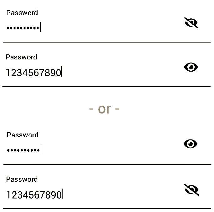
So, speaking from personal experience when I was asked to redesign the login page for a Financial software. I proposed three designs, including the eye icon.
To keep story short, I would definitely vote for using a text (Show Password or SHOW in the Password field) as opposed to the "eye" icon.
This was not based on a survey, but practice. We have a vast variety of users (clients) with ages that range between young users (age of a fresh college graduate) and old users (60s and 70s years old). Once we threw the design (with eye icon) as a beta we had a lot of phone calls asking about it. Questions ranged between, why we need this now? To What is this for?
We figured that some users tried it and did not find it important but risky (that's another discussion). While others (older respected generations) did not even click on it, they called to ask What is it?
Some designers suggested that we add a tool-tip on the eye icon says "Show Password" on mouse-over. But again many users did not even try to click on it and we believe some even ignored its existence.
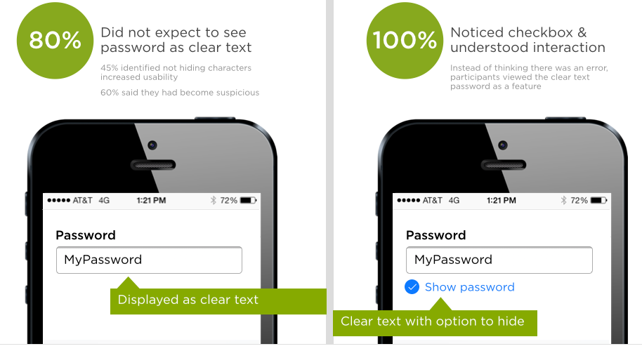
However, after a call from the head of Customer Services department who called to have it completely removed, someone suggested to go very conventional and add a check-box with "Show Password" text next to it to remove all kinds of ambiguity it caused. However, I did not want to go very conventional with it, especially that we are already using that space for "Caps Lock is on" warning and "Forget username or password" link.
So I suggested to add a text "SHOW" in the Password field itself and added a tool-tip says "Show Password" on mouse-over. Text changes to "HIDE" to mask the password again.
We lived happily ever after!
This design actually solved three issues:
(1)- The need for the "Show Password" feature for a better UX.
(2)- The space issue that we had if we would have chosen to use a check-box and "Show Password" text next to it. (as mentioned earlier, we were already using that space for a warning message when Caps Lock is on and for a forgot username or password link).
(3)- It is a responsive design, using the text "SHOW" is fairly easier to click on a mobile device compared to a small check-box.
Hope this adds some insights.


