3

I am using jquery UI sortable to allow rows in an html table to be sortable. I want to use an icon for a handle and I am trying to figure out what is the best image / icon that would best illustrate that a user can drag this element to drag the current row above or below other rows. My mouse is already changing cursor to show:

     .handle {
          cursor: move;
      }

to represent that you can drag so I am trying to figure out how important the image matters at all.

Here were some suggestions:

enter image description here

enter image description here

but when I look at these, my instinct is to click the up or down arrow (versus have this represent something to drag?)

3
  • I would call that fields can be (re)ordered. To me sort is alphabetical sort (ascending or descending)
    – paparazzo
    Commented Jan 24, 2015 at 20:21
  • I have updated the title of the question
    – leora
    Commented Jan 24, 2015 at 21:40
  • Why an icon in every row? A title bar with the instruction "Drag and drop to reorder".
    – paparazzo
    Commented Jan 26, 2015 at 17:48

2 Answers 2

6

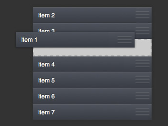
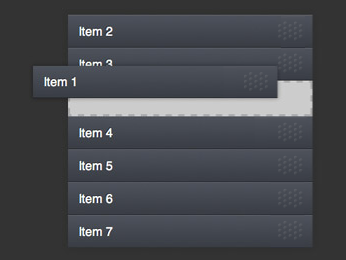
I typically use a grippy looking dotted area like this, that's also roughly the size/shape of a fingertip.

enter image description here

...or 3 bars indicating a similarly grippable area:

enter image description here

The idea being to make it look like the surface of the button itself stippled or embossed - and so making it more connected to the whole button rather than being a separate function or action.

Here's a close up of the dots:

enter image description here

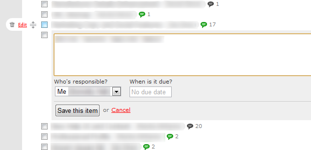
Another common symbol is one like this screenshot from Basecamp. Note that here the icons on the left of the list item only appear as you hover over the item, which means that particular behaviour wouldn't work on mobile:

enter image description here

3
  • 7
    I would avoid the 3 bars since that's now the ubiquitous "hamburger" and can potentially imply a menu associated with each item for some users. The other dotted grip is great though.
    – J. Dimeo
    Commented Jan 24, 2015 at 19:09
  • The dotted grip has the 'advantage' of keeping the same appearance when you have elements that can be dragged not only vertically but in any direction. If you differentiate between the direction of dragging (it does give a slightly better visual hint about what actions can be done but) it is less consistent across various drag actions. Agree with J. Dimeo about the conflicting connotation of the hamburger style bars. Commented Jan 27, 2016 at 9:15
  • I think it's also worth noting that the dotted pattern doesn't need to be particularly complicated. This is an approach which relies on some very basic skeumorphism for the idea of a grip-pattern being used on physical objects to suggest "hold me here" - even if it's not required to actually provide grip. Whilst skeumorphism is somewhat out-of-fashion at the moment due to overuse, this works. VisualFeaster's example from gmail is fundamentally the same with a simpler image and a smaller grab-handle - and that smaller grab handle might lead to more mis-touches. Commented May 24, 2017 at 12:59
3

In order to make it simpler you can use dotted vertical lines as in the Gmail example. enter image description here

1
  • That still requires prior knowledge of what the dots mean.
    – Mayo
    Commented May 24, 2017 at 13:12

Your Answer

By clicking “Post Your Answer”, you agree to our terms of service and acknowledge you have read our privacy policy.

Not the answer you're looking for? Browse other questions tagged or ask your own question.